Malmö by Bike
Redesigning
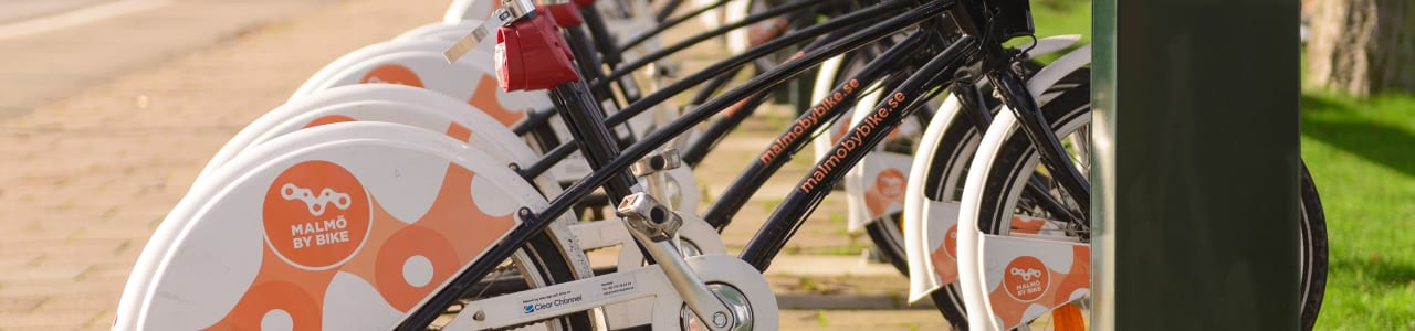
This is a redesign of the UI in the Android version of Malmö by Bike, when trying to find a nearby bike. Malmö by Bike is a affordable bike rental service with around 500 bikes distributed at about 50 spots in central Malmö.
De-construction and problem
When deconstructing and analyzing the different parts of the app I could find several problems that I wanted to address.

Focus
The app is cluttered with functionality and buttons that have low value but adds cognitive load to the user. We have many elements that could be cut away.
Clarity and consistency
The elements have inconsistent styling making the app feel less well put together. Others elements have hidden affordances, where they just seem to be icons but are actually buttons. Some buttons, like the record trip button, use an icon that is commonly associated with "play", making the function of the button unclear.
The map pins have different shapes, indicating different functionality but it is unclear what would be different between a circle and a triangle, There is no hierarchy between these shapes and users have to learn what they do.
Re-construction
The redesign focuses on reducing clutter and making the data available at all times.
Removing features
I have removed the record trip function, as this is something the user probably gets in a better way from a dedicated fitness tracking app.
The "favorite" functionality lets you see all your favorited stations in a separate list and see their status there instead of on a map. As the stock of bikes in a station changes at a high rate it is not very valuable to look a favorite station that is not in your immediate proximity and thus I removed the function.
The filter at the bottom of the screen will not be needed any more as I implement a map pin that shows both dimensions of data at the same time.
Redesigning
Working with the consistency of the design I used the color coding where it was applicable, like in the station cards and pins, and kept the standard UI patterns consistent with the Android platform.
I redesigned the map pins so the users can get a better overview and do not have to switch between seeing available bikes or available locks. I kept the color coding from the original app but also added bars, to get more granular data. The Icons have two bars to indicate the availability of both locks and bikes.

The pins have a more clear hierarchy, to make it easier for the user will understand the difference.
Testing
My limited user tests showed that the design worked as expected, it was fast and the users did not have to explore the different functions to understand the app. The scope of the tests was small and further tests with a larger scope would be interesting to see how the redesign would affect everyday use.
The result
The redesigned resulted in an interactive mockup restricted to the user flow I focused on.
Conclusions
I gave the app a well needed focus but if I would have had more time I would work more on the map pins and establishing a better language to communicate their functionality.