Google Analytics
Assignment: Analytics
Brief: Find design opportunities in the Google Merchandise Store based on Google Analytics
Materials: Google Analytics
Team: Individual
note: I redid this assignment for a re-exam in November of 2021.
Analyzing the Analytics
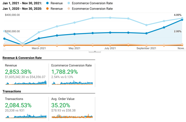
Quality of data is very important. I wanted to use 2 years of data to compare but those sets are very hard to evaluate as there are very different in revenue. 2020 had a revenue of $54k versus the 2021 revenue of $1.6 million. I will have to use the 2021 data only. There also seems to be some irregularities with the February sales dropping drastically to then just come back in March. I will not try to find insights in that part of the dataset.

Noteworthy data
- The mobile vs desktop use ratio is odd. Just under 1/3 of the users are on mobile, this is very low in 2021 and might be because it's a web store, and shopping is still easier on a big screen. Mobile users are also half as likely to return.
- USA is a very dominant origin country with over 40% of users, India is a distant second with 9%.
- Referal users are by far the most valuable. They are 8% of the visitors but 50% of the revenue.
- Sales are greatly reduced on non working days as weekends and holidays.
- AdWords are losing them money. The only well performing keyword is the name of the site and on that search they would probably be on top anyway. Youtube campaign spent $39k to make $52.
- I would guess that there is a lot of internal sales as many order are for huge amounts of the same product, like 100 backpacks or multiple orders of 25 giftcards for $100 a piece. I don't see that normal consumers would do this.
- The 15% returning users generate 70% of the revenue.
- There seems to be around 0.5% of the users that return over 50 times in a year.
- Display ads have very bad conversion rates (0.96% of the sessions but only 0.02% of revenue).
- Mobile users just have 0.56% conversions versus desktop with 3.34%.
- 7 out of the top 10 mobile devices used are used are Google Pixel phones. These phones are rare and my suspicion is that Google employees are a big portion of the visitors. These users also have a higher conversion rate.
Design for mobile first
The industry standard is to design for mobile first as this will seldomly harm any desktop usage but the other way around can often lead to problems. This is even more true than in 2010 when responsive web design was invented as mobile traffic is the dominant traffic on most sites, on this particular site mobile traffic is low but that could be caused by the design. As mobile traffic seems to under perform on the site I would suggest further research into why.
Some problems I can find right away is that the site is abysmally slow. Google lighthouse gives it a 23 out of 100 in performance with a 22.6 from start until you can interact with the site. Funnily they also score very low (50) on search engine optimization.
I think the start page has potential for improvement. One problem is the auto-scrolling carousel at the top, auto-scrolling is not a great UI-pattern and the manual navigation is bad. Today, I would expect a better navigation than having to click small dots under the carousel, I would want clicks on the sides on the carousel and swipes. The navigation is even worse on mobile as the expectation to be able to swipe is higher and the small dots are bad targets for taps.
The click targets on the product cards are very small, just a link instead of the whole card, making mobile navigation harder. None of the high performing products are pushed on the home page, instead we get some "trending" categories. Nothing in the analytics data shows that these products are trending.
With almost 200 network requests on a simple product page, it's no wonder that it is slow. Megabytes of javascript gets loaded just to show a very simple page that should be light and fast to load. Performance is also part of UX and especially on mobile. It's not ok to load almost 4mb of compressed data just to show a page with 1 medium image and 7 thumbnails.