Multiscreening
Last friday we all presented the films we made that week. The assignment in was a video prototype of a multi-screen experience with a glanceable UI and it was interesting to see all the takes on the concept. Some groups made real good videos and concepts while others I think got away from the assignment a bit when they wanted to make cool things. I think it was clear that as soon as visual design elements where introduced in the videos, the critique would get skewed towards that. A lot of critique focused on colors and technology.
I think this was a bit sad as I interpret the assignment to be more about testing an experience and communicating that. I guess it's hard to make any hard lines but I would have liked to see more talk about the conceptual stuff. Like "how is glanceability built in?", "is the information useful and actionable?" and questions like that. I think it's a bit hard to critique in these large environments, especially when there is no discussion already going on. I feel that I come off as a douche when I try to point things out, but I don't feel confident enough to make any claims about the strengths of the design. I need more time with it to find those qualities and a smaller forum where I feel I can goof up without losing face. I guess that is something I'll have to work on.
KitchenHub
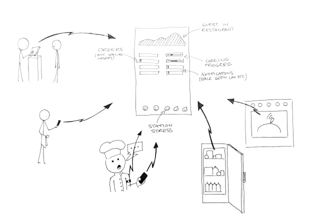
Our video is about a system that keeps the kitchen staff informed without having to know all the details. You can see if a roast is done soon, but you might not need to know the seconds. The more detailed information is available if you want it on the appliance itself.

We got some well deserved critique about how the interactions could have been better illustrated and I think the video shows how we were two different teams doing scenes at two different locations. We had just a vague idea of what the other group was doing and we should have had a "director" that could have pulled us in the same direction.
Takeaways
Overall I think this week showed what a powerful medium video is when you want to show an experience. It also showed us how much more experience we have with this now. Making this movie was so much faster and smoother than last time we had to make a video prototype.
I also think we got to experience how valuable lo-fi visuals can be. When you leave a lot to the imagination of the audience you don't get irrelevant questions about colors and contrasts.