Rocking scissors and paper
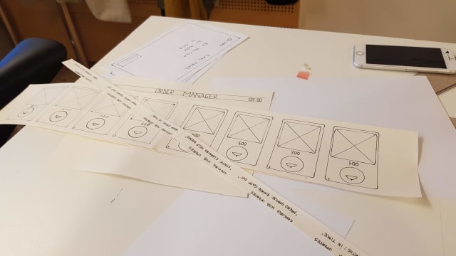
When setting out to make a quick video prototype of our project we chose paper as our material. We wanted something fast and far removed from graphic design. The fast part might not have been correct. Making six different devices in paper where all had changing components was not the fastest, we could probably have made it faster in illustrator but the what we got was a more true wireframe mindset. While we saw that other groups where debating contrast and colors we could just focus on the interactions and information in the prototype.

I think we often want do make "shiny" design. We want to present something that is aesthetically pleasing and will impress stakeholders at first glance. This can be a trap where we spend a lot of time debating ad designing characteristics of the design that may or may not even be implemented later on. We also run the risk of getting in love with a design and have a hard time scrapping it later. I have seen this many times in my own work where a design is modified to try to retain some aspects you really like, and while doing so you ruin it and get something bad, but at least you kept your favorite header almost intact :)
Another danger could be that stakeholders get attached to the design early on and don't want to change it. As they are not as involved in the design process they may have a hard time understanding why something had to change.
Filming
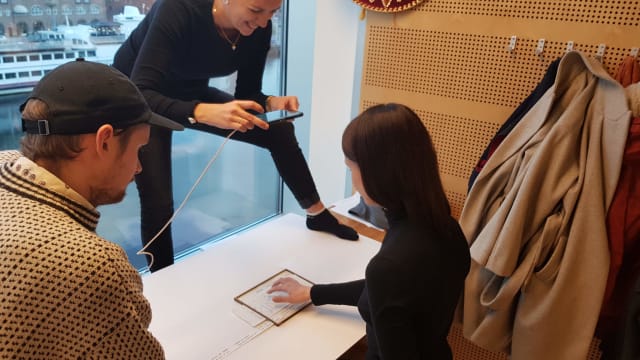
Just doing stuff can really make stuff happen. Who knew? We just asked if we could film in the uni cafeteria and in one hour we had planned our shots, filmed a couple of versions of every shot and edited it all.

We had some discussions in the group about how to edit and what to keep. I didn't see the benefit of keeping everything we filmed just because we want to show what we have done. I think killing darlings is really important, especially when you present your things. The audience might not even understand why you liked that thing so much. In the end we compromised and I hope everyone is happy.