Posts about “TEI w:1”

  1. Photo by Jeremy Yap on Unsplash

    Multiscreening

    Last friday we all presented the films we made that week. The assignment in was a video prototype of a multi-screen experience with a glanceable UI and it was interesting to see all the takes on the concept. Some groups made real good videos and concepts while others I think got away from the assignment a bit when they wanted to make cool things. I think it was clear that as soon as visual design elements where introduced in the videos, the critique would get skewed towards that. A lot of critique focused on colors and technology.

    I think this was a bit sad as I interpret the assignment to be more about testing an experience and communicating that. I guess it's hard to make any hard lines but I would have liked to see more talk about the conceptual stuff. Like "how is glanceability built in?", "is the information useful and actionable?" and questions like that. I think it's a bit hard to critique in these large environments, especially when there is no discussion already going on. I feel that I come off as a douche when I try to point things out, but I don't feel confident enough to make any claims about the strengths of the design. I need more time with it to find those qualities and a smaller forum where I feel I can goof up without losing face. I guess that is something I'll have to work on.

    KitchenHub

    Our video is about a system that keeps the kitchen staff informed without having to know all the details. You can see if a roast is done soon, but you might not need to know the seconds. The more detailed information is available if you want it on the appliance itself.

    An illustration of how the kitchen hub system interfaces with all the appliances in the kitchen
    All systems in the restaurant send abstracted information to the kitchen hub

    We got some well deserved critique about how the interactions could have been better illustrated and I think the video shows how we were two different teams doing scenes at two different locations. We had just a vague idea of what the other group was doing and we should have had a "director" that could have pulled us in the same direction.

    Takeaways

    Overall I think this week showed what a powerful medium video is when you want to show an experience. It also showed us how much more experience we have with this now. Making this movie was so much faster and smoother than last time we had to make a video prototype.

    I also think we got to experience how valuable lo-fi visuals can be. When you leave a lot to the imagination of the audience you don't get irrelevant questions about colors and contrasts.

  2. Rocking scissors and paper

    When setting out to make a quick video prototype of our project we chose paper as our material. We wanted something fast and far removed from graphic design. The fast part might not have been correct. Making six different devices in paper where all had changing components was not the fastest, we could probably have made it faster in illustrator but the what we got was a more true wireframe mindset. While we saw that other groups where debating contrast and colors we could just focus on the interactions and information in the prototype.

    Paper prototypes of UI on a table

    I think we often want do make "shiny" design. We want to present something that is aesthetically pleasing and will impress stakeholders at first glance. This can be a trap where we spend a lot of time debating ad designing characteristics of the design that may or may not even be implemented later on. We also run the risk of getting in love with a design and have a hard time scrapping it later. I have seen this many times in my own work where a design is modified to try to retain some aspects you really like, and while doing so you ruin it and get something bad, but at least you kept your favorite header almost intact :)

    Another danger could be that stakeholders get attached to the design early on and don't want to change it. As they are not as involved in the design process they may have a hard time understanding why something had to change.

    Filming

    Just doing stuff can really make stuff happen. Who knew? We just asked if we could film in the uni cafeteria and in one hour we had planned our shots, filmed a couple of versions of every shot and edited it all.

    Cathrine, Denisa and Simon are filming a paper prototype
    Cathrine, Denisa and Simon are filming a paper prototype. AT times we had to involve more people.

    We had some discussions in the group about how to edit and what to keep. I didn't see the benefit of keeping everything we filmed just because we want to show what we have done. I think killing darlings is really important, especially when you present your things. The audience might not even understand why you liked that thing so much. In the end we compromised and I hope everyone is happy.

  3. Screen time

    We feel the time running and have to decide on a situation. We go through our earlier ideas and decide to ideate on three of them.

    Post-it notes with ideas

    Doctors with patients

    Ideation on doctor patient situation

    We ideate on the patient/doctor situation. This was probably the favorite situation before the ideation but we found it a it boring afterwards, we also worry that our experience in this field may be very limited.

    Patrolling police

    Ideation on police with multiple screens

    If we would pick the police we would likely go into a dark and speculative design. It would be very political and with the short time we have on the project it could fall flat and just be a "black mirror reject".

    The restaurant kitchen

    Ideating on cooking with screens

    This was our least favorite situation coming in, but when we started to explore the idea, it grew on us. I like the idea of using many small screens with specialized information and a large screen with. The worry is that we are biting off more than we can chew, there is a lot to deign and prototype and we only have two days.

    A sketch of how the screens and systems will work in the kitchen

    We decide to work on this and start to wireframe the different screens. Tomorrow we will have to make a storyboard and film it in a kitchen. We got permission to film it in the university cafeteria.

  4. Working with text

    Yesterday we spent most of the day working with the texts in preparation for the seminar in the afternoon. I like how we have focused more on the texts this year. There seem to be a lot more discussion in the class this year, maybe because everyone is always working in the studio, but it may also be the seminars that force people to read the texts. Anyway, the fact that more people read the text I think has a kind of synergy, where everyone gets more out of the texts as we can discuss it more. Or it's just me reading better.

    The seminar

    As we in our group already had been discussing the questions for the seminar for a couple of hours, we had already answered most of the questions, but discussing it in class gave us some new perspectives. Having David there deepened my understanding a bit more and opened new discussions.

    We talked about how much data you need for your research and some people, me included, felt that there was not enough data to draw some conclusions. While I understand, and agree with, that qualitative research has different restrictions than quantitative studies, I just don't think some of the conclusions where justified in some cases. It's nitpicking but I still think some conclusions in the field study are weird. When 50% of group A says something, it's not ok to group them with group B that was testing a totally different prototype and conclude that prototype A had this quality just because group B thought prototype B had the same quality. You should just be honest and say that the interviews are inconsistent. I think that the way these people work may have more to say about it than the visual queues.

    Group work

    We have yet to pick a situation to work with. I had some ideas i will present to the group today.

    • A glanceable todo list. It could be something like making a second display view for Github where you see the issues you have taken for the day.
    • A time tracking app that lets you see if you are tracking billable hours and for what project
    • Notifications for your computer on a phone. Moving them from the main screen would also mean that you can easily turn them off by flipping the phone.
    • Some kind of running "coach"
    • A dystopian gig economy situation where you see how little you make and maybe also how you should act.

    My ideas seem to be rooted in my real world problems and not that exciting. We should do something crazier.

  5. First glance at TEI

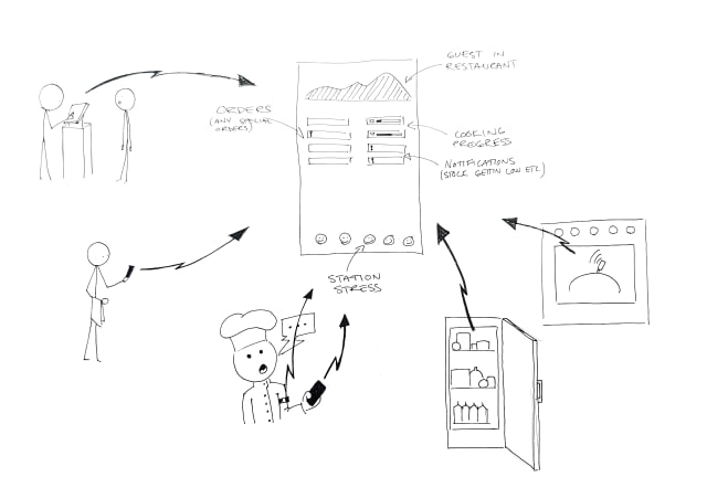
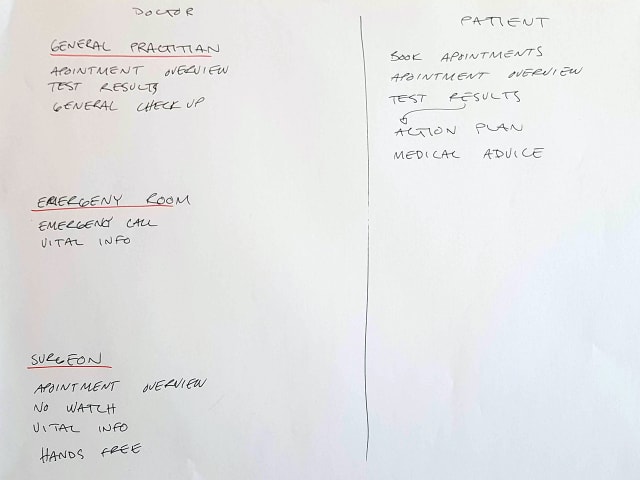
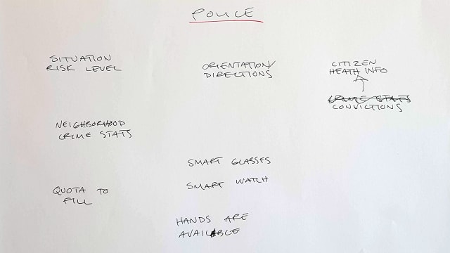
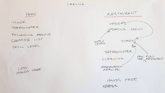
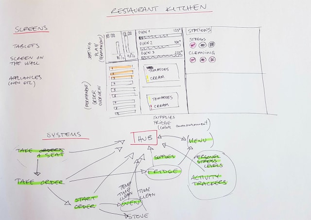
    New week new course. Tangible and Embodied Interactions. I don't really know what that means, at least the embodied part. I think it has to do with a stronger relation to human physics rather than just cognition. We talk about the limitations of the human bodies and senses and will design with that in mind.

    The first week we will design and present a multi screen experience where glanceability is a key factor. Glanceability is the concept where you have a visual expression (maybe other senses too?) that is so abstract and/or simple that the user just has to glance at it for less than five seconds to get it. Doing this fast glance avoids kicking into a cognitive mode where you start to analyze the data. I guess this ties back to Thinking fast and slow that Sofie brought up last year.

    I can see how this could be useful while I run. I use my run tracking watch to get info while I run and I have often felt that the data is too raw. I get very stupid while running hard and trying to calculate the tempo needed to make my goal time can be hard at times. Even things like understanding what number is remaining time and what is my current tempo can be hard during intervals.

    Three texts to read

    We have three texts to read for today and they aren't the hardest reads. Designing and Evaluating Glanceable Peripheral Displays, Matthews, T. (2006, June), is a writeup of a pre study for a thesis. It has some usable insights when defining glanceable displays but is not very deep. It feels a bit odd to quote psychology research from the 50's, there has to been development since then, but I'm not knowledgeable enough to argue too much. It seems a bit odd though to cite a paper and then saying that the estimation is rough. Why not use any of the later research done. I guess it comes down to having cool references.

    Exploring the Design Space of Glanceable Feedback for Physical Activity Trackers, Gouveia, R., Pereira, F., Karapanos, E., Munson, S. A., & Hassenzahl, M. (2016, September), is a longer text. It's a study done through design and seems to be similar to what we are expected to hand in by the end of the course for our longer project. It breaks down glanceable feedback into six qualities to be able to discuss them but I think they are quite political when they do. Is the encouragement of checking your device more really something that we should strive for? I think a lot of people thought smart watches with notifications where going to make us check our devices less but I think this mindset might be a cause for the opposite to be true.

    They also try to get people to compete with other anonymous pre recorded user data. In doing this they find it to be disheartening for users. It's not hard to see that competing against someone that always achieves the goal you set up while you might not can be a downer. If they would have thought about it, they could have realized beforehand that they should compare against other people with the same goal that also failed at times.

    I think some of the shortcomings of the paper stems from that they did their research in part based on what was easily attainable. They seem to have some walking data but not the intent of the people behind the data. This is also true of the analysis, it feels shallow and very data oriented. They try to be a quantitative research paper without very much data. It can also be seen in their citations, when they cite a study of one subject. There are insights in here but it wasn't my favorite paper.

    The last paper Evaluating Peripheral Displays, Matthews, T., Hsieh, G., & Mankoff, J. (2009), builds on the first. This time the Matthews puts her theories to test and does two studies, one lab study and one fields study. The study also takes three other studies to try and find a more all encompassing definition of qualities to evaluate when talking about peripheral displays. They are using both quantitative and qualitative methods but it seems to lack a bit. It does not go very deep in interviews and does not have a lot of data. One of the studies only has two people each in two groups. It's hard to extrapolate the findings like they do when comparing the field study result. They group one from group A with group B, just to be able to say that three out of four say one thing. It seems a bit disingenuous to create ad hoc groups just because the data pool is so small.

    Even though I think the research lacks a bit in quality I think the paper can help us a lot in doing our own research later on in the course.

    In the end all texts give insights into how a design research project can be done. It feels like every text is there to help us in one part of the later larger project. The first is how we will write our intentions in order to get feedback from our supervisor before we do our research. The second text is an example of what we should hand in in the end of the course and the third helps us with our research