Posts about “TEI w:3”

  1. Photo by Ricardo Gomez Angel on Unsplash

    Show and tell it with physics

    Today was show and tell with dataPhys. Some groups showed really nice concepts but a lot of us missed the opportunity to do some real physicalizations. In my opinion, most of us just did visualizations in a 3d space. I know the lines are blurry but we could have used physicality more, and this applies for most groups.

    I think Julia, Therese and Victor did a really nice concept where visuals didn't matter that much. The data was conveyed with weight, and the "data points" where of different shapes so it would be hard to just see which was bigger or smaller. I think this was a brilliant move because it "traps" the data in physical space. An image of this physicalization communicates very little of the data. You really have to interact with and relate to the object to "read" it.

    I wasn't that happy with our concept. It wasn't very strong. I don't mind that we took the provocation very literally, that was our intention and I think it was a bit fun not to make a social commentary but we could have worked a lot more on the physicality of it. It's mostly an object that you observe and very few of the data points could not just have been visualized.

    Other things that came up during this course was how showing data is not neutral just because the data is just numbers. When you edit and filter data you have to think of the social and cultural context you act within.

    Context and history matters

    I also think there was a weird discussion about how the texts were too old to be relevant. I think it is very dangerous to think that visualization design is a solved problem in the last 10 years. We have more or less visualized data as long as we have recorded history and there are a lot to learn from that. Design is not bad just because it does not fit our current trend, it might actually be better att communicating the data. And just because we have better looking AR now than in the 90s it does not mean we have better AR.

    Context and history matters, a lot.

  2. Photo by Isis França on Unsplash

    Finally working

    This week had a rough start, one member was sick and another was working so on monday we decided to just do some ideation and try to get a context to design for. As we where only half the group present we decided not to make any decisions when we thought everyone would be there the day after. The ideation process didn't go very well either.

    The only more concrete idea that came out of the day was a physicalization of the development of fetus. An object that can show the size and weight the fetus at different stages of the pregnancy. I find the idea intriguing as it is something you will never be able to experience in real life, at least not as a positive experience, and it is something where numbers are too abstract to really communicate the reality. The object could also show things that happen in the fetus as it develops, like neural development, but It may also be detrimental to the experience.

    For the tuesday we decided to read the three papers and meet up after lunch to discuss them and then ideate together. Just as we where going to meet up we got messages from the teammates that where absent the day before, that the situation was the same as on monday. We met anyway to discuss the texts and ideate a bit more. During the discussions we agreed on making something less political than people would expect us to do, and hopefully something that could provoke nice feelings and joy. At the end of the day we had narrowed our contexts down to weather in a home setting. Not the most exciting context but that was intended.

    On Wednesday we met before the seminar to work a bit on the project but the absent teammates had not read anything and had not looked at the slides on canvas so we had to dedicate the morning to explaining the concept for the week and what the project brief is. At least we could start talking a little more productively after the seminar and get into the physicalization of weather.

    The Thursday was the first and last real work day. We started by trying to explain our ideas and how we see them being designed. This didn't lead us to any big insights and we decided to test the FSB method to step through the process and not jump ahead as much. This was a lot better for us, we could define what we wanted the artefact to to and then go on to how to do that. It seems like a nobrainer but I never done it in this way, not like this rigid framework.

    In the end we got something together but I think it really shows that we didn't work at full speed this week. It's sad because I think the topic is super interesting and I would have wanted to explore it more.

  3. Photo by Jeremy Lishner on Unsplash

    Tangible bits and other pieces

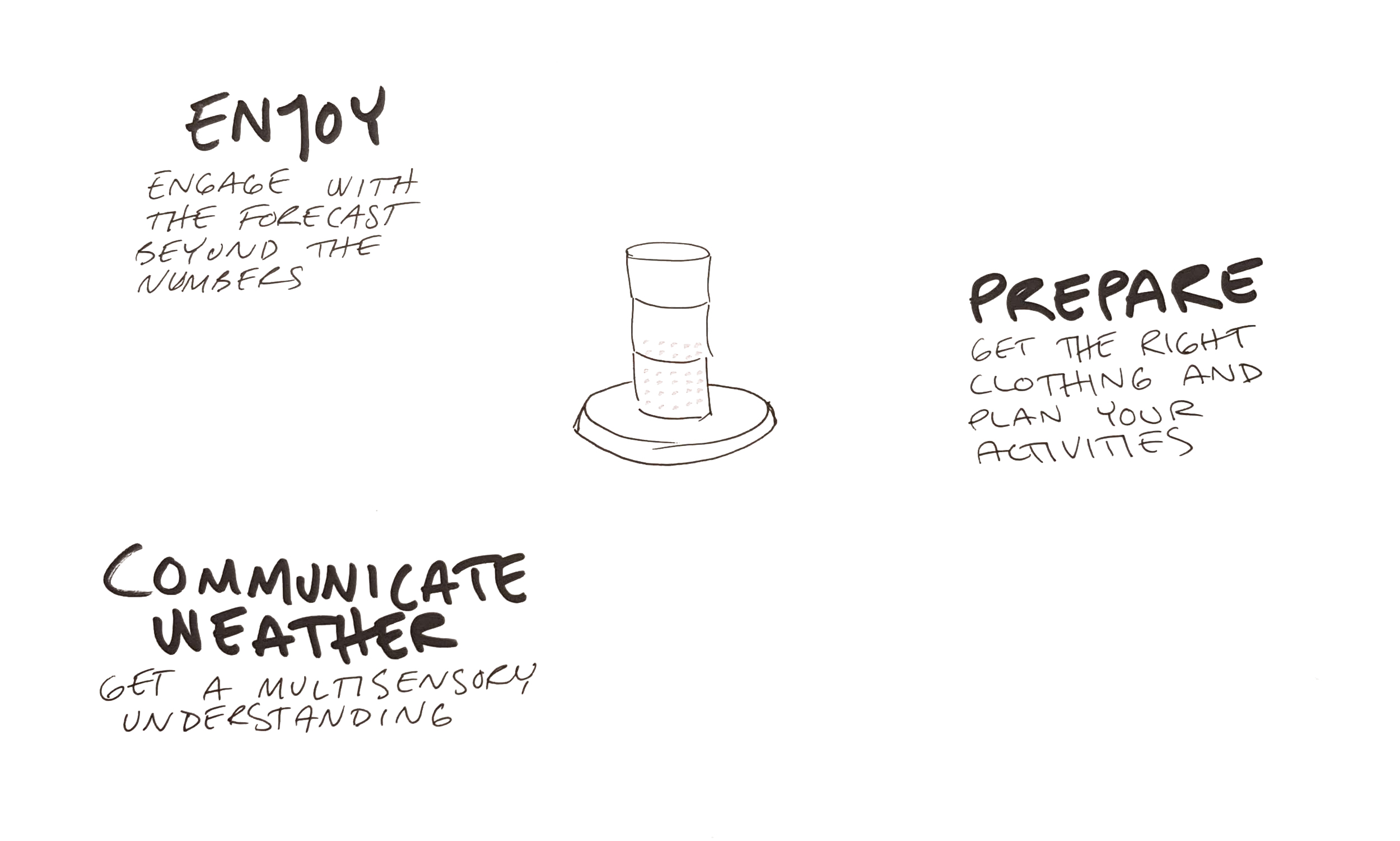
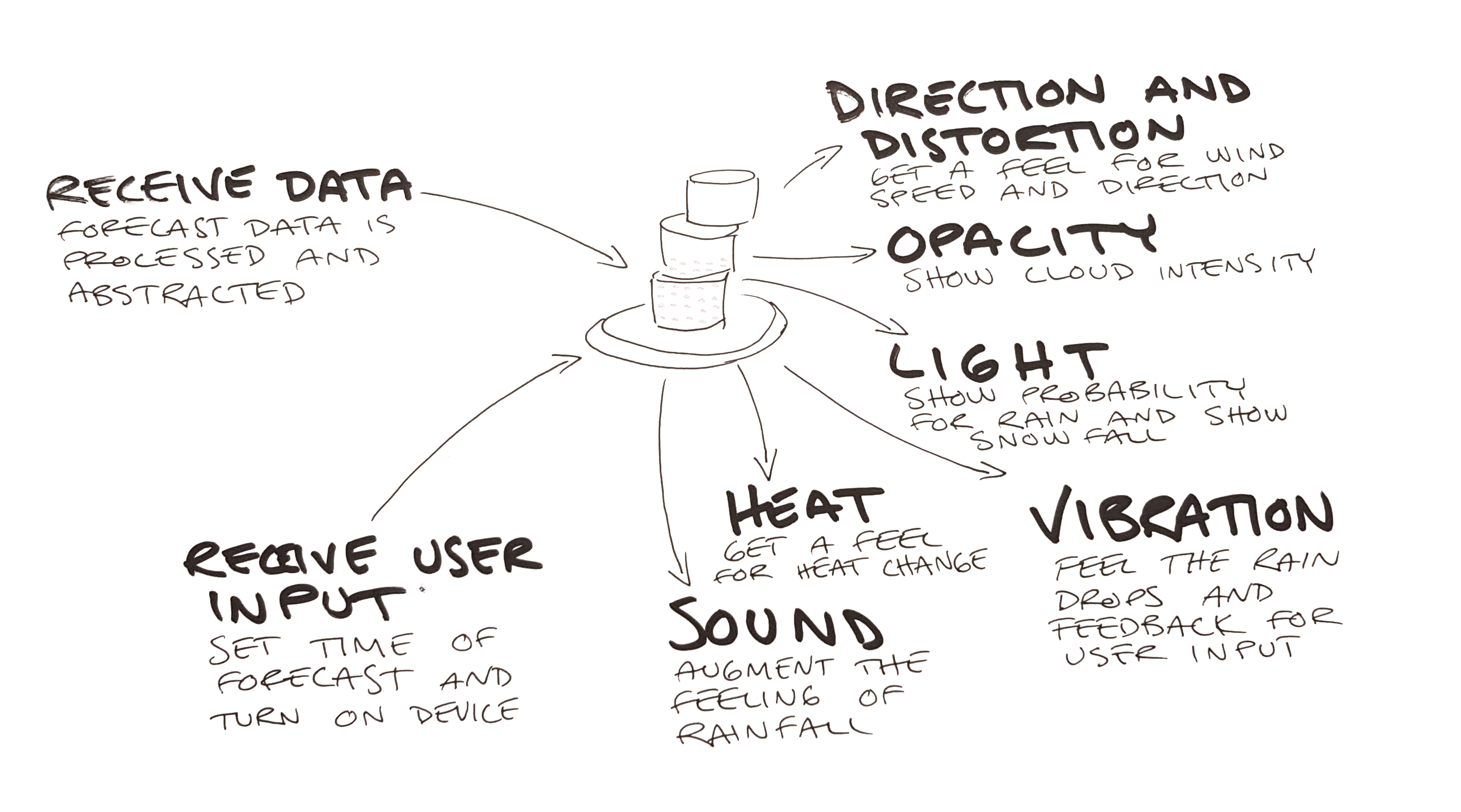
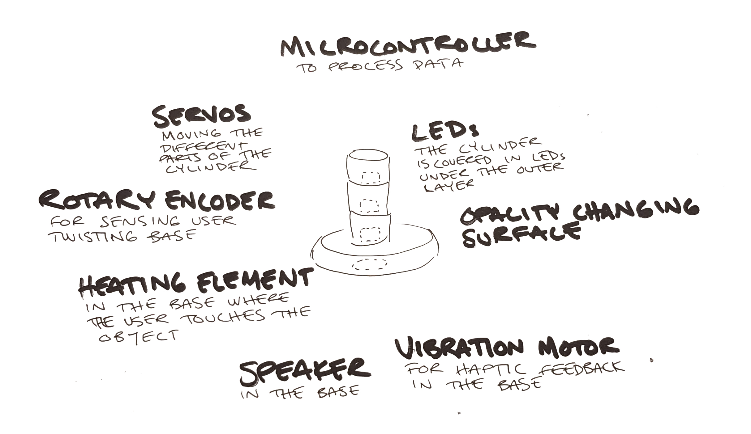
    Tangible Bits: Towards Seamless Interfaces between People, Bits and Atoms

    Hiroshi Ishii and Brygg Ullmer 1997

    Although this text is very old it is a fun read. You can see how academia was miles ahead of commercial companies and developing techniques that would take a decade to start to trickle out into the world. The Microsoft PixelSense (Surface when launched) was very similar to the metaDESK and a very interesting product. It sadly went nowhere, maybe because the price tag of $10000.

    My understanding is that this is seminal work that informed much of the work in tangible interaction later on. Most of the examples are interesting but some feel a bit too quirky or gimmicky, like the LiveWire.

    As a text it's more of an overview of work that has been done and there are not that many insights or maybe I take them for granted 20 years later. There are cognitive benefits to physical objects (atoms) and coupling this with a digital data (bits) create a new way of controlling a digital system and suddenly we can touch the digital world (or cyberspace as they call it) and it becomes tangible. The hope is to have the benefits of both worlds.

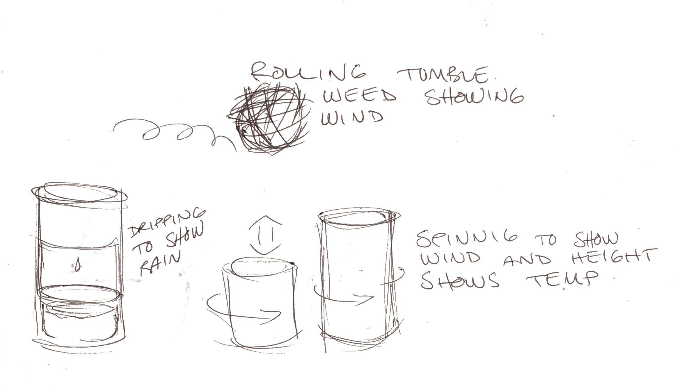
    I love the example of the Marble Answering Machine. Maybe we don't use answering machines anymore but saving data (but more like a pointer) as a physical object gives us a relation to the data. We can keep it in a box to save for later and remember what they are by their characteristics like color and material. We can even customize them by writing on them or scratching our initials into them.

    This text really inspires me. This is the reason i signed up for this programme, I was tired of being stuck in the digital world, I wnt to mix the worlds.

    Opportunities and Challenges for Data Physicalization

    Yvonne Jansen et al. 2015

    The concept of physicalizations is an interesting one, like supersized visualizations, but the text fails to show any appealing examples in the paper. Most examples are in my opinion just visualizations with other media. They may have some extra benefits but it's such a subtle difference that I don't think we can in all examples even talk about physicalization.

    In the Hans Rosling example I argue that the fact that it is on a stage where the audience can't interact with the objects makes it a visualization. If this was to be considered a real physicalization, I argue that any movie or animation depicting physical objects also would count as one. I think that to be considered a physicalization there should for the audience be a diminishing of experience when the physicalization is recorded on video. In this example there is no active perception, non visual communication or other benefit.

    I get that the lines can be a bit blurry, but if you want to argue for why this is important and why we need a new field of research, you have to make examples that are good and make your case strong.

    The other parts of the text are more about how visualizations could benefit from being tangible. It borrows a lot from TUI but that is to be expected as the relationship between physicalization and TUI is similar to the relationship between visualizations and GUI.

    The authors also get into the challenges of physicalizations and this seems to be similar to that of visualizations where animation and interaction can make data easier to grasp but can also make the representation harder to read.

    Visualization Criticism

    Robert Kosara 2007

    THis paper felt like the least solid one of the bunch. It takes a very strange stance when it says there are two kinds of visualizations, pragmatic and artistic, that are impossible to reconcile. It is like the author thinks that charts and graphs have no inherent meaning, as if any language, visual or other, can be communicated in a totally neutral voice without meaning. I think he comes from a place where numbers are more correct than other information, and this is probably true for most of us, but if we think harder and deeper we can also argue that the numbers are just abstract representations of the world. Statistics are a nice way of working with a complex world but they are not the world. Quantitative measures can often be less accurate than qualitative but they are so much easier to work with.

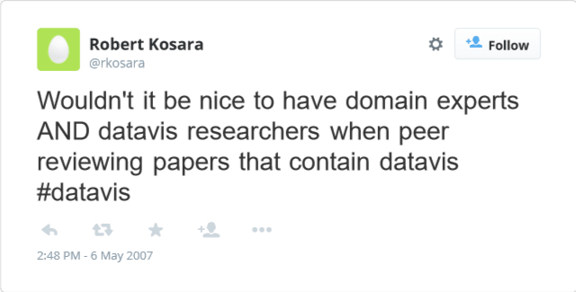
    I think Kosara comes from a good place when he wants critique, and that some of his ideas are good, like having different experts weigh in on and review papers. It's just in the connection to the art world and how it should be implemented that he stumbles. I think he misunderstands what an art critic is, it is not an artist little helper that comes to the studio to discuss his latest work of art. A critic writes and theorizes about art, not for the individual artists sake, to contextualize, analyze and explain the art to others.

    Another mistake in my opinion is to think that critics not being artists is a bad thing. Why is it bad to have someone that is an expert of art theory theorizing. In a way it is the same as he proposes, he wants visualization researchers to peer review his work, he does not want just engineers to review engineers. It's the same concept, take an expert of the theory of visualization to review visualizations.

    The method of critiquing also baffles me. Are the rules for real? This is nothing like art critique, this is mentoring or tutoring. The author wants clear rules for good design and someone who can tell him how to do it. What he wants could probably be delivered as a book or course. It is similar to Twitter's Bootstrap for the web. It could make a lot of visualizations better but it does not make those visualizations good.

    When writing a paper in the vein of "how this can learn from that" it is a good idea to have knowledge about the "that" otherwise you are just setting yourself up for failure. Most of the critique I have is about the author's notion of the art world, but when the whole premise is to bring a concept from the art world into visualization that becomes pretty important. The paper would have had more weight if he just dropped the parts he didn't grasp and focused on what he wanted. It might even fit in a tweet:

    Fake tweet that sums up the paper

    Rant over.

  4. Diagram by Florence Nightingale

    Provocative information

    This week started with a lecture on visualization and physicalization of data and how that can be used and has been used to make information easier to grasp.

    Almost ten years ago I fell in love with a visualization of the 2008 credit crisis. I still think it is pretty good but it today the visuals feel a bit dated. The nice thing about it is that it explains a very complex problem in a simpler graspable way.

    A visualization of the 2008 credit crisis

    I made some infographics over the years but I never made anything very interesting or good. I can make nice illustrations but when it comes to animation i fall short. My biggest deficit was probably the lack of understanding for the concept I tried to visualize. I never got enough time from the clients to make a really informed infographic and I think that is probably the most important part of it. You really hae to research and get into the finer details of a concept to understand what is really important and worth bringing in to the visualization.

    Physicalization seems to bring a new set of problems. Not just what parts of the information do you want to give form. You also have to decide how it should be experienced, as the physical form gives it opportunities and challenges that are not present in graphics. Should the weight of the object reflect something? Should the audience pick it up? Is it an experience or an object? There are so many possibilities.

    Having the real world presence can also give sculptural qualities and it makes me think of art and installations but with a message. I guess this could be just as the relationship between art and visual communication. Calling physicalisation of data art is probably an insult just as a nice book cover can be beautiful, but it's not art. Even so my thought go there, and even more when talking about dynamic physicalisations. I start to think of fluxus and how some artists painted with acid on plastic that melted away.