Deconstructing Malmö by Bike
In this project I chose to work with the app Malmö by Bike. It's a bike rental service with around 500 bikes distributed at about 50 spots in central Malmö. I use it quite a bit, when my bike is broken or I just need a bike one way. I first found the service under a different name in New York.

The app functionality include: a way to find available bikes or return spots, either on a map or in a list; a trip recorder and a view to see past trips; support ticket submission; app tutorial.
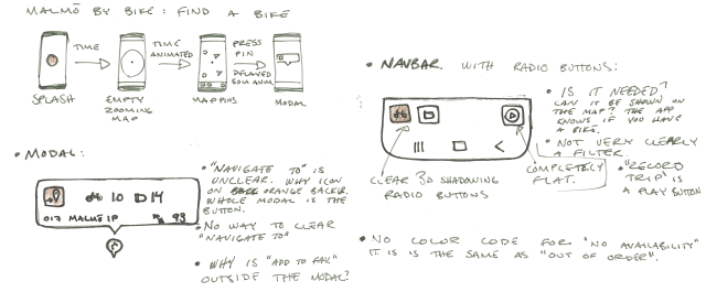
I had a hard time narrowing down what was a good project for this assignment and kept moving away from what we are supposed to do. The app is lacking in some regards and in the beginning I was focusing too much on these bad design choices, but after talking to Clint a bit I have found a user path that I want to focus on.
This assignment focuses on finding common UI design patterns in existing apps and communicating the findings and I have chosen to focus on the user goal of finding a bike at Dalaplan and to use it to go to Niagara at Malmö University.
I have broken down the existing app into the following patterns:

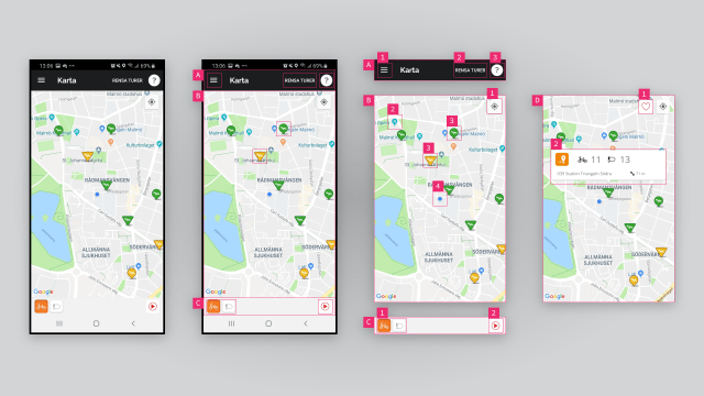
A: Top Bar
A top bar serves to collect important navigation and page info so the user can easily navigate through the app. This top bar contains several other patterns.
- Hamburger Menu: This is a way of hinting that there is navigation to be accessed by pressing the button. The hamburger menu has been criticized for its accessability but is very well used today.
- Text Button: This is a very discrete button that does not show its affordance very well, a problem some buttons in Google's Material Design paradigm suffer from. On top of this it's a reset button for a function (trip recorder) that I would guess very few use. It takes up precious screen real-estate and is should probably move.
- Icon Button: This button shows help documentation for this screen. It might be a bit too much to have it here and could probably be hidden in the hamburger menu.
B: Scrollable Map
The main view of the app is a scrollable and zoomable map where you can navigate to find bikes and stations. Overlaid on the map are some more elements to help the navigation.
- Icon Button: This button center the map on your position. It's probably something that is included in the Google Maps element and thus carries the style from there.
- Map Pins: These map pins are included with the map to show points of interest but probably just confuse in this context.
- Map Pins, Stations: These pins are custom and are buttons that open a modal for the station. They have a different styling to show that they are special but don't feel coherent with the rest of the app as the shadow is totally different and they have a border stroke. Some are triangles and some are more like pins, this indicates different station types but no user would guess that triangles are stations where you can pay. That has to be found out in the documentation. The color of the pin indicate available bikes or return spots based on selected filter in the bottom bar.
- Map marker: THis marker is your position in the world.
C: Bottom Bar
The bottom bar is like the top bar, a place to cluster buttons and info that are a bit out of the scope of the main view, like the filter in this view. It is also a place where tabs that shift the view often reside in apps.
- Toggle Buttons: Sometimes called radio button, this button group can only have one active (pressed) button at a time. Pressing another button toggles all other buttons into inactive mode. This is useful when only one option is applicable like here in this filter selector. The style for these is again a new one.
- Icon Button: This button just has a play icon in a circle and I would guess very few users would know that it starts a recording of your trip. I have no idea why anyone would like this feature, if I was to record my commuting I would do it in an app that gives me a bit more, something like a training tracking app.
D: Selected Station
This is the scrollable map whe a station is pressed.
- Icon Toggle Button: This button appears when you tap a station pin. You can toggle it to save the station to your favorites list. The style is similar but not exactly the same as the center position button but why is it outside the station card? Gestalt theory would suggest this is bad as not clustering all station info together makes it hard for the user to understand the context.
- Card: A card envelops most of the data for the station and puts it on top of everything else. This is a clustering method to show that this data belongs together. In this app it is pretty obvious but other apps could have long lists with data that can be segmented and better understood with cards.