Posts about “Journal”

  1. Valentin Salja on Unsplash

    Getting Closer Faster

    What does digital prototyping practices have to contribute to speculative design approaches?

    Introduction

    According to the definition used by Malpass (2016), speculative design is a genre within critical design that focuses on socio-scientific and socio-technical concerns. It is used either as a tool to look at what effects emerging technologies could have on everyday life or to reimagine how current technology might be used. Speculative design approaches can be used to create a basis for discussion around the political implications of technological advancements. As with all critical design, it’s purpose is to engage with an audience to create discussion and not to serve as functional commercial design.

    Prototyping is the practice of quickly developing prototypes, getting data from testing it on users, using the insights to develop a new prototype and then repeat the process. In a double diamond approach to design we can use this process to explore different possible solutions in the divergent developing phase or to refine our design in the convergent delivery phase. It’s an iterative process where you want to explore your design space little by little to be able to draw conclusions from the latest iteration.

    Digital prototyping practice is designing with the same approach but you use digital tools and delivery methods. With digital prototyping you can get what looks like very polished designs in a short time. You can develop websites or interactive mockups in a fraction of the time it takes to make a convincing physical prototype. As digital artifacts are by their nature immaterial and infinitely copieble they are easily disseminate through digital networks like the Internet, digital cinemas or email. With this approach designers can more quickly iterate and test the concept to see that we are hitting the right marks.

    What do digital prototyping practices have to contribute to speculative design approaches? How can we use our prototyping practice, especially our digital prototyping practice, to create better and or faster speculative design? In this essay I will argue for how digital prototyping could help projects like the Gaver and Martin (2000) Alternatives workbook of alternative design concepts by engaging more with their intended users and to reach a larger audience. I will use the work we did with iSweat, a digital speculative prototype, in the course as a base for this argument.

    iSweat

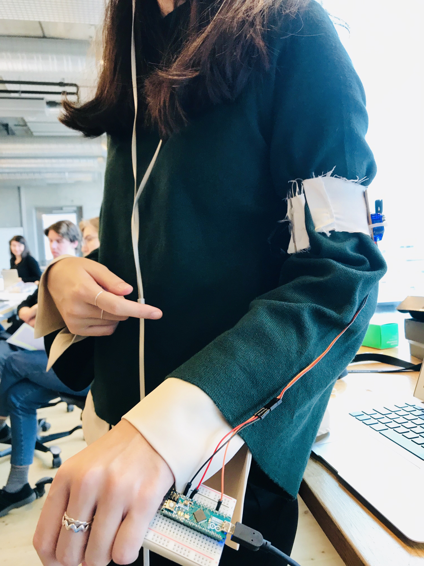
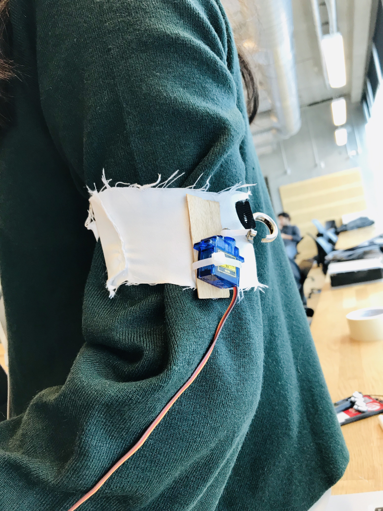
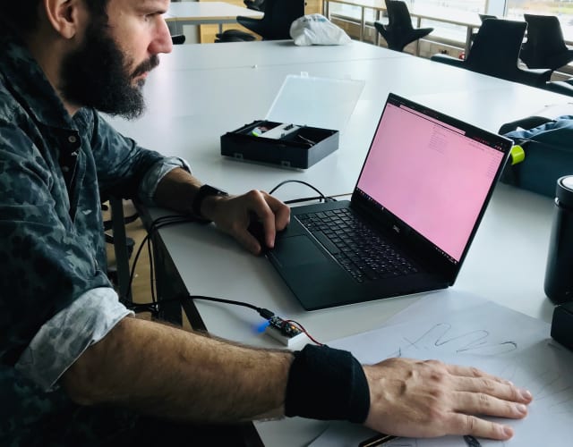
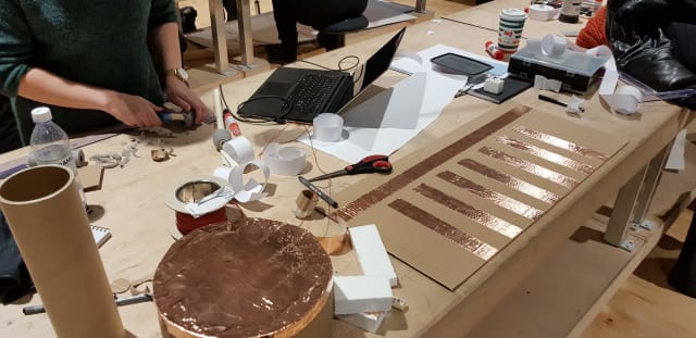
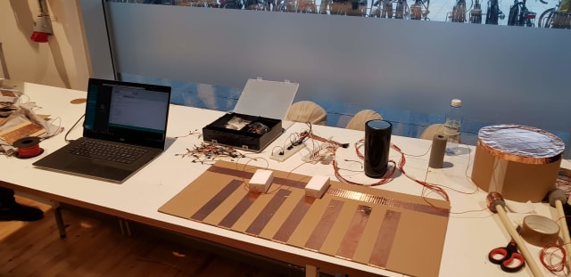
    As part of the Interaction Design programme at MAU we were tasked with creating a digital prototype highlighting one of the United Nations’ (2021) Sustainable Development Goals, through a speculative design approach. We were to communicate the problem in a novel way where users were to experience the prototype and not just read about the sustainability goal. We had four weeks working half time on the project.

    The speed of digital prototyping made an iterative design process possible, where we could go through different versions of the service every week and keep what we liked and develop the concept into something sharper. The digital nature of the prototypes made it possible to user test quickly and often with a minimal setup as it was all online. These qualities would make it possible for us to develop the project week by week and

    A screen on a webstore showing sale of gig work
    Figure 1. Screenshot from the worker selection screen in the iSweat web shop.

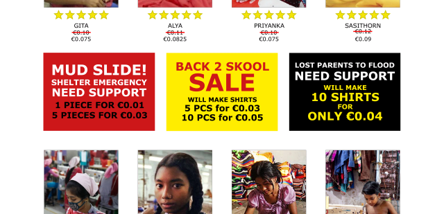
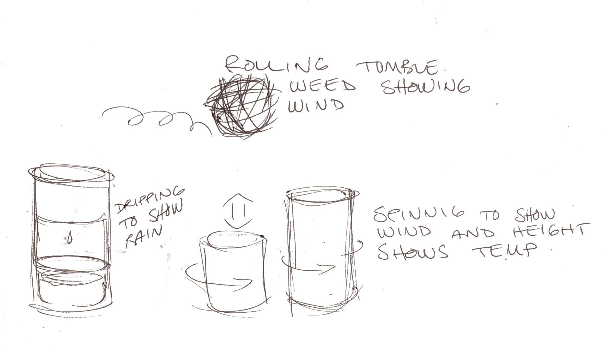
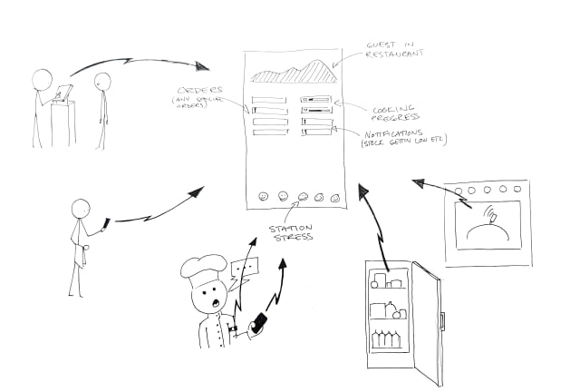
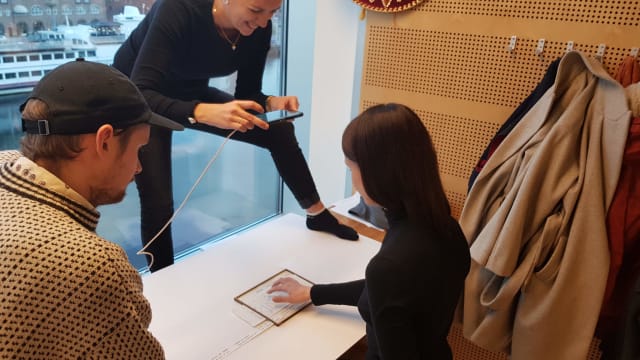
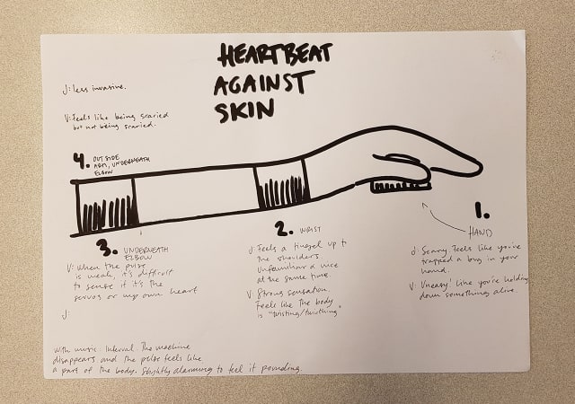
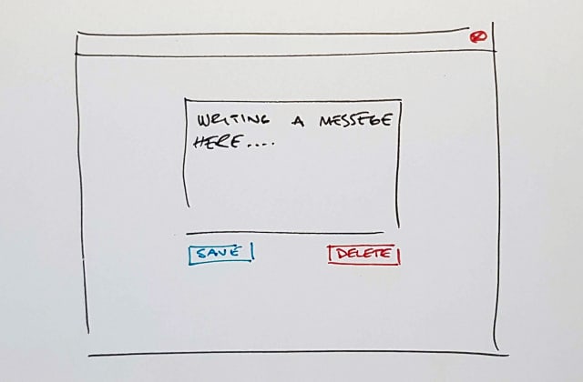
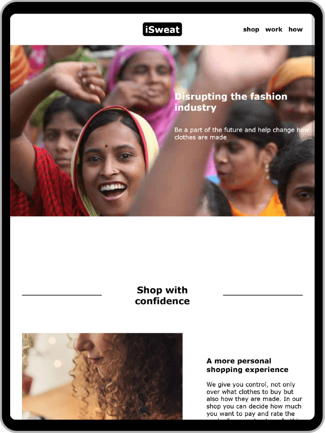
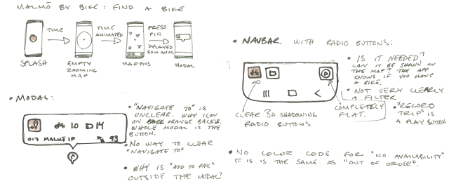
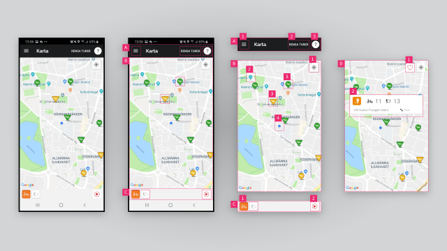
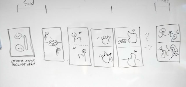
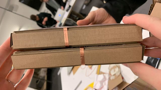
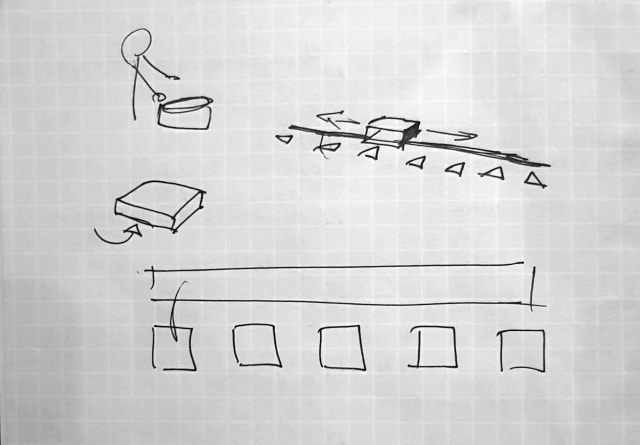
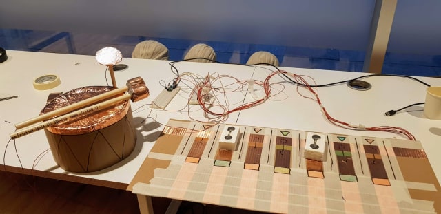
    Our group designed a service where we merged a fast fashion clothing store with the trend of “gig economy” contract workers to highlight the trouble of workers rights and sustainability in production. The service was presented as a digital prototype of a web shop, an app for gig workers and a website presenting the company. The webshop would ask consumers to not only choose a garment but also what worker should sew the garments (Fig. 1). This introduced a pricing comparison and competition and consumers would have to choose based on just an image, rating,name and price. We also introduced sales on some workers, highlighting their exposure to global warming.

    The Alternatives Workbook

    Gaver and Martin developed the Alternatives workbook in 2000 as an inspiration and base for discussion about Information Appliances presented to their partners at the Appliance Design Studio. They made conceptual design proposals for ten devices that would highlight other values than productivity, efficiency or entertainment.

    The proposed products span a wide variety of usage fields and go from speculative to critical design. They are presented as the work of two people over the period of a couple of months and give the impression of being fast ideas that inspired new ideas and you can see how there was a flow of themes being explored.

    As a workbook they are presented in their final form with seemingly little involvement from any other people and with little iteration.

    Digital speculative design

    How speculative design could benefit from digital prototyping

    Speculative design is about engaging with an audience to create debate. Using digital prototyping techniques could benefit speculative design and make it easier to approach the audience where they are instead of bringing them in as with a more traditional exhibition based approach.

    Digital prototyping facilitates testing the design on users, wether it is on an audience or the designer exploring the design space, making it more affordable and quicker as you can distribute the design digitally and update the design between sessions in a way you could only do with very lo-fi physical prototypes. Engaging in this way with the audience during the development of the speculative scenario can benefit speculative design as it gives the opportunity to gauge how successfully you communicate your message.

    When presenting a message or a novel idea like a critical design project, it can be beneficial to communicate in a more affective way through real or rhetorical use, letting the audience use the design, as an app or website, or showing it in use through video or similar digital media. Presenting the speculative design project as a digital product gives an opportunity to approach your audience like users of an experience rather than a passive readers or viewers of an exhibition. Letting the users experience a speculative design project enables you to give the audience a more visceral reaction to the scenario and can lead to a deeper understanding of the concept.

    In our project it was evident to us that the act of selecting children to sew your clothes gave a viceral reaction in the users and we could use that insight to focus our message. This reaction was not evident when discussing the concept and needed to be experienced. Without a digital prototype we could not as easily have tested it on users as many users and in different locations. Gaver and Martin could have used a similar approach to dial in the message they wanted to deliver to their partners. Their approach is a more designer centric approach than ours and when working with abstract and potentially provoking subjects, it could benefit them to test it on the audience during development. It would not have been impossible for them to do so with their approach either, but as they worked part time for a limited period of time, it would have been a bigger burden to print and send via post or to gather users in their studio. A digital approach would also let them reach a larger audience than the one they intended with their book as distribution would be close to free.

    What are the pitfalls of digital prototyping within speculative design?

    When engaging with users you always run the risk of exposing them to unethical practices. Many speculative projects are best to be viewed under the guise that they are real in order to be impactful and some designs might be hard to experience in an ethical way, great care has to be taken to not expose the audience to harm. If you distribute the design digitally to contexts where you have less control over how the design is experienced the problem is more pronounced. Several critical design projects have become viral, like Facezam (Bonazzo, 2017), and show the potential for harm when the audience is unaware of the critical aspects of the design.

    Even though digital prototyping can accelerate the prototyping process it has some limitations. All digital prototypes have an overhead and are never as quick as paper prototypes to get started. Tools have to be setup and you need some degree of technical knowledge, especially for more advanced prototypes. It is not to be used as a first step in the prototyping process as many insight can be gained with a faster lo-fi physical prototyping approach.

    Conclusion

    Digital prototyping practice can contribute to speculative design but does also pose risks that designers have to be aware of. In our work with iSweat we used that practice to good effect and the project would not have come nearly as far without it.

    As we experienced in our work, speculative design can benefit from digital design practice of easy and quick iteration to sharpen the message it communicates. The iterative process led us down paths we never could have foreseen and sped up the workflow significantly as testing could be done at the same time as parts of the group worked on the design. The interactive elements that our digital prototype had afforded the audience, as users, get to feel what the proposed design entails and let us user test and gain insights into what we wanted to iterate on. It will also give the users a more empathetic understanding of the proposed design as they can see themselves in the situation more easily. In our example we could clearly see that our audience had a greater reaction to our final iteration than to earlier versions.

    Letting an audience experience the speculative design also poses problem different than those of the workbook. Ethical concerns, over what you subject your audience to, could be raised. You have to be receptive to how your message is received and to be aware of your privileged position when you present your design. These concerns are always present when exhibiting speculative design but are especially pronounced as digital projects can have a far wider reach and the context could easily be lost when a project gets shared on the Internet.

    References

    Gaver, B. and Martin, H., 2000, April. Alternatives: exploring information appliances through conceptual design proposals. In Proceedings of the SIGCHI conference on Human factors in computing systems (pp. 209-216). http://dx.doi.org/10.1145/332040.332433

    Malpass, M. (2016). Critical Design Practice: Theoretical Perspectives and Methods of Engagement. Design Journal, 19(3), 473–489. http://dx.doi.org/10.1080/14606925.2016.1161943

    United Nations. (2021, December 3). The17 goals. Sustainable Development. https://sdgs.un.org/goals

    Bonazzo, J. (2017, March 16). The Man Behind the Facezam Hoax on How His Fake Facial Recognition App Went Viral. Observer.https://observer.com/2017/03/the-man-behind-the-facezam-hoax-on-how-his-fake-facial-recognition-app-went-viral/

  2. Photo by Henry & Co.

    Designing with texture

    Introduction

    Interaction designers are increasingly tasked with crafting nuanced digital feedback to inform and delight the user. However, there is a lack of frameworks for designing continuous feedback that could help. Heyer (2018) proposes a set of lenses for analyzing interactive objects in terms of how they afford manipulation in different contexts and why this manipulation is integral for skillful coping. The part of Heyer's reasoning that I will focus on in this essay is feedback and feedforward as texture. According to Heyer, texture is always there, it is part of the material, it is invisible but always available: the noise of a car engine, the weight of a coffee thermos, the sound and vibrations when a bike's tyres roll on the road. These textures reveal something about the artifact’s state and are a natural part of any mechanical machine or tool. Digital artefacts, on the other hand, do not have intrinsic textural feedback and designers need to design the feedback in order to facilitate coping. The current paradigm in interaction design is not concerned with vague textural qualities: it is more interested in the precise nature of numbers and meters.

    In the Interactivity course me and my peer were tasked with designing for coping with servos. We worked with a beat, or rhythm, as feedback. While we did not arrive at a concrete application of the interaction designed, I believe the reflections provoked by this exploration highlight aspects of Heyer’s theory that I might have otherwise overlooked. Based on them, I will discuss the potential for nuanced textural feedback, how it can benefit skillful coping, and what issues might arise when designing with textures.

    Textural feedback

    Textural feedback is when an artefact informs us of its state with intrinsic features. Feedback, like the resistance when driving in a screw, the roar of the engine in a car, or the sound of the plank when the saw is cutting through wood. When you drive, you know when to shift gear without looking at the tachometer. When tightening a screw, if you are skilled enough, you know when it is tight: you do not risk over tightening. You can hear when you are nearing the end of the plank and can adjust the force and speed to get a clean cut. Physical artefacts have this feedback and feedforward mechanism built in and we as users use them to cope with the tasks at hand. Digital artefacts typically have a more binary type of feedback. Notifications and status LEDs have their role, but in the flow that is coping, they interrupt the user and enforce an unnatural cognitive evaluation of the situation. Textures in digital artifacts could keep users in their flow of actions and let them cope without thinking. However, to build texture designers have to explore all the ways they can unobtrusively give users ongoing feedback. Some examples of this are shape changing objects, color changing surfaces, vibrations, sound, or any other continuous signals. There is not a lot done in this field and it is open for design exploration.

    Interactive artefacts, as we design them, are digital in nature as that is our material. As digital artefacts they are designed from the ground up and seldomly have a lot of feedback that is inherent to their construction, at least not on purpose. We have to design the functions as well as the feedback, feedforward and affordances. When doing so we tend to like to design clear and unambiguous so that the artefact is easy to learn and use. This line of thinking goes against much of older design of machines, where the capabilities were more important than ease of use, and having to learn the trade was a given.

    Textural feedback can also give us glanceable information that could help us cope. A hard drive that inflates to show you how full it is would let you know without having to continuously check when we have to delete files to free up space. That kind of information would make coping easier as well as introduce social manipulability into the artefact. It would signal an ability to keep your workspace clean or to show off how much work you have done.

    Skillful coping

    Heyer (2018) builds upon earlier work on skillful coping and argues that nuance in feedback is the key to skillful coping and the development of expertise. An artefact can have different affordances to different people depending on their skill level and previous experiences. Michael Polanyi's (2009) notion of tacit knowledge also lends credibility to this theory. Polanyi proposes that we have tacit skills and knowledge difficult to express and relate. These skills can be, for example, craft-related. Here the practitioners simply know the right amount of force they need to apply to cut into their material. Polanyi suggests they could never express this knowledge or explain it without using the tool at hand.This rich feedback is unusual in digital artefacts but we can see it in some specialist tools, such as, for instance, Wacom drawing tablets. Here the pressure of the pen against the tablet lets a skilled artist draw with fluid line widths and emphasize with the force of her stroke. More advanced pens also take distance and angle into account. Wacom's tablets are a great example of where rich feedback affords skilled coping for the experienced artist but they also show that a novice user will not have as many affordances as an expert before they learn how to control the pressure of the pen, this is something to keep in mind when designing the software to be used with the pen.

    What opportunities lie in textural feedback

    Nowadays feedback is often expressed in absolute numbers, such as blinking light or text. It is good to know the percentage of battery left, but what decisions can a user make if they do not know how fast the battery is draining? They have to hover the power icon on their smartphone every time they want to know more. As designers, we could embrace this and design for less concrete feedback. We could create more nuance, richness and texture.

    What is missing is the sensed, felt, or tacit knowledge. When you pick up a spray can, you feel how full or empty it is: you do not have to check a status meter to see that it is almost empty. We can design for this in digital artefacts too. However, it requires us to think differently.

    One of the prototypes me and my peer created was a servo that one strapped onto their wrist, giving them a "heart beat" feedback that we could adjust in several dimensions. When trying out different rhythms and beats the user could get an unobtrusive yet quite rich feedback. They would experience a richness in the different rhythm, strength and speed that would make their "heart beat". There was a weird eerie feeling when experiencing the "heart beat" of the prototype ourselves. It somehow felt like our own heart beat. The sensation was similar to high intensity training, as the heart beat cooled down at times.

    An industry that could easily incorporate more textural and rich feedback is the gaming industry. Game consoles often already use haptic feedback but it is limited to occasional short bursts similar to notification vibration on smartphones, using textured feedback could give more nuance and depth. Players are used to having to learn games and their user interfaces, as they often differ quite a lot. This makes them more appreciative of novel forms of feedback. Competitive online games also have a high level of skill development that would facilitate textural feedback. With the advanced haptic feedback of the current generation of consoles, the heart beat we designed could easily be used in a game pad to communicate character health or similar status. It would just disappear in the background but always be noticeable, especially when it changes or reaches higher intensities.

    Limitations of textural feedback

    When designing texture, designers explicitly design for a learning curve. This makes the divide between a novice user and an expert even wider. Making digital artefacts approachable yet enabling rapid skill development at the same time is a big challenge. I believe this might be done, for example, with multiple layers of feedback like in the car, where the tachometer shows the engine revolution at the same time as you feel and hear it. However, it remains a challenge to tackle.

    We also have to take into account what this feedback does to the user. The "heat beat" felt very real and had a hard coupling to the real world feature it was mimicking. It would be hard to use it for something that is not associated with pulse without changing it significantly. Holding your hand on top of a device that moves with a "heart beat" was very discomforting, it felt like smothering a small living thing. I struggle to see where that could be used outside of very niche experiences. Textural feedback is specific to the experience designed for, it can not always be replicated or abstracted through patterns or rules.

    Conclusion

    Textural nuanced feedback could be instrumental in developing new artefacts that allow for skillful coping. It could help create products that are easier and more pleasurable to use in the long run. Despite its potential textural nuanced feedback remains largely unexplored in interaction design. As I have discussed in this essay, there is great potential in the concept. However, considering the steep learning curve and the specificity of feedback patterns, it might be hard to find opportunities for implementation. If we design with this in mind, as more devices implement textural nuanced feedback we might be able to shape new user interface patterns that will become recognizable and familiar.
    In this essay, I have focused only on physical feedback. Nevertheless, I see great potential in using textural feedback in purely digital artefacts, such as mobile and web applications. Here it might be designed as a background function, running continuously throughout the user’s interaction with the application, or similar. This is a subject I want to explore more as a web developer.

    References

    Heyer, C. (2018). Designing for Coping. Interacting with Computers, 30(6), 492-506. https://doi.org/10.1093/iwc/iwy025

    Polanyi, M., & Sen, A. (2009). The tacit dimension. University of Chicago press.

  3. Photo by Kelly Sikkema on Unsplash

    Service Design intro and readings

    We start a new course, Service Design where we will work with Malmö libraries as a stakeholder to design for libraries during societal crisis. Good timing.

    What is service design, and in particular in regards to libraries? It seems to be a bit of corporate buzzword bingo with a core of common sense that might not have been applied in most design projects. It feels like a response to the reductionist thinking where everything should be components and silos to be more resilient.

    I can see similarities to web design where components are all the rage these days and a response to projects becoming more complex. It makes the overview of the project better as you know things won't affect other parts of the project. I think it also makes a holistic approach harder, not nesecarily hard but, when developers are only concerned with their own parts they can lose a sense for the whole. I think this is part of the frustration developers have with CSS, it is global and that can be hard. The problem I see is that this is reality, a component is nothing without the whole.

    A problem I see in service design is that it seems to have different names and meanings to everyone. Everyone seems to have a set of rules that are all the right way to do it and there is a big dose of corporate self help gurus and buzzwords.

    What is the role of libraries?

  4. Instrumental knowledge

    Sansa: A Modified Sansula for Extended Compositional Techniques Using Machine Learning

    McLean J. Macionis and Ajay Kapur 2018

    This feels like a school project, a good school project, but not one with very high academic standards or contributions. It feels like something that might be the result of our final project in TEI.

    I think it is a bt thin in motivating why they did it. There are many instruments that are easy to pick up and understand and a lot of them could probably house electronics. Why choose the sansula?

    Most of the features are just the result of electrifying an instrument, not particularly their implementation. The parts that are more unique feel a bit bolted on, would making gestures with the whole instrument have any positive effect for the musician. On top of that, those examples don't really use the instrument as such at all. So why not just use a sensor in any ol object then?

    Kontrol: Hand Gesture Recognition for Music and Dance Interaction

    Kameron Christopher et al 2013

    Kontrol seem to be in the same vein as Sansa in terms of the type of text. It seems a bit less cohesive as some of the examples of the Kontrol seem to be totally different devices.

    I think the saxophone example shows a lack of understanding of the instrument and context. When talking about the Guqin they go into great lengths to describe how the tone is generated and what makes it special but with the saxophone they seem to think that the important part is the hands. Thinking you can respond to the music by just knowing hand movement. That would be like just knowing what string was played on a guitar or the guqin.

    Furthermore I don't think most saxophonists that use filters would use them with a laptop, I think they would have pedals.

    Trying to cram some buzzwords into the text in the end does not do it any favors. What do they mean by "incorporation of nanotechnology"?

    Sensori-Motor Learning with Movement Sonification: Perspectives from Recent Interdisciplinary Studies

    Frédéric Bevilacqua et al 2016

    This text was better. It goes through some earlier research into the use of sonification in different fields.

    At times it feels like it rushes through what they did but there are some nice insights in it. The parts about what sounds are expected and how that can be used to increase the effect of the sound is interesting.

    Most of the research seem to be inconclusive and they want further research to explore the same issues. Some of the experiments seem to be replications of older experiments and have the same results. It's hard to see the contribution of the paper other than saying that this is a field that could be studied further. I think they are right in that though. This field seems interesting and it should be studied more.

  5. Photo by Franck V. on Unsplash

    Computer, make music

    This week we explore computer assisted music with the help of machine learning in Wekinator and some Processing.

    Before the demo today I ws pretty sure I was going to do this project in Node and the browser and use TensorFlow PoseNet there, but after seeing how easy it was to get going with Wekinator and Processing I'm not so sure anymore. I think we will just doi it with the tools Daniel demoed today and I can create some kind of web server that connects to Wekinator in my spare time.

    A web server bridge could still be useful as it could be used for some distributed systems like art installations that the audience can interact with. I think this is a good project for the future.

    Today also showed how much progress my class has made since last year with programming. It also showed in the last course but I ws impressed to see how people just started editing the Processing examples even though we have barely worked in Processing before. It really shows how experience builds confidence and how understanding of one language translates to other languages.

    Assignment: ML Music

    Brief: Design an instrument that uses a computer to generate sound

    Materials: Wekinator and Processing or other stuff

    Team: Cathrine, Denisa, Simon and me

    We started by looking through some examples and started poking in the MIDI output example but we moved on after a while as our understanding of MIDI is limited and we don't see the great payback in figuring out all of that in a week to get Logic Pro to work with it. We think we can make more with just Processing and playing samples.

    Simon made a nice example where he extended the drum machine example. He imported some nicer samples and and this will probably be a basis when continue work with Motion Leap tomorrow.

  6. Photo by Ricardo Gomez Angel on Unsplash

    Show and tell it with physics

    Today was show and tell with dataPhys. Some groups showed really nice concepts but a lot of us missed the opportunity to do some real physicalizations. In my opinion, most of us just did visualizations in a 3d space. I know the lines are blurry but we could have used physicality more, and this applies for most groups.

    I think Julia, Therese and Victor did a really nice concept where visuals didn't matter that much. The data was conveyed with weight, and the "data points" where of different shapes so it would be hard to just see which was bigger or smaller. I think this was a brilliant move because it "traps" the data in physical space. An image of this physicalization communicates very little of the data. You really have to interact with and relate to the object to "read" it.

    I wasn't that happy with our concept. It wasn't very strong. I don't mind that we took the provocation very literally, that was our intention and I think it was a bit fun not to make a social commentary but we could have worked a lot more on the physicality of it. It's mostly an object that you observe and very few of the data points could not just have been visualized.

    Other things that came up during this course was how showing data is not neutral just because the data is just numbers. When you edit and filter data you have to think of the social and cultural context you act within.

    Context and history matters

    I also think there was a weird discussion about how the texts were too old to be relevant. I think it is very dangerous to think that visualization design is a solved problem in the last 10 years. We have more or less visualized data as long as we have recorded history and there are a lot to learn from that. Design is not bad just because it does not fit our current trend, it might actually be better att communicating the data. And just because we have better looking AR now than in the 90s it does not mean we have better AR.

    Context and history matters, a lot.

  7. Photo by Isis França on Unsplash

    Finally working

    This week had a rough start, one member was sick and another was working so on monday we decided to just do some ideation and try to get a context to design for. As we where only half the group present we decided not to make any decisions when we thought everyone would be there the day after. The ideation process didn't go very well either.

    The only more concrete idea that came out of the day was a physicalization of the development of fetus. An object that can show the size and weight the fetus at different stages of the pregnancy. I find the idea intriguing as it is something you will never be able to experience in real life, at least not as a positive experience, and it is something where numbers are too abstract to really communicate the reality. The object could also show things that happen in the fetus as it develops, like neural development, but It may also be detrimental to the experience.

    For the tuesday we decided to read the three papers and meet up after lunch to discuss them and then ideate together. Just as we where going to meet up we got messages from the teammates that where absent the day before, that the situation was the same as on monday. We met anyway to discuss the texts and ideate a bit more. During the discussions we agreed on making something less political than people would expect us to do, and hopefully something that could provoke nice feelings and joy. At the end of the day we had narrowed our contexts down to weather in a home setting. Not the most exciting context but that was intended.

    On Wednesday we met before the seminar to work a bit on the project but the absent teammates had not read anything and had not looked at the slides on canvas so we had to dedicate the morning to explaining the concept for the week and what the project brief is. At least we could start talking a little more productively after the seminar and get into the physicalization of weather.

    The Thursday was the first and last real work day. We started by trying to explain our ideas and how we see them being designed. This didn't lead us to any big insights and we decided to test the FSB method to step through the process and not jump ahead as much. This was a lot better for us, we could define what we wanted the artefact to to and then go on to how to do that. It seems like a nobrainer but I never done it in this way, not like this rigid framework.

    In the end we got something together but I think it really shows that we didn't work at full speed this week. It's sad because I think the topic is super interesting and I would have wanted to explore it more.

  8. Photo by Jeremy Lishner on Unsplash

    Tangible bits and other pieces

    Tangible Bits: Towards Seamless Interfaces between People, Bits and Atoms

    Hiroshi Ishii and Brygg Ullmer 1997

    Although this text is very old it is a fun read. You can see how academia was miles ahead of commercial companies and developing techniques that would take a decade to start to trickle out into the world. The Microsoft PixelSense (Surface when launched) was very similar to the metaDESK and a very interesting product. It sadly went nowhere, maybe because the price tag of $10000.

    My understanding is that this is seminal work that informed much of the work in tangible interaction later on. Most of the examples are interesting but some feel a bit too quirky or gimmicky, like the LiveWire.

    As a text it's more of an overview of work that has been done and there are not that many insights or maybe I take them for granted 20 years later. There are cognitive benefits to physical objects (atoms) and coupling this with a digital data (bits) create a new way of controlling a digital system and suddenly we can touch the digital world (or cyberspace as they call it) and it becomes tangible. The hope is to have the benefits of both worlds.

    I love the example of the Marble Answering Machine. Maybe we don't use answering machines anymore but saving data (but more like a pointer) as a physical object gives us a relation to the data. We can keep it in a box to save for later and remember what they are by their characteristics like color and material. We can even customize them by writing on them or scratching our initials into them.

    This text really inspires me. This is the reason i signed up for this programme, I was tired of being stuck in the digital world, I wnt to mix the worlds.

    Opportunities and Challenges for Data Physicalization

    Yvonne Jansen et al. 2015

    The concept of physicalizations is an interesting one, like supersized visualizations, but the text fails to show any appealing examples in the paper. Most examples are in my opinion just visualizations with other media. They may have some extra benefits but it's such a subtle difference that I don't think we can in all examples even talk about physicalization.

    In the Hans Rosling example I argue that the fact that it is on a stage where the audience can't interact with the objects makes it a visualization. If this was to be considered a real physicalization, I argue that any movie or animation depicting physical objects also would count as one. I think that to be considered a physicalization there should for the audience be a diminishing of experience when the physicalization is recorded on video. In this example there is no active perception, non visual communication or other benefit.

    I get that the lines can be a bit blurry, but if you want to argue for why this is important and why we need a new field of research, you have to make examples that are good and make your case strong.

    The other parts of the text are more about how visualizations could benefit from being tangible. It borrows a lot from TUI but that is to be expected as the relationship between physicalization and TUI is similar to the relationship between visualizations and GUI.

    The authors also get into the challenges of physicalizations and this seems to be similar to that of visualizations where animation and interaction can make data easier to grasp but can also make the representation harder to read.

    Visualization Criticism

    Robert Kosara 2007

    THis paper felt like the least solid one of the bunch. It takes a very strange stance when it says there are two kinds of visualizations, pragmatic and artistic, that are impossible to reconcile. It is like the author thinks that charts and graphs have no inherent meaning, as if any language, visual or other, can be communicated in a totally neutral voice without meaning. I think he comes from a place where numbers are more correct than other information, and this is probably true for most of us, but if we think harder and deeper we can also argue that the numbers are just abstract representations of the world. Statistics are a nice way of working with a complex world but they are not the world. Quantitative measures can often be less accurate than qualitative but they are so much easier to work with.

    I think Kosara comes from a good place when he wants critique, and that some of his ideas are good, like having different experts weigh in on and review papers. It's just in the connection to the art world and how it should be implemented that he stumbles. I think he misunderstands what an art critic is, it is not an artist little helper that comes to the studio to discuss his latest work of art. A critic writes and theorizes about art, not for the individual artists sake, to contextualize, analyze and explain the art to others.

    Another mistake in my opinion is to think that critics not being artists is a bad thing. Why is it bad to have someone that is an expert of art theory theorizing. In a way it is the same as he proposes, he wants visualization researchers to peer review his work, he does not want just engineers to review engineers. It's the same concept, take an expert of the theory of visualization to review visualizations.

    The method of critiquing also baffles me. Are the rules for real? This is nothing like art critique, this is mentoring or tutoring. The author wants clear rules for good design and someone who can tell him how to do it. What he wants could probably be delivered as a book or course. It is similar to Twitter's Bootstrap for the web. It could make a lot of visualizations better but it does not make those visualizations good.

    When writing a paper in the vein of "how this can learn from that" it is a good idea to have knowledge about the "that" otherwise you are just setting yourself up for failure. Most of the critique I have is about the author's notion of the art world, but when the whole premise is to bring a concept from the art world into visualization that becomes pretty important. The paper would have had more weight if he just dropped the parts he didn't grasp and focused on what he wanted. It might even fit in a tweet:

    Fake tweet that sums up the paper

    Rant over.

  9. Diagram by Florence Nightingale

    Provocative information

    This week started with a lecture on visualization and physicalization of data and how that can be used and has been used to make information easier to grasp.

    Almost ten years ago I fell in love with a visualization of the 2008 credit crisis. I still think it is pretty good but it today the visuals feel a bit dated. The nice thing about it is that it explains a very complex problem in a simpler graspable way.

    A visualization of the 2008 credit crisis

    I made some infographics over the years but I never made anything very interesting or good. I can make nice illustrations but when it comes to animation i fall short. My biggest deficit was probably the lack of understanding for the concept I tried to visualize. I never got enough time from the clients to make a really informed infographic and I think that is probably the most important part of it. You really hae to research and get into the finer details of a concept to understand what is really important and worth bringing in to the visualization.

    Physicalization seems to bring a new set of problems. Not just what parts of the information do you want to give form. You also have to decide how it should be experienced, as the physical form gives it opportunities and challenges that are not present in graphics. Should the weight of the object reflect something? Should the audience pick it up? Is it an experience or an object? There are so many possibilities.

    Having the real world presence can also give sculptural qualities and it makes me think of art and installations but with a message. I guess this could be just as the relationship between art and visual communication. Calling physicalisation of data art is probably an insult just as a nice book cover can be beautiful, but it's not art. Even so my thought go there, and even more when talking about dynamic physicalisations. I start to think of fluxus and how some artists painted with acid on plastic that melted away.

  10. Photo by nattarin kraiwachirasit on Unsplash

    Smell & tell

    the battlescent logo

    Today we had our show and tell with the smelly games. There where both good and less good games. Maybe smell does not do a good job in delivering a rhythm, but the same game could have become more like twister.

    I liked the "Smelly Cat", a smelly version of "Old Maid". I liked the physicality of the cards and how well smell could be implemented. The same goes for "Domi-nose", a domino with scent. Theses games had smell in them as natural ingredient that had a value of it's own and never had to be translated. You never have to know what the scents are or their names, you just have to pair them with the same scent.

    Many games had "guess the smell" components. But in some, like the mentioned above, the smell was a quality, you never had to translate it. Just like a color in many card games, it's just there to make the game work.

    Sadly it felt like the presentations got rushed the longer the day went. In the first ones we could ask questions and such but in the end it was just presentation -> demo -> over. I would have liked a bit more information and discussion.

  11. Photo by Darren Nunis on Unsplash

    Building Battlescent

    After the Wednesday smell workshop we got a quick assignment for the week to present on friday.

    Assignment: Smelly Game

    Brief: Modify an existing game to incorporate smell. It does not have to be the complete game, you can focus on just one aspect of it.

    Materials: Smell and any other materials.

    Team: Cathrine, Denisa, Simon and me

    We started brainstorming on games and quickly gravitated towards Battleship. Not going with our other alternative, "Guess who", was lucky as two other groups went with that.

    We started exploring how smell could be added and we decided to change the guessing mechanism into a smell skill assisted guessing. A quick paper prototype, where you closed your eyes and tried to track the smell showed promise and we decided on that concept.

    We then started designing the board in illustrator and I guided Sion through it as he has very little experience with that and wants to learn. Cat and Denisa took the designs and ran to the laser cutter while Simon and I designed some smell containers to 3d-print. We where unlucky with the printer as the PLA did not want to stick. This has been the problem for some days and I have not been able to solve it. I hoped as these designs where simple and we used the best PLA it would work but it didn't.

    Luckily we had anticipated this and asked Johannes if we could use some of his small containers he has for a smell project, and that was absolutely fine. With that in mind we designed our game board to be compatible with his containers and that saved us in the end.

    I will try to find some IPA and see if that solves the 3d-printer problems.

    The Wednesday ended with us fitting the parts to see if everything works and then we went home. We where a bit worried about the smell of burned MDF ruining the game so I took all the parts home to lay them out on my balcony for the night. Julia mentioned baking soda as a possible smell absorber too but we didn't try that.

    Testing the smell board

    Today started with us sanding the board dow a bit to remove stains and a bit of smell. THe smell problem wasn't that bad, it was more like a background noise that was quite easy to disregard. It clashed a bit with bay leaf, which was one of our three smells, so we decided to change that in the end.

    with enough time it was quite easy to pin point the "ships"

    Trying it out on our selves and our classmates showed that with enough time it was quite easy to pin point the "ships". We tried different configurations where the "ships" could be any shape and not just lines or even scattered around. This proved to make it harder but we also strayed from the original game, so we decided to play with time instead. Having a time limit also made it harder so we stuck with that.

    After having a lot of discussions about how the game rules could work we decided not to focus on those parts and more on just the smelling/guessing part of the game. The brief is clear on that we don't have to show a complete game and we want to focus making our redesigned part as good as possible.

    We tested on more class mates and are happy with the result. Tomorrow we make the powerpoint and get to see what everyone else has been doing.

  12. Photo by Pedro Figueras from Pexels

    Smoke rings

    We had a workshop on smell. Simon started by introducing us to the history of scent toys and games.

    Kōdō

    We started with a simpler form of Kōdō, where you are subjected to three scents and have to remember them. Then we got to smell them again in a random order and we had to guess which ones they were. I took notes on the smells to try to categorize them and to remember.

    1. Citrus, tar, wood
    2. Citrus, vanilla, caramel
    3. Carnation, leather, dentist

    I think most of us had all three right when guessing. Maybe Simon made the game a bit too easy.

    Rose bombs

    These rose water filled egg shells are interesting as an artifact. As eggs they feel very fragile, are a very good size and weight in the hand and afford throwing, they almost demand throwing. The history is several hundred years old and they were used to spice up dinners and parties. It's like an antique water ballon, but they are nicer to handle than balloons.

    Four people play catch with a rose bomb

    Vortex Cannons

    Vortex cannons were a lot of fun. By blowing smoke rings, they can deliver smell over longish distances and target people. The smoke is just for visuals, it is easier to play around with if you can see the ring.

    Vortex cannons shooting smoke rings
    Vortex can be built easily and can deliver smell over a longer distance and with some accuracy

    Combining this with computer vision and servos could make a fun project. A Raspberry Pi with a camera that turns to target people and shoot smells using a vortex cannon actuated by a solenoid. Maybe later.

  13. Photo by Alejandra Coral on Unsplash

    Smelling

    We start a new week with a new theme, smell. Talking about smells sparked a lot of interest in me. It's a complicated topic as there is no rgb of smell, we have about 350 different working smell receptors, digitizing that is hard. So it requires physical scent carriers and that is bulky. The resolution in a scent display is very low, the ones we saw only had 4-8 different smells because it get bulky. I never thought about this topic before but Simon's angle had a lot of personal hooks for me.

    Seeing how my mothers sense of smell and taste diminished in her last year, and seeing how that made her eat less and all the problems that led too was very hard. I saw the same tendencies in my girlfriends grandmother and in a lot of people when I was working in an home for elderly. That's why it felt personal reading the articles about the research and the coupling between loss of smell and dementia.

    It also made me think of my brother who lost his sense of smell around the age of 25. It probably has to do with allergies and such but it would be interesting to try some smell training on him. I may try the 12 week thing on him.

    Gaming is something that hooked me as a child, I still am very interested but I don't practice as much as I would want. I remember trying to play "Leisure Suit Larry" in the early nineties. My strongest memory was trying to get by the age verification system. If my memory serves me, you had to answer questions that children shouldn't know, like old politics and stuff. We had to refresh until we got the one question we knew the answer too.

    There are a lot that I didn't know about smell. The belief that humans are bad at smelling is not true, we are even better than dogs at some categories of smells and we can learn to track by scent out in nature.

    This week will be interesting.

  14. Photo by Jeremy Yap on Unsplash

    Multiscreening

    Last friday we all presented the films we made that week. The assignment in was a video prototype of a multi-screen experience with a glanceable UI and it was interesting to see all the takes on the concept. Some groups made real good videos and concepts while others I think got away from the assignment a bit when they wanted to make cool things. I think it was clear that as soon as visual design elements where introduced in the videos, the critique would get skewed towards that. A lot of critique focused on colors and technology.

    I think this was a bit sad as I interpret the assignment to be more about testing an experience and communicating that. I guess it's hard to make any hard lines but I would have liked to see more talk about the conceptual stuff. Like "how is glanceability built in?", "is the information useful and actionable?" and questions like that. I think it's a bit hard to critique in these large environments, especially when there is no discussion already going on. I feel that I come off as a douche when I try to point things out, but I don't feel confident enough to make any claims about the strengths of the design. I need more time with it to find those qualities and a smaller forum where I feel I can goof up without losing face. I guess that is something I'll have to work on.

    KitchenHub

    Our video is about a system that keeps the kitchen staff informed without having to know all the details. You can see if a roast is done soon, but you might not need to know the seconds. The more detailed information is available if you want it on the appliance itself.

    An illustration of how the kitchen hub system interfaces with all the appliances in the kitchen
    All systems in the restaurant send abstracted information to the kitchen hub

    We got some well deserved critique about how the interactions could have been better illustrated and I think the video shows how we were two different teams doing scenes at two different locations. We had just a vague idea of what the other group was doing and we should have had a "director" that could have pulled us in the same direction.

    Takeaways

    Overall I think this week showed what a powerful medium video is when you want to show an experience. It also showed us how much more experience we have with this now. Making this movie was so much faster and smoother than last time we had to make a video prototype.

    I also think we got to experience how valuable lo-fi visuals can be. When you leave a lot to the imagination of the audience you don't get irrelevant questions about colors and contrasts.

  15. Rocking scissors and paper

    When setting out to make a quick video prototype of our project we chose paper as our material. We wanted something fast and far removed from graphic design. The fast part might not have been correct. Making six different devices in paper where all had changing components was not the fastest, we could probably have made it faster in illustrator but the what we got was a more true wireframe mindset. While we saw that other groups where debating contrast and colors we could just focus on the interactions and information in the prototype.

    Paper prototypes of UI on a table

    I think we often want do make "shiny" design. We want to present something that is aesthetically pleasing and will impress stakeholders at first glance. This can be a trap where we spend a lot of time debating ad designing characteristics of the design that may or may not even be implemented later on. We also run the risk of getting in love with a design and have a hard time scrapping it later. I have seen this many times in my own work where a design is modified to try to retain some aspects you really like, and while doing so you ruin it and get something bad, but at least you kept your favorite header almost intact :)

    Another danger could be that stakeholders get attached to the design early on and don't want to change it. As they are not as involved in the design process they may have a hard time understanding why something had to change.

    Filming

    Just doing stuff can really make stuff happen. Who knew? We just asked if we could film in the uni cafeteria and in one hour we had planned our shots, filmed a couple of versions of every shot and edited it all.

    Cathrine, Denisa and Simon are filming a paper prototype
    Cathrine, Denisa and Simon are filming a paper prototype. AT times we had to involve more people.

    We had some discussions in the group about how to edit and what to keep. I didn't see the benefit of keeping everything we filmed just because we want to show what we have done. I think killing darlings is really important, especially when you present your things. The audience might not even understand why you liked that thing so much. In the end we compromised and I hope everyone is happy.

  16. Screen time

    We feel the time running and have to decide on a situation. We go through our earlier ideas and decide to ideate on three of them.

    Post-it notes with ideas

    Doctors with patients

    Ideation on doctor patient situation

    We ideate on the patient/doctor situation. This was probably the favorite situation before the ideation but we found it a it boring afterwards, we also worry that our experience in this field may be very limited.

    Patrolling police

    Ideation on police with multiple screens

    If we would pick the police we would likely go into a dark and speculative design. It would be very political and with the short time we have on the project it could fall flat and just be a "black mirror reject".

    The restaurant kitchen

    Ideating on cooking with screens

    This was our least favorite situation coming in, but when we started to explore the idea, it grew on us. I like the idea of using many small screens with specialized information and a large screen with. The worry is that we are biting off more than we can chew, there is a lot to deign and prototype and we only have two days.

    A sketch of how the screens and systems will work in the kitchen

    We decide to work on this and start to wireframe the different screens. Tomorrow we will have to make a storyboard and film it in a kitchen. We got permission to film it in the university cafeteria.

  17. Working with text

    Yesterday we spent most of the day working with the texts in preparation for the seminar in the afternoon. I like how we have focused more on the texts this year. There seem to be a lot more discussion in the class this year, maybe because everyone is always working in the studio, but it may also be the seminars that force people to read the texts. Anyway, the fact that more people read the text I think has a kind of synergy, where everyone gets more out of the texts as we can discuss it more. Or it's just me reading better.

    The seminar

    As we in our group already had been discussing the questions for the seminar for a couple of hours, we had already answered most of the questions, but discussing it in class gave us some new perspectives. Having David there deepened my understanding a bit more and opened new discussions.

    We talked about how much data you need for your research and some people, me included, felt that there was not enough data to draw some conclusions. While I understand, and agree with, that qualitative research has different restrictions than quantitative studies, I just don't think some of the conclusions where justified in some cases. It's nitpicking but I still think some conclusions in the field study are weird. When 50% of group A says something, it's not ok to group them with group B that was testing a totally different prototype and conclude that prototype A had this quality just because group B thought prototype B had the same quality. You should just be honest and say that the interviews are inconsistent. I think that the way these people work may have more to say about it than the visual queues.

    Group work

    We have yet to pick a situation to work with. I had some ideas i will present to the group today.

    • A glanceable todo list. It could be something like making a second display view for Github where you see the issues you have taken for the day.
    • A time tracking app that lets you see if you are tracking billable hours and for what project
    • Notifications for your computer on a phone. Moving them from the main screen would also mean that you can easily turn them off by flipping the phone.
    • Some kind of running "coach"
    • A dystopian gig economy situation where you see how little you make and maybe also how you should act.

    My ideas seem to be rooted in my real world problems and not that exciting. We should do something crazier.

  18. First glance at TEI

    New week new course. Tangible and Embodied Interactions. I don't really know what that means, at least the embodied part. I think it has to do with a stronger relation to human physics rather than just cognition. We talk about the limitations of the human bodies and senses and will design with that in mind.

    The first week we will design and present a multi screen experience where glanceability is a key factor. Glanceability is the concept where you have a visual expression (maybe other senses too?) that is so abstract and/or simple that the user just has to glance at it for less than five seconds to get it. Doing this fast glance avoids kicking into a cognitive mode where you start to analyze the data. I guess this ties back to Thinking fast and slow that Sofie brought up last year.

    I can see how this could be useful while I run. I use my run tracking watch to get info while I run and I have often felt that the data is too raw. I get very stupid while running hard and trying to calculate the tempo needed to make my goal time can be hard at times. Even things like understanding what number is remaining time and what is my current tempo can be hard during intervals.

    Three texts to read

    We have three texts to read for today and they aren't the hardest reads. Designing and Evaluating Glanceable Peripheral Displays, Matthews, T. (2006, June), is a writeup of a pre study for a thesis. It has some usable insights when defining glanceable displays but is not very deep. It feels a bit odd to quote psychology research from the 50's, there has to been development since then, but I'm not knowledgeable enough to argue too much. It seems a bit odd though to cite a paper and then saying that the estimation is rough. Why not use any of the later research done. I guess it comes down to having cool references.

    Exploring the Design Space of Glanceable Feedback for Physical Activity Trackers, Gouveia, R., Pereira, F., Karapanos, E., Munson, S. A., & Hassenzahl, M. (2016, September), is a longer text. It's a study done through design and seems to be similar to what we are expected to hand in by the end of the course for our longer project. It breaks down glanceable feedback into six qualities to be able to discuss them but I think they are quite political when they do. Is the encouragement of checking your device more really something that we should strive for? I think a lot of people thought smart watches with notifications where going to make us check our devices less but I think this mindset might be a cause for the opposite to be true.

    They also try to get people to compete with other anonymous pre recorded user data. In doing this they find it to be disheartening for users. It's not hard to see that competing against someone that always achieves the goal you set up while you might not can be a downer. If they would have thought about it, they could have realized beforehand that they should compare against other people with the same goal that also failed at times.

    I think some of the shortcomings of the paper stems from that they did their research in part based on what was easily attainable. They seem to have some walking data but not the intent of the people behind the data. This is also true of the analysis, it feels shallow and very data oriented. They try to be a quantitative research paper without very much data. It can also be seen in their citations, when they cite a study of one subject. There are insights in here but it wasn't my favorite paper.

    The last paper Evaluating Peripheral Displays, Matthews, T., Hsieh, G., & Mankoff, J. (2009), builds on the first. This time the Matthews puts her theories to test and does two studies, one lab study and one fields study. The study also takes three other studies to try and find a more all encompassing definition of qualities to evaluate when talking about peripheral displays. They are using both quantitative and qualitative methods but it seems to lack a bit. It does not go very deep in interviews and does not have a lot of data. One of the studies only has two people each in two groups. It's hard to extrapolate the findings like they do when comparing the field study result. They group one from group A with group B, just to be able to say that three out of four say one thing. It seems a bit disingenuous to create ad hoc groups just because the data pool is so small.

    Even though I think the research lacks a bit in quality I think the paper can help us a lot in doing our own research later on in the course.

    In the end all texts give insights into how a design research project can be done. It feels like every text is there to help us in one part of the later larger project. The first is how we will write our intentions in order to get feedback from our supervisor before we do our research. The second text is an example of what we should hand in in the end of the course and the third helps us with our research

  19. Photo by Leone Venter on Unsplash

    Presenting

    We went through this module with great insecurity. It felt like we never had it under control until the last week. It was a good experience for me, to have to find my footing at times.

    Tracking movements when handling objects

    The presentation went ok today. We had some critique about the visualization of the movement but I am pleased overall. These actions might not have been the best suited for machine learning but it is interesting to explore the limitations of the tech as well. It made us think more about the movement in the terms the two papers talked about. We also kept away from making a flashy demo and I think that was a plus for us. In module one we spent to much time on making graphics and that was not the case here.

    This course has been an interesting one. Working with the basic ideas of interaction and exploring it in different ways has really been educational and enjoyable. There has also been more focus on the texts and that has been really helpful for me. I'm not always the best one on reading text but in this course I have leveled up my reading discipline.

  20. Photo by Mark Eder on Unsplash

    The non action

    An ioio XPS inspired me to think about not doing things. It was a talk about colonialism in design and how not trying to solve something for someone can be more helpful. We as designers have to step back at times and acknowledge that we might not always know the best answer. At times the user knows best. I guess this is also the basis for user centric design as opposed for genius based design, and maybe the basis for IxD at MAU.

    The absent action is our theme now. We will work with cancelling, regretting and uncertainty. They feel very related but stand apart a bit. The uncertainty opens up for cancelling but can also be a fulfilled action in the end. If you just take a simplistic view of it it's just a fulfilled action that is carried out slowly but I think there is a quality that is getting missed in that view. THere is something in the hesitation that is interesting.

    When you decide not to fulfill the move, we call this a cancelled move. Cancelling is easier to identify for the mover and the observer but it may be hard the machine view. If the object we are to pick up is the one sensing it will never see an action if it has no sense of the room.

    Regreting is similar to cancelling but you first fulfill and then return it. I think observing it is similar to a cancelled move where you have to have a context to understand it. You can see it as two fulfilled actions, picking up and putting down, but we argue that when you see it as a whole it is different.

    This is the space we chose to work within the last week and I think it is an interesting one. It is far from where we started and a stretch in the topic but Jens seems to be fine with it, even excited.

  21. Photo by Paolo Nicolello on Unsplash

    What have we done?!

    This week we started by planning what we need to do to get ready for fridays presentation. During this we started to doubt the effort that we have made in this module. We worked together in module one and there we made several prototypes for at least four concepts and in this module we have not the same amount of output.

    Going through what we have done, we realized that we actually have worked more than we remembered.

    Notes on what we have done so far
  22. Photo by Siora Photography on Unsplash

    Cancel that

    After some coaching we got an approval for our concept. If we don't get the computer to recognize our moves that can be ok, as the investigation is the important part. We should analyze how these kind of moves and record how it looks when you regret a move and when you don't. We also have to try the moves and see how they feel for the mover.

    We will move forward by prototyping these moves in different situations to se if we can identify the canceling and regret of movements. What does it look like when you are in the middle of a movement? Can the the machine recognize the hesitation? Can we isolate this cancelling movement? Movements that are stopped and regretted, can the machine recognize this?

    We started looking at some different situations where one person would do something and one person would suddenly tell them to stop. The first was writing on a whiteboard. In this case we found that the canceling was done very subtly in between drawing the individual lines making up the letters. Stopping the writing action was not noticeable, if you don't account for the words not being completed. There was no twitch or anything that we could see.

    The same was true for walking, we could not see the cancelling as a specific move. We concluded that this could be a consequence of theses actions really being an ongoing series of actions. When told to stop, people would stop before initiating the next "subaction".

    I cancel a throw and then complete a throw of a small ball

    When making more distinct actions we noticed more clear cancels. With the throwing we could see a difference when the mover knew the he would cancel. In this case he would cancel before getting into the swing. We also had some tests where you didn't know that you had to cancel. In this case we could see the swing being initialized and that the cancel could fail, in regards to holding on to the ball. Theses moves where more interesting from the mover perspective, with a heavy object being thrown, the cancellation can really be felt, it can even hurt. As the mover has to stop the swing or divert it, the energy has to be dispersed in another way, and this will be felt in the arm.

    I pick up a bandage a couple of times

    Smaller actions like picking things up is different again. Here we get further into the action and when we cancel we can see a twitch almost like we are being burned. We can also see a lot of hesitation, probably because we know it is an experiment. We can also se that at times we actually take the object and then release it. We call this regretting a move as we think it differs from cancelling.

  23. Photo by Chris Barbalis on Unsplash

    Handling it

    We are handling real objects now in order to understand the movements. We may be able to translate this to our gesture interface later but we need to understand how to design meaningful gestures first.

    When we start to analyze object manipulation we find that there are many different ways of interaction, we can push, pick up, drag etc.

    I move an object by lifting it

    I move an object by pushing it

    I move an object by dragging it

    While testing the handling of objects we started to talk about social interactions when we handle objects. Things like giving and taking from other people can be an interesting angle. While testing this we started to play tricks on each other and saw how this changed the way we received the objects, you can see me taking it from under after Lin just dropped it once.

    Two people move an object back and forth in different ways

    While doing this prototyping we started to talk about hesitant actions and deciding not to do thing. We got back to the discussion we had earlier on, when Lin talked about hesitating to press play, and this time I understood her better. Just because the machine sees an interaction as a binary action, play or pause, it does not mean that the mover or observer sees the same. When you press play, your action starts earlier, the whole approach to the machine, reaching out and finally pressing play is part of the move.

    This whole move is disregarded by machines today, they just listen for button presses and similar. We found this interesting and started to investigate the canceling of actions.

  24. Photo by Rechanfle on Flickr

    Minority repeat

    We spent most of last week reading, tinkering with the ML libraries and walking around the studio. This wee we started working on something inspired by the movie Minority report, one of the better Philip K Dick adaptation (some are very bad). We didn't have a clear goal but after talking a lot last week we decided to just try something out.

    Just do it

    Minority Report style interaction

    We talked a lot about different gestures and what they could mean, and how you could complete certain actions. When we started to just prototype the movement we got new insights and ideas. While trying it out we decided that a general computer UI was not whet we wanted to do, we instead decided to focus on music. Music was our theme in module 1 and it seemed fitting to have it here too.

    We talked a lot about what different gestures could mean for our imaginary music player and once again got stuck a bit in the theory. After a while we just went to a white board and imagined that as our interface. When we started to gesturing and finding the actions we wanted, Lin brought up the idea of not being sure when you press play. I, stuck in a binary mind set, was skeptical of this but this lead us into to actions where you are not sure.

    Not so sure

    We started playing with skipping tracks in a more nuanced way. Maybe you can peek at the next track and slowly and gradually start to play it, or if you don't like it, just not skip to that track. This was interesting to me as I never saw these nuances before. In my mind the only nuanced action in music players are volume controls and scrubbing.

    Gesture controls for music player

    We got a bit stuck here, we had some easy gestures for some actions but others felt contrived and at times didn't even feel good. In our coaching with Clint he suggested we could try interacting with real objects to see how that manipulation is played out.

  25. Photo by McKenna Phillips on Unsplash

    What are gestures?

    We talk a lot about gestures, and in discussions we throw the word around without thinking of what it means, almost as carelessly as the use of "intuitive".

    But what is a gesture really? A gesture is many times really hard to define. How do you wave? There are a million different waves but we perceive them as the same.

    Is a gesture a symbolic move? Some definitions seem to say it is an expression. Then it seems to be a kind of language. It feels like it is a very nuanced language too, small differences in the movement can be the difference of a threat and an invite. It seems interesting today when we talk about gesture based interactions.

    When we design for gestures it is important to think about this. The mover perspective becomes very important here. A swipe in an app can become a peek if it is slow and I often pull to refresh when I just want to scroll to the top. There seems to be a lack of gesture interpretation and that can be grounded in how hard it is for the machine to understand the intent, and the intent is what differentiates the gesture from the move.

    One of the worst features in Instagram is how you have to know the amount of pictures in a post when you swipe to the next one. If you make the same swipe when you are at the last photo you are taken to the next screen. There has to be a better way to do this and I think it is a very engineery problem, a problem that is the result of engineers making the design decision. THere has to be a better way to interpret the touches, that take context into account.

  26. Photo by Jake Hills on Unsplash

    M3: Try walking in my shoes

    The last module in this course is about machine learning and gestures. We will use a phone to record movement and try to teach the machine to recognize what we do.

    An interesting part of ML is the difference from "normal programming". Where traditional programming is logical and has if/else statements, modern AI has more of a fuzzy logic, making judgments and discriminations based on earlier experience. This can make programming easier but can also lead to very unpredictable results where the logic becomes more of a black box that is hard to understand.

    When the logic comes from training there is a risk of unknown bias to creep in. When we define a human in a program we might think of things to identify them by, like legs arms and such. There is already a risk here, where we have to account for people without arms and legs and so forth. With ML this is even harder as we might forget to teach it a lot of stuff. This was the case when google launched filters for Hangouts, they taught the system on google engineer as these were easy to come by humans. This meant that it did not get trained on black people, as Silicon Valley is very white.

    Another thing to think about is what a gesture really is. A swipe on a phone is really easy to identify as a human, but if you try to describe it it gets harder. How long is it? How fast? It's interesting how all the simple things become complex when you really look at them.

    Assignment: Machine Learning

    Brief: Explore and design movement, gestures and bodily interactions with sensors and ML

    Materials: TensorFlow and sensors in a smartphone

    Team: Lin and me

    We started by toying around with the code Jens gave us. It's an extension of the Node JSON bridge by Clint that we used in Programming 2. We started by trying to record some easy gestures like circles and lines. It worked ok, but the length of th moves have to be the same and that might not be so good.

    We started thinking of some movements to analyze and as we both like working out we started to think in those terms. Maybe trying to see if you make your reps the right way or counting reps. When we talked to Jens he didn't like the idea. He wanted us to go deeper, analyze what the movements really are. The texts talk about this too, how the moves can be viewed in different ways.

    When designing movement The Mover is the first person perspective, an important experience as this is what the "end user" will experience. If the move feels weird it should probably be designed in another way. This is something that is often forgotten when designing for example mobile apps, the hamburger menu in the top left corner is a terrible position for the user but it looks good when designing the app on a large screen.

    The Observer is the view another person would have, this can be important to see the social implications of a move. A silly example could be when children spin around, they enjoy the movement but adults see all the dangers to the room and china.

    The final perspective is The Machine is a bit different than the observer as it has no understanding for cultural context. It can only see what we have given it sensors to see and many kinaesthetics known to the mover are lost. The machine can not see how hard you push and we have to account for this when we want the machine to understand the movement.

    In the end we want to find a mapping between what the mover feels and what the machine senses.

    To dig deeper we started investigating walks. We can identify people we know by their walk far away and yet it is hard to explain what it is about it that is special.

    We tried to record ourselves walking back and forth and train the machine to recognize us. In the end we wanted to be able to copy each others walking styles with the help of the machine. To get a sense of how it is to walk like another person. We failed miserably. It could never identify our walking style and always thought it was Lin.

  27. M2: Show & tell

    Our show and tell went better than expected. Jens tried our prototype and was surprised by how it really felt like his own heartbeat. This echoes what we felt earlier on in the module.

    Clint had some constructive and nice feedback too. He wondered if we had thought of music in our beat, like having a stronger beat ever second or fourth. I don't know how that escaped our mind but that would probably have been a nice thing to try to get away from the heart. Jens thought it might be hard to escape the heart as it felt so natural.

    The take away of m2

    Now when we are done I can see more clearly what Clint wanted us to explore in this module. THe title was Coping with Servos but I don't think we where supposed to work with coping. It may be a miscommunication but the focus here was nuanced expression. This was what threw us of track a few times as we where trying to get to the coping and thus invented situations to cope in.

    The nuanced expression is a must have in coping and that is why we started there. It was a challenging module and our emotions where on a rollercoaster ride but I think we got close in the end. Looking back I can mostly see the positive parts of the module but I know I was very frustrated at times.

    We had a lot of discussions in the class about the text and the usefulness of what we where doing and that was interesting. It's nice to discuss the texts and try your arguments to get a better understanding of the concepts we are introduced to.

    Coping is something I have not thought of much in the digital world but I hope I will think of it in the future.

  28. You shot me down, bang, bang

    Coaching didn't go as planned. Clint didn't see any nuance in the what we where planning and he didn't think it was good to focus so much on a situation.

    We had a discussion about the difference between nuance and steps and that maybe if you get very many steps you get nuance.

    I find it hard to talk about coping when you don't have a situation.

    We dropped the GUI and focus on the trying to make the heartbeat more interesting.

  29. Another week another concept

    While Josefine was in Stockholm I have been implementing some kind of attack in our prototype. It's the time it takes to change the beat. It makes for a smoother experience where you feel the build up to a higher puls. A bit like a real heart in that it takes time to change heartbeat.

    We also got some kind of sustain working where you could change the space between beats without changing the number of beats per minute. This could be useful to make it less heartlike.

    Under the sea

    We start thinking of coral reefs and how we can have multiple Gluewies together to form a larger whole, where the individual movement becomes less prominent. We will try to get this into some kind of emailing situation.

    In this situation there is no wrong order, you will succeed whatever order you do it in but there might be an optimal order where you minimize the risk of mistakes. While you write the email and have no subject the expression will reflect this and it will look like there is some friction in "the machine", just as you can feel when you work a machine in the wrong way.

  30. Nuance and Gluewie

    We try to get some more nuance into our project by adding some concepts from syths. Attack, Decay, Sustain and Release (ADSR) is a breakdown of what happens when you press a synth key. The attack is the time it takes to get to max volume, decay is what gets you from there to the sustained tone wile holding the key and the release is how the tone fades away.

    A sketch showing the concept of ADSR

    I start trying to implement some of this while Josefine tries to find new ways to express the beat. She constructs Gluewie, the gluestick/feather thingy that rolls against your skin and tickles you with feathers. It's not the greatest success.

    Gluewie, a character made of a gluestick and a feather

    Stealing as prototyping

    We also steal a prototype from Patrik And Kornelia to test a constricting expression. This was one of my first thoughts to go with early on in the project but it felt like it could be a bit to much just for laughs. The prototype works good but is not better than what we have so we stick to our direction.

    Coaching

    Clint asks if we are to restricted by heartbeat and if it is really nuanced or is it just on/off. I disagree as I think the beat is not in itself a complete heartbeat, the heartbeat is the strength, the distance between beats and more. We might want to work more on this though, to get more dimensions in there.

    During the coaching we talk about how Gluewie is almost like a coral reef or jellyfish when he moves. This is intriguing and Josefine and I start thinking of concepts like that. We decide to diverge our thinking next week and come up with different ways of expressing the flow in a more visual form.

  31. Beat it

    Placement matters

    After yesterday's ideation we realized we wanted to make something that is attached to the body instead of something you just see or hold.
    With the software we could regulate speed and strength of the beat. We tried to attach the servo to four different spots while trying it with or without hearing it (muting the sound with headphones).

    testing the beat on my wrist
    testing the beat on my wrist
    • Palm: Feels weird, like you are trapping or crushing a small animal.
    • Wrist: I felt a bit like it was something medical. in the way when you try to do stuff.
    • Antecubital: Very similar to the wrist. A bit less in the way than when on the wrist.
    • Elbow: This may be the best placement. It feels less invasive than the wrist or antecubital.
    sketch of the spots we tested the servo on

    All placements other than having it in the palm felt really similar. We both had a hard time distinguishing the machine beat from our own heart beat. When it was weak I didn't notice it much but when we dialed up the strength and speed it felt like your heart was pounding, like you are running or scared.

    Feedforward

    sketch of the GUI we used to test

    We built a simple GUI to test if we can communicate a sense of how "dangerous" the action is. It's some kind of feed forward but very abstract, you will just get a feeling for how nervous you should be when performing the action. When you hover the save button the beat slows down and becomes less strong and when you hover delete it becomes stronger and faster.

    The "save" feedforward wasn't that obvious but the "delete" felt quite dangerous, like something bad would happen. We also tried it on a class mate and her reactions where very different when she saw the GUI or just felt the beat. When she had not seen the GUI she could feel the changes but didn't put much meaning into them. When she could see the GUI and move the mouse she felt it more strongly and associated it to danger like Josefine and me.

    Take aways

    I think we learned a lot today. The beat may have some kind of quality that makes us associate it with our own body and not think of it as an external artefact. This was a really strange and strong insight. The placement also means a lot, maybe because some spots would be associated with medicine and the cable running from your wrist feels like some kind of intravenous tube?

    We still lack some nuance in our prototypes. The beat can be adjusted finely but we have no way for the user to do this. Maybe we need a more complex GUI and task for the user to do.

  32. New week new direction

    After a good end to last week we start up again and try to go in a different direction.

    Josefine talks about feedforward and palm reading, I'm sceptical.

    The sound of the servo laying and beating on a table is not pleasant. Very tiring in the long run.

    We talk more about the heartbeat and how it could be used. Feedback seems limited, should we do feed forward? Maybe with a GUI.

  33. Friday wine and workshop

    Some kind of flow

    Today was a productive day. In the morning I was programming the servo movement so we could make a rod move up and down to show some kind of flow. Josefine built a prototype of some kind of shape changing thing to show the motion.

    We take Clint's wine example to heart and the creativity starts flowing.

    As the day progressed we worked more and more together on the physical objects. The iterations got sturdier and sturdier as the first one was too flimsy. In the end we got it to work but we didn't like the result very much. The movement was long and slow and looks like some kind of breath. It didn't give the impression we where looking for. Just having the servo laying on the table with the arm moving in much smaller angles made for a more interesting movement. It felt like some kind of heartbeat. Putting your hand over it fells like crushing a small animal. Unsettling.

  34. Coaching gets us started

    Coaching

    We get our first coaching and we find that we might be on a stray path. Robots and gaming might not be the best way forward. Clint wants us to think about where we have been coping and what lenses apply in those instances.

    He suggested that we should think about our own examples of coping and where they are in the “spectrum” of lenses. We are still very confused about what to do. We go back to the text and discuss it with fellow students.

    Clint talk a lot about a glass of wine and how that appears different to different people. We should somehow focus on the novice to mastery journey.

    Post coaching

    Josefine talks about how working in a restaurant has a lot to do with coping. Your actions have social manipulability as you communicate with your speed and apparent busyness that you don't have time to carry out more food and how planning the carrying of dishes is important. What is done in the doing.

    I had a weird social interaction with someone with noise canceling headphones last semester. Does that have anything to do with social manipulability?

    We end the day with a little sketching and plan to meet up in the workshop to build something in the morning.

  35. Feedback in games

    We get into how feedback is in games. In Zelda, breath of the wild the player has to be vigilant of remaining energy while running. If you empty the energy stor e you will be punished by having to walk for a while. The feedback for this is a circle on the screen and we talked about how this could be implemented as a continuous and nuanced feedback and how there are very many missed opportunities. The Nintendo Switch, and some earlier consoles by the company, tries to push for new interactions and feedback but it seems to be hard to convince game makers to use these. I remember how many reviews of the Switch focused on the console as an artefact and these feedbacks where key. The click when docking the joycons is even part of Switch logo.

    Gaming is a genre where it seems to be easier than most to introduce new concepts in interface and interactivity. The VR "revolution" has focused on gaming in both iterations (90s and 20-teens). The same seems true for haptic feedback, even though Apple has been focusing on this lately. The Apple haptic feedback seems to be more about how you can make thing thinner if they don't have to move but you then have to create an artificial feedback to make up for the lost feedback.

    Update: The Playstation 5 has been announced and they seem to move towards more nuanced feedback and feedforward with "adaptive triggers" and "haptic feedback far more capable than the rumble moto" Wired interview with Sony

  36. Draw robot draw

    Drawing on previous experience

    As we dive into the coping we talk about where we experienced coping in digital products. The only experience I can think of where nuance is present is when using a wacom pen and tablet. You can feel how the pressure of the pen against the tablet changes the brush on the screen. The pen has been designed with meta manipulability in mind as you can easily switch tool in the app by just flipping the pen around. You go from drawing to erasing with ease and don't have to think about it. It's also an example of how the users skill changes the use of the artefact, a beginner does not yet have great control of the brush size but the more you use it the better you get at fine grained control.

    Drawing with robots
    Omnia per Omnia by Sougwen Chung

    A tool that moves with you

    The drawing discussion led us into tools and drawing, could we make some kind of tool with a servo? Maybe a robot. Josefine found an interesting art project tat was using robots to draw and we decided to do something in that direction.

    We finish the day on a high. Robots and painting seem fun.

  37. Coping with servos

    We start this module by reading Designing for coping by Clint Heyer. He introduces four lenses we can use to identify different kinds of coping mechanisms we have with and through our artifacts.

    • Malleability is the properties we change outside of our intended action, like setting thing up for our activity. They are more or less permanent, like changing tyres on our car, once we have done it it stays like that until we change it again.

    • Meta Manipulability happens inside our activity but is not really a part of it, it is more about facilitating our activity by adjusting tools and the like. Handing over a tool in the wrong way does not stop the activity but it can break a flow. When you are drawing you constantly adjust your position and the paper to keep make it less physically demanding to draw.

    • Direct Manipulability could be described as the coupling between the action and the way I use the object. It can be the feedback I get from my engine revving or the thicker line I get when I press harder with my pen.

    • Social Manipulability is what your actions express in a social context the act of writing a document on a computer has a lot of social expressions, like how hard you type, if you move away from others to do it or if you just start writing in the middle of a meeting. All these qualities are lost in your document as the only thing that is left is text.

    These four concept are reduced or even often lost in digital products. We have no richness in our impression and expression, text is text, the computer is a black box and you are left with really poor abilities to interact with our artifacts. We seldom get the a fraction of the nuance we get from mechanical products. Even if you don't know what way to screw in a screw, you can feel the when it is tightening or loosening. The same is not true for most digital stuff, I can't feel when I am nearing the edge of the screen with my mouse.

    One of the few places I have found a richer input is in my wacom tablet. I can feel how hard I press and that translates to the screen, and I am always aware of where my pen will land on the screen when I put it to the tablet, the direct manipulability. Rearranging the tablet to give me a better position is meta manipulability. Theses qualities make my work easier, I guess this is what Clint talks about when he talks about coping.

    The text is a hard read and I'm pretty sure I have misunderstood at least some parts of it but I like how it makes me think about aspects of artefacts that I have not been thinking of before.

    Assignment: Coping/Servo

    Brief: Design a fluid, nuanced interaction with servos

    Materials: Servos and the text "Designing for Coping"

    Team: Josefine and me

    We kick this off by examining the text, discussing it with each other and with our class mates.

  38. M1 Takeaway

    When we started this module we where experimenting rather blindly with the camera and different computer vision libraries. We just did what we felt like doing that day, without really thinking of a vision or how the interaction should be like. We had our focus on the input, probably because that's where we had some concrete limitations with computer vision.

    In this stage we missed to think about the whole. Theme

    We started this module with a text about faceless interaction

  39. Building tension

    After a coaching session with Jens we might have found a theme. We talked about how we could build something that is not obviously of any use and that could be interesting and have meaningful interactions. We found that when we talk about what we want to build, a magical focus or the the stone from 2001, we are talking not just about relations but some kind of tension that build in relation to the people and the artefact or point in space. Instead of playing a sound depending on where you are in the room and in relation to other we should focus on how to build tension.

    What is tension

    We have different associations with this but I come back to the rubber band. How does that sound? We could have some kind of tone that changes. Now we just need to learn how to generate tones and apply effects in the browser.

  40. Helping Friends

    Today I held a little workshop in the Studio to help class mates that struggle with the programming part of the project. In a couple of hours we went through a lot of questions and threw some ideas around.

    Temporal Chromatic Experiments

    In this first session we focused on the Diff example by Clint but expanded it by changing colors of objects. Then someone asked if it was possible to delay parts of the image to have some kind of ghost effect. I had no idea but started coding while explaining what I was doing and came up with a functional sketch of this.

    Mind Lasers

    We moved on to test some TensorFlow things. With the Coco SSD we experimented with trying to find the heads of people. It's not perfect but it works ok.

    In helping Josefine with a question about drawing lines I suddenly connected the dots, both literally and metaphorically. Lin and I had been talking about relationships between people and and it seemed like a daunting task to calculate all this. Now I see how easy it could be.

    I never thought I would think it's this much fun to hold a lecture/workshop. I always resisted the idea of teaching others. I am reconsidering. I get so much back. It is so inspiring to see what everyone else is thinking of and struggling with and I get so many ideas about what I want to do next.

  41. Aesthetics of interaction

    In Aesthetics of Interaction – A Literature Synthesis by Lenz, Diefenbach and Hassenzahl they analyze 19 papers describing the aesthetics of interaction to find a common ground and language to be able to critique interactions in a less subjective manner. They find common attributes that can be used to describe broader needs or categories that describe how the interaction feels like security, autonomy and so forth.

    I like how texts like these can show things that seem so obvious when you read them. Finding a new language around these things really make me think in different manners and reveal patterns that I didn't see before.

    Having theses attributes gives us the opportunity to design something different and consciously try to make our interactions break with our established thought and patterns. Is faster always better? Should we really have so many notifications or should I as a designer try to alleviate the information overload and the constant call for attention. Computers and by extension smartphones are built as tools but when we use them as social devices we might need to design them with different attributes.

    I listened to Kara Swisher interview the psychologist Jennifer Eberhardt about bias in tech on Recode Decode the other day. An interesting bit was when Eberhardt talked about a social network for neighborhoods that slowed down it's UI to make people think more when they wanted to report a suspicious person. By doing this they avoided a lot of racism.

  42. Coaching & relationships

    Our latest sketches may be fun but it's more about having control and being a user. That's something we want to get away from in this module. We tried to introduce more people but we only got more chaos.

    When talking to Clint we found that maybe we want to work with relationships between people rather than just where they are in space and their relationship to the camera. His feedback was also to make the project a bit more interesting by having it react to people instead of just being controlled. We should move away from music and maybe find a sample we can play. We talk about some kind of noise that can be affected by different people. After the coaching talk it feels like we have more direction and can keep moving after standing still for a bit.

    Lin and I talk a lot about programming and how simple math can be used to great effect in our prototypes. Things seem more complicated than they are. We can take some shortcuts to fool people it is more complicated than it really is. She will keep doing some smaller projects while I focus on finding out more about sounds in the browser.

  43. Field work

    I am struggling to find an interesting faceless interaction field. I tend to want to find a situation and a function but our assignment is specifically to ignore why and where.

    One problem is that we don't really have a question that we want to answer. We are talking about relationships between people and maybe objects too but we not anything deeper than that. In our last coaching talk, this was the main thing Clint thought we have to work on. The problem is that I don't know how. It seems we are stuck in some kind of rut, manufacturing "slick" demos without really exploring what we are supposed to do.

    We worked a bit separately today so I would give Lin a chance to program without me just taking over all the time. While I was working alone I started exploring something that would pick up on where in a room a person would be and control the sound volume and speed that way. I don't know what to do with this. I still don't know what this has to do with faceless interactions and fields. It feels like something I did because it was a logical step to take based on the last sketches.

  44. Tinkering

    Text Tracker

    text tracker

    We started experimenting with what kind of interactions we could get out of a camera. An obvious one was taking facial tracking and making some kind of weak faceless interaction. The result is a text that you can control with tilting and moving your face to tilt, scroll and zoom the text.

    Text Tracker Demo

    I found the face-tracking to be a intuitive and fun but we came very close to a normal interface. It is so direct and the feedback so clear. We are very much focusing on one user manipulating the graphics on the screen and this was not the purpose of the assignment.

    Trying to get away from the "face" of the Text Tracker we decided to testing out sounds.

    Music on Speed

    music on speed

    Trying to get away from the directness of the previous example we tried to work with more general movement (number of pixels that have changed between frames) hoping that control scheme would make it less obvious and opening it up to multiple people at the same time. One aspect I think is important in Faceless Interaction Fields is to try to get away from the user. The way we try to do it is to have multiple users and having the interaction be a collaboration between all of them.

    Music on Speed Demo

    I think we got closer to facelessness here. You could argue we don't have a user as the program just cares about movement in the room. I think we may have polished the wave a bit too much. It was just there to visualize the movement before we tried to get sound working but it takes away a bit from the whole experience as it draws your attention to the screen and thus also making you think about the computer as an observer of sorts instead of treating the room as a "sensor".

    Using music is also problematic as the interaction feedback becomes so prominent. We will have to go into something more abstract that draws less attention.

    Next step

    We are still stuck working with a computer and a screen. We have to move on and make it less obvious where and what the interaction is.

  45. Interactivity - M1 kickoff

    The semester starts with a lecture on Faceless Interaction — A Conceptual Examination of the Notion of Interface: Past, Present, and Future by Janlert & Stolterman. They argue that we are to locked into what they describe as four different thought styles about interfaces and have not really defined what interfaces are. The authors want us to think further and less technically about interactions and interfaces. As interactions become more complex we might need to create new types of interfaces or leave the traditional interface behind and behave more like people do, interactions that are more based on culture and context than on control panels.

    What they propose is a new faceless interaction thought style, where we don't direct our attention to a specific surface. It is more about fluid interactions in an open world where we think of interactions more like waves than points. Waves are less defined and can differ in strength, so thinking in this wave makes more continuous and less on or off.

    The authors imagine three different directions for faceless interactions:

    • things: Artefacts that interacted with based on physicality like picking up a speaker to make it play or flipping your phone to mute it.

    • being: Systems that you relate to like having conversation with it like smart speakers and digital assistants

    • field: A more abstract interaction where you don't have a clear target to interact with or maybe not even a user. Ambient computing and prediction could fit in here.

    It's an interesting and thought provoking text but I think it lacks a bit in it's grounding. The authors ask us to just trust them as they don't give us a lot of evidence to base the assumptions on. I really think there are things to work with here and it gives me a better language and understanding of interaction as a medium but I wish they would explain a bit more how they came to these conclusions.

    Assignment: Fields/Computer Vision

    Brief: Tinker with computer vision and how that could be used with the fields direction of faceless interactions. Formulate a very modest initial question, sketch, reflect, repeat.

    Materials: Computer vision.

    Team: Lin and me

    We started by examining the computer vision demos Clint gave us and explored some more libraries. TensorFlow by google seems to have some nice functions to find people and stuff.

    The assignment seems very vague and we are struggling a bit to come up with stuff we want to tinker with but reading more about it and discussing it with other people should make it a bit more clear.

  46. Photo by Nathan Dumlao on Unsplash

    Final week of prototyping

    The last supervision before the presentation went well. We got good feedback and some small pointers to where we could improve before handing it in. The only point of contention was about the company website where we got the feedback that it might be good to have two separate for workers and consumers, but we think that this should be viewed more like a company overview where all the parts are presented, just like the uber homepage. The apps should be viewed as the separate portals for workers and consumers.

    Presentation

    We presented and got some nice feedback. Our class is not the one to engage too much in critique and feedback but this presentation was better than most. I enjoyed seeing the presentations of the other groups, as I have not seen their processes.

    The prototypes

    We presented the following prototypes:

    Web Site

    We made the iSweat company website to have a starting point where you could explore the company and the apps.

    The iSweat homepage

    Web Shop

    The consumers come in contact with the company through this webshop. The prototype was built in Adobe XD.

    Worker App

    Gig workers would mainly just use the worker phone app. The prototype was built in Adobe XD.

    Wrap up

    I think the project was a nice exercise in iteration. We were at very different point every monday, it was almost like we had to change concept every week. It shows how fast you can work when you only have to produce digital prototypes. Physical prototyping can also be fast but this was on another level. We could explore every iteration more and get a more finished prototype every time. We did a writeup of the project on the company website.

  47. Photo by Austrian National Library on Unsplash

    The Uber for t-shirts

    This week was great for us, we worked hard and came to great insights that changed our project's path.

    Pivot into gig economy

    At the first supervision we got some good feedback. We talked about how we should show and not tell what our message is and how we could make that obvious to people without just explicitly stating it in text.

    The supervision led us into discussing how we could make our statement more obvious by not having the consumer do the work, which could be seen as a nice thing, and instead make the consumer a more active part in the exploitation of workers. The shop will be some kind of gig-worker sweat shop where you as the consumer both order the t-shirt and decide who should sew it. We decided to reduce each worker into a profile picture, name, price and rating. This feels like a gig-app approach where you try to balance the humanity and productification of the gig-worker. The customer would have to add a t-shirt to the cart and then add a worker that should get the work.

    I like how it is a bit double edged, like the "t-shirt economy" concept where developing countries are exploited by the west but still might be better off than without the work. It's a complex question in my opinion.
    We made a new iteration of the web store and tested it on ourselves and some class mates. You feel dirty as you are shopping for workers, just as intended.

    We decided to reuse the IKEA-like instructions that we made and turn them into an app. As we wouldn't send the instructions to the customer we modified them a bit and made a mockup for a gig worker app where they can accept jobs and get the instructions for sewing and how to thank the customer. It felt good to be able to reuse this as Veronika had spent a lot of time doing the instructions and it would be a shame to waste that nice work.

    To collect it all together I was put on the task to make a website for the fictional company where they would try to sell their services to customers and gig workers. We tried to keep the tone very peppy and positive as a company would at least try to believe their own message.

    Turning it up a notch

    On our second supervision with Peter we got the feedback to make it more extreme. It feels like Peter and Clint see things quite differently at times. Peter suggested to make sales on the workers and we took that idea and developed it further to incorporate global warming and other problems that developing countries might face.

    Ad for a hurricane season sale on work

    We decided to add some advertising banners to the "choose your worker" screen in the web shop. This was done to skew it a bit further for the crowd that would just look at it and say "good for them to get a job".

    Presentation is next week but I am confident in our project and that I will have time to make the website.

  48. Photo by Gaelle Marcel on Unsplash

    Finding new ways forward

    This week was a bit frustrating. It felt like we didn't communicate our ideas very well at the critique sessions and the group fell apart a bit.

    We got the feedback that a video prototype might not be enough and that we should create the web store implied in the unboxing video. We where told that we should investigate how such a store would look and what kits could be sold there.

    Making Kits

    After the first supervision, we discussed the possibilities that could come out of a web store. We took great inspiration from H&M and started discussing how we could make different kits with different patterns and colors. This is where the group work broke down a bit, two members just took the bigger concrete tasks and left without telling the rest of the group while the rest of us was fumbling in the dark a bit and trying to come up with tasks to do. I feel like it's not unusual that I get the role of group parent where I have to make sure everyone has a task and that they can do it. It is very frustrating and is probably based in part of my vocal nature, other team members design work inexperience and our age differences.

    In the end I made some designs for packaging and stencils and we cut them out of cardboard in the laser cutter in the workshop. The designs of the prints were inspired by t-shirts on the H&M web shop but made to look a bit crappier and modular so you could vary your prints a bit.

    Critique

    Our second critique session was with Clint and he pointed out that our concept might be a bit too fuzzy. What are we really critiquing really? If we want to make the critique about fast fashion, we might want to mimic those companies a bit more. They don't offer any custom design or add-ons as they want to streamline their processes. Our concept might be too far from there to really be understood as a critique of them.

    Re-aligning

    We came out confused but we found a new way. We will take the work and suggestions we got this week and take the project in a slightly different direction. We will keep the self assembly and press on that that is the only way this company can guarantee that there is no exploitation of the work force. The focus will be less on the DIY nature though and it's just a way to shine a light on the working conditions and not a way to build an attachment to the garment. We will also remove the customizations and make a web shop that looks more like a normal store.

  49. Photo by Aron Visuals on Unsplash

    Struggling to find our way

    UN's goal of "Sustainable Production and Consumption Patterns" is about using less non renewable resources and reducing the per capita foot print of waste and how we could decouple economic growth from resource usage.

    We started talking about what sustainability really is how planned obsolescence can be a thing and how consumers could make informed choices. We got interested in the informed consumer and dove down that rabbit hole. When every product is as complex as they are today it seems impossible to make a real informed choice. We would have to spend hours just to shop for tomatoes.

    We had ideas for more labeling, with the real cost of a product in the veins of "Only 0.12 children died in the production of this smart phone" or maybe more abstract like a green tree but red human to symbolize how the product is good in resource use but bad in worker conditions.

    We continued on the ideas we had last week of labeling goods as good or bad for sustainability and developed that into some kind of Kharma-currency, where you would on top of the normal cost of a product, have a "kharma" cost that reflects how sustainable the product would be. A company could have a kharma sale, where they lowered the kharma cost of their products by increasing their sustainability for a period of time.

    It all seems to lead to surveillance and governmental control in a Chinese totalitarian and dystopic manner, and that feels a bit lazy. Maybe even like the Black Mirror rejects Clint told us not to produce.

    Critique sessions

    The critique we got was that we lacked a clear vision on what we want to achieve and communicate with our project. We should stay away from trivial truths and do some field work. We also got some concrete examples on what we could look into and while I didn't find any of the ideas that interesting in themselves, they inspired us to look into new problems and areas.

    DIY

    We decided to get more into clothing and fashion as theses are areas with notorious sustainability issues. How could we make users value their clothes more? We started to ideate on this a nd came up with kind of DIY clothing kits where you would have to assemble your own t-shirt. This would teach you how much time and care goes into something as trivial as a H&M t-shirt.

    The end product could be an unboxing video of this product and we started do look at fashion unboxings. Wow, that is dark, so much waste. We decided to go out and do some research on how much resources go into a t-shirt and how we could make our own kit.

  50. Photo by Meg Nielson on Unsplash

    Speculative Project

    We were introduced to the project we are going to be working on for the next 4 weeks. We are to select one of UN's Sustainable Development Goals and somehow create new knowledge around that. We started discussing what goals we wanted to work with and we landed on number 12, Ensure sustainable consumption and production patterns.

    I can see ho this could become quite political and want to focus on workers rights. I find the consumption part of the goal to be a little to bland. If you look back at what Dunne & Raby were writing about, these goals seem to land squarely in the speculative and not in the critical design corner. The goal feel a bit like lip service where we should try to find solutions that can sustain the status quo and I think more radical measures will be needed if we are to "solve" the problem of a bleak future.

    Assignment: Speculative Digital Design

    Brief: Generate knowledge through a speculative design approach around the theme of UN's Sustainable Development Goals

    Materials: Digital Prototyping

    Team: Patrik, Veronika, Snezhana, Caleb and me

  51. Photo by Markus Winkler on Unsplash

    Google Analytics

    Assignment: Analytics

    Brief: Find design opportunities in the Google Merchandise Store based on Google Analytics
    Materials: Google Analytics
    Team: Individual
    note: I redid this assignment for a re-exam in November of 2021.

    Analyzing the Analytics

    Quality of data is very important. I wanted to use 2 years of data to compare but those sets are very hard to evaluate as there are very different in revenue. 2020 had a revenue of $54k versus the 2021 revenue of $1.6 million. I will have to use the 2021 data only. There also seems to be some irregularities with the February sales dropping drastically to then just come back in March. I will not try to find insights in that part of the dataset.

    A chart showing revenue in Google Analytics

    Noteworthy data

    • The mobile vs desktop use ratio is odd. Just under 1/3 of the users are on mobile, this is very low in 2021 and might be because it's a web store, and shopping is still easier on a big screen. Mobile users are also half as likely to return.
    • USA is a very dominant origin country with over 40% of users, India is a distant second with 9%.
    • Referal users are by far the most valuable. They are 8% of the visitors but 50% of the revenue.
    • Sales are greatly reduced on non working days as weekends and holidays.
    • AdWords are losing them money. The only well performing keyword is the name of the site and on that search they would probably be on top anyway. Youtube campaign spent $39k to make $52.
    • I would guess that there is a lot of internal sales as many order are for huge amounts of the same product, like 100 backpacks or multiple orders of 25 giftcards for $100 a piece. I don't see that normal consumers would do this.
    • The 15% returning users generate 70% of the revenue.
    • There seems to be around 0.5% of the users that return over 50 times in a year.
    • Display ads have very bad conversion rates (0.96% of the sessions but only 0.02% of revenue).
    • Mobile users just have 0.56% conversions versus desktop with 3.34%.
    • 7 out of the top 10 mobile devices used are used are Google Pixel phones. These phones are rare and my suspicion is that Google employees are a big portion of the visitors. These users also have a higher conversion rate.

    Design for mobile first

    The industry standard is to design for mobile first as this will seldomly harm any desktop usage but the other way around can often lead to problems. This is even more true than in 2010 when responsive web design was invented as mobile traffic is the dominant traffic on most sites, on this particular site mobile traffic is low but that could be caused by the design. As mobile traffic seems to under perform on the site I would suggest further research into why.

    Some problems I can find right away is that the site is abysmally slow. Google lighthouse gives it a 23 out of 100 in performance with a 22.6 from start until you can interact with the site. Funnily they also score very low (50) on search engine optimization.

    I think the start page has potential for improvement. One problem is the auto-scrolling carousel at the top, auto-scrolling is not a great UI-pattern and the manual navigation is bad. Today, I would expect a better navigation than having to click small dots under the carousel, I would want clicks on the sides on the carousel and swipes. The navigation is even worse on mobile as the expectation to be able to swipe is higher and the small dots are bad targets for taps.

    The click targets on the product cards are very small, just a link instead of the whole card, making mobile navigation harder. None of the high performing products are pushed on the home page, instead we get some "trending" categories. Nothing in the analytics data shows that these products are trending.

    With almost 200 network requests on a simple product page, it's no wonder that it is slow. Megabytes of javascript gets loaded just to show a very simple page that should be light and fast to load. Performance is also part of UX and especially on mobile. It's not ok to load almost 4mb of compressed data just to show a page with 1 medium image and 7 thumbnails.

  52. Photo by Markus Winkler on Unsplash

    Prototyping with Data

    We had a workshop where we was given the task to design a movie app but I did a news feed app instead as I found it a bit more inspiring. To fake data in a more realistic way we installed the plugin Repeator that lets you mock data into repeater grids. This was a nifty plugin that I will use in the future when I have to do these kind of mockups.

    XD really helps in these kind of situations. Too many times I have been doing hifi sketches in Photoshop or Illustrator and gotten feedback that some small change needs to be done and then I have to make that change in 100s of places. XD really helps in those kind of situations and Repeator supercharges the repeater grid.

    I focused on the news feed screen just to play around a bit with the plugin.

    Now I just have to find a plugin that lets me use JSON data or similar to have my grids show "real" data.

  53. Photo by Markus Winkler on Unsplash

    Data driven design

    What are the implications of heavy use of data in the design process? We can easily get into hairy situations where we are spying very much on our users, gathering data that will never be used but risks exposing our users if the company is hacked or an the company goes rogue.

    On the other hand it can give us valuable information for understanding the use of our product that could never be acquired in other ways. The unobtrusive nature of these kinds of data gathering makes them good in production code as the product will still be fully usable as we gather the data.

    There is a larger question of where all this data goes. Google is keen on slurping up our data and gives us analytics for "free", we just pay with our customers data. Amazon does similar things with track 3rd party vendors performance so they can see what products are performing well and then launch a cheaper competitor.

    In the end I see the value, but an over use can kill the soul of a design. If there is no opinion and we are just going the way of least resistance, we will never change anything and just preserve the status quo. Another problem with all this testing is that we are often breaking it down into atoms, when we put it all together it might not work so well. An A/B test changing a button text in one end of an app might have implications that we didn't forsee. We might have introduced new wordings or colours that work here but not in other parts.

  54. Reconstructing Malmö by Bike

    Starting the reconstruction was harder than I thought. I stumbled a bit and had a fair bit of scope creep. In the end I decided to strip it down a lot and just focus on how you find a bike or free return slot.

    I started to make quick sketches and didn't care about the design of icons or similar. I just wanted to get a sense of what I would want in the flow. I decided to remove a lot of of functionality as I saw it as cluttering the screen.

    What am I looking for?

    When sketching the new app, I see that I'm stuck in the current design in some aspects. I did not thing of displaying more data in the map pins at all times. When I got the idea I don't understand why I didn't think of it immediately. It shows the power of sketching where one small idea gives another and you see a clear evolution in the multiple iterations.

    As a user, I want to see where to get or return a bike fast, I don't want to change filters to make the data available, filters that are reset when the app is off. I want to find a bike or return slot close to me, so the favorites have to go but the list of stations can stay (it is outside of the scope of this redesign though).

    In the end I just want the finding to be fast and clear. I want a clearer hierarchy of what services ae available at the stations.

    Throwing away stuff

    The focusing on the task at hand makes some functionality moot. I will remove the following functionality:

    • Record trips: I don't see the use of this. It is very bare-bones and just shows you a line on the map of where you have travelled. This is better done in other apps.
    • Center: I went for the approach that Google Maps has, of just showing this button when the map is not centered on you and you are not viewing a specific bike station.
    • Documentation: I want to move this to the hamburger menu and maybe show it on the first use. You should not be needing this as much with the new design and having a tutorial being that prominent in everyday use feels weird.
    • Favorite: I don't see a big reason for a list of favorites. The favorites are not as accessible as the map, as the map is the screen we start on and finding your station ahead of time has very little value as the bike stock changes fast and you never know how many bikes have been taken or returned since you looked. On top of this there seems to be a delay in the data in the app. This is frustrating when looking for a bike in real time and makes planning for finding a bike impossible.
    • Filter: I plan to remake the icons to show the stock of bikes and return slots at the same time. This make the filter superfluous and by removing it I can also remove the bottom bar and give the map more space.

    Adding stuff in

    As I opted to strip the UI down a bit, I don't add so much to the app. My main focus is the map pin for the stations. The challenge is to ass more data without making it cluttered or unclear. I experimented with different designs designs and land on one of the simpler ones.

    The qualities I like are that still has a "chevron" that point to where it is on the map. Without this it can be hard to know where the station is on the map.

    I like having both types of assets visible as bars as it makes it faster to search for the different types without changing any filters.

    I experimented with how the payment stations should be made more visible. In the end I opted for a crown. It has some Swedish connotation with the King and the name for our currency. The other visualizations might be nicer but are not as clear, especially when small.

    For color I went with the brand colors even though they are not the nicest. I would rather use Malmö green but the service uses the orange so much and it would be weird to introduce a new color.

    Sketches on paper
    Examples of map pins for an app
    Ideation on map pins for Malmö by Bike

    The digital prototype

    The final digital prototype turned out nice but I would have wanted to make it bigger in scope but that would also make the prototype massively more complex. One solution could be to make different flows where you don't have a continuos

    User Testing

    I dicided to go for a "think out loud" test as the prototype was so small in scope and I wanted quick results for such a short project. Think out loud gives you insight to the reasoning, or at least what the tester shares as their reason and that can give me insights into what I am missing.

    I gave the test users the task of finding the closest available bike as this is what my re-construction is focused on. It's hard to test what effects the decluttering of the UI has had without testing the original app as well and it feels like that is out of my scope here. It would be interesting to do some kind of A/B test with the apps but then I to remake the original app in XD or just use paper prototypes. Sadly I didn't find anyone that had any experience with the original app, but I don't think that was very important here.

    User 1

    This user was reasoning about the dot and how that was probably their position. They clicked the closest station and found that it had no bikes and then the next closest and found a bike. They said that they wanted an icon to show what the bars in the pins represent. I don't think this is the case, I think you might be confused onece before you click a station but then it is just a cleaner experience.

    User 2

    This user was very timid and it felt like they were worried of doing the wrong thing. They wanted confirmation from me that they were allowed to do things. THe user clicked aroud a bit seemingly without a plan and then found that one station was the closest but said that it didn't have any bikes but if it still was the one I wanted. They didn't like the color scheme, it felt boring.

    User 3

    This user also completed the task very quickly. They where reasoning about the crowns on some pins and that this might be where the payment is not out of order. They found this weird. I can agree that the payment station signalling is weak, I would like to work more on this.

    Test take-aways

    The test was easy for two of three users. I don't think I can credit my disign for all of this but I have made it less cluttered and a bit more clear, but I think it was mainly about the narrow scope of the test. I got some good and some less valuable feedback but if I would work omn it more I would have to take these into account.

    Portfolio

    The assignment also called for us making a portfolio page for our redesign, I have included it at portfolio/malmo-by-bike.

  55. Photo by Rechanfle on Flickr

    Critical Speculative Fiction

    This was an interesting lecture where we got to see some speculative / critical design. Many projects can look silly at first glance but if you dig a little deeper they quite intriguing and could lead to interesting discussions. Dunne & Raby with their A/B Manifesto, might be drinking their own Kool-aid a bit too much, but the manifesto is interesting and thought provoking. We have to question the status quo and try to reframe our line of thinking to not get stuck in the capitalist money making machine. On the other hand it has a lot of the same problems and can easily feel a little like upper middle class privilege. That said, I still think it can contribute to a societal debate just as art can, even though it seems hard these days.

    Of the two concepts I like critical design the most. I do love science fiction but I like the critical and social aspects of it, not the technological. Star Trek or Star Wars can be fun but they are not as interesting as 1984 or some of Philip K. Dick's short stories. It's interesting to see how this kind of design is edging closer to art and future studies.

    Examples

    The Facezam example was a bit interesting, I'm pretty sure that The Astonishing Tribe in Malmö were working on something similar before being bought by Blackberry. I remember a video about it speculating on how the phone could find different social media accounts for the person in the viewfinder. I can't remember if it was a real product they were working on or if it was a specualtive design project. It wasn't as critical as Facezam is though, and didn't spark any controversy. I guess it was simpler times. These kind of projects can form a basis for discussions on privacy and who own our data. In an article in Mashable Facebook defends themselves and says that such a thing couldn't happen as they are very responsible. A year later the Cambridge Analytica story broke.

    The Camera Restricta is a more playful and fun critique of how we document our lives and what we think is a unique and interesting picture. It reminds me of pictures I have seen of Kodak Picture Spots, those are sadly not critical design.

    Since the course I have found something that relates a bit to this. We were shown a child's smog alarm "toy" that wanted to raise the question of what we do about the air quality in cities today. On a trip to Stockholm I found an ad for a air filter pacifier, I don't know if it was a critical design project but I doubt it, I think it was just a sad way of making money on peoples fears.

    A baby pacifier with air filter
  56. Deconstructing Malmö by Bike

    In this project I chose to work with the app Malmö by Bike. It's a bike rental service with around 500 bikes distributed at about 50 spots in central Malmö. I use it quite a bit, when my bike is broken or I just need a bike one way. I first found the service under a different name in New York.

    An analysis of a GUI

    The app functionality include: a way to find available bikes or return spots, either on a map or in a list; a trip recorder and a view to see past trips; support ticket submission; app tutorial.

    I had a hard time narrowing down what was a good project for this assignment and kept moving away from what we are supposed to do. The app is lacking in some regards and in the beginning I was focusing too much on these bad design choices, but after talking to Clint a bit I have found a user path that I want to focus on.

    This assignment focuses on finding common UI design patterns in existing apps and communicating the findings and I have chosen to focus on the user goal of finding a bike at Dalaplan and to use it to go to Niagara at Malmö University.

    I have broken down the existing app into the following patterns:

    Annotated screenshots from Malmö by Bike

    A: Top Bar

    A top bar serves to collect important navigation and page info so the user can easily navigate through the app. This top bar contains several other patterns.

    1. Hamburger Menu: This is a way of hinting that there is navigation to be accessed by pressing the button. The hamburger menu has been criticized for its accessability but is very well used today.
    2. Text Button: This is a very discrete button that does not show its affordance very well, a problem some buttons in Google's Material Design paradigm suffer from. On top of this it's a reset button for a function (trip recorder) that I would guess very few use. It takes up precious screen real-estate and is should probably move.
    3. Icon Button: This button shows help documentation for this screen. It might be a bit too much to have it here and could probably be hidden in the hamburger menu.

    B: Scrollable Map

    The main view of the app is a scrollable and zoomable map where you can navigate to find bikes and stations. Overlaid on the map are some more elements to help the navigation.

    1. Icon Button: This button center the map on your position. It's probably something that is included in the Google Maps element and thus carries the style from there.
    2. Map Pins: These map pins are included with the map to show points of interest but probably just confuse in this context.
    3. Map Pins, Stations: These pins are custom and are buttons that open a modal for the station. They have a different styling to show that they are special but don't feel coherent with the rest of the app as the shadow is totally different and they have a border stroke. Some are triangles and some are more like pins, this indicates different station types but no user would guess that triangles are stations where you can pay. That has to be found out in the documentation. The color of the pin indicate available bikes or return spots based on selected filter in the bottom bar.
    4. Map marker: THis marker is your position in the world.

    C: Bottom Bar

    The bottom bar is like the top bar, a place to cluster buttons and info that are a bit out of the scope of the main view, like the filter in this view. It is also a place where tabs that shift the view often reside in apps.

    1. Toggle Buttons: Sometimes called radio button, this button group can only have one active (pressed) button at a time. Pressing another button toggles all other buttons into inactive mode. This is useful when only one option is applicable like here in this filter selector. The style for these is again a new one.
    2. Icon Button: This button just has a play icon in a circle and I would guess very few users would know that it starts a recording of your trip. I have no idea why anyone would like this feature, if I was to record my commuting I would do it in an app that gives me a bit more, something like a training tracking app.

    D: Selected Station

    This is the scrollable map whe a station is pressed.

    1. Icon Toggle Button: This button appears when you tap a station pin. You can toggle it to save the station to your favorites list. The style is similar but not exactly the same as the center position button but why is it outside the station card? Gestalt theory would suggest this is bad as not clustering all station info together makes it hard for the user to understand the context.
    2. Card: A card envelops most of the data for the station and puts it on top of everything else. This is a clustering method to show that this data belongs together. In this app it is pretty obvious but other apps could have long lists with data that can be segmented and better understood with cards.
  57. Photo by Jannis Blume on Unsplash

    User Testing

    We had a lecture on user testing and how to do it, and also a bit on how not to do.

    We went through four different types of tests: observation, when you want a realistic use of your prototype; video analysis, where you can get very rich data on the interaction on a screen and reactions; think aloud, when you want to know the users reasoning; use & interview, when you want rich qualitative data from your tests.

    All types of tests have pros and cons and no one fits all situations.

    We also have to be conscious of when we test. We need to have something significant to test but we shouldn't wait to long as we could find fundamental flaws that have to be addressed.

    I have found that testing can reveal things you wouldn't ever dream of finding because you are so invested in your product and get blind to what other people could see in it.

    Guest Lecture

    We also had a guest lecture with Patrik from a company called Arvato Financial Solutions, it's some kind of Klarna competitor that mainly focuses on Germany right now.

    He talked about what you want to learn from your tests. What does prototypes prototype :). He also talked about the problem of building too big prototypes and the problems they have with prototypes that don't use real time data.

    It is important to know the limitations of your prototype so you can cater for that in the tests.

    Why do we user test?

    My main take away here is why we should do it, because for me it can at times feel like something I don't prioritize over doing "real" work.

    • We do it to get distance and experience the prototype for the first time through the tester.
    • We might also need a reality check on why we designed it like this, wa have an agenda and it won't always align with our users.
    • We often already know what is possible, both technically and politically, and this can close our mind.
    • Kill your darlings. User tests can reveal things that need to be cut.
  58. Photo by Alice Butenko on Unsplash

    UI Design Patterns

    We got an introduction into UI design patterns, anti-pattern and dark patterns. UI design patterns are patterns we see in software we use. Anything from simple input fields and thumbnails to more complex composite patterns like carousels and wizards. These patterns have formed when they are used in many places and almost become standard.

    Anti-Patterns

    What constitutes an anti-pattern could be contested but in my years as a web developer I have seen patterns come and go. Many consider things that take agency away from the user like auto playing carousels or scroll-jacking to be anti-patterns as they often work against the will of the user. Nowadays many consider carousels altogether to be an anti-pattern, as they hide content that is important enough to have in a prominent position and make the user click to see more.

    Dark Patterns

    Dark patterns ar more insidious, they are not just bad patterns, they are patterns that try to trick the user into doing something. This could be anything from displaying every time someone else books a hotel to make you anxious about finding the best price hotel and just book something fast. Gamification could also be seen as a dark pattern, it certainly is when casinos use it to make you gamble more, but it could also be a useful pattern in education.

    Can we break away?

    It is useful to know about these patterns as it gives us a better understanding of what makes the UI and we can use the knowledge to analyze software design. It is also important to know the rules, even informal rules like patterns, to know where we can break away from the rules and when it is smarter to just stick to the patterns we got.

    The hamburger menu is an example of this. I remember when it was new and there was a lot of discussion about it. Would it just confuse users or was it something that we needed. I think the hamburger menu won in the end but I don't know if we just got used to it or if it was innovative. I don't remember what we used to do before it.

    Finding patterns

    There are a lot of sites that gather examples of UI design patterns, I like designvault, as it has a rather large list of apps and patterns that make sense to me.

    Now I have to use this deepened knowledge to find patterns in Malmö by Bike.

  59. Photo by Kelly Sikkema on Unsplash

    Digital Prototyping Intro

    The start of our new course Digital Prototyping builds on what we did during GUI. It's a bit like the redesign for one hand assignment we did with Sofie but this time we will focus less on just UI and will focus more on UX as we are to redesign a user flow of our own choosing in an app we use often and know well.

    We talked in class about UI patterns, what they are, why they are there and how to identify then. A UI pattern can be things like using a card metaphor to cluster information or how a date input could look like an old time calendar to signal its intended use. Good UI patterns reduce cognitive load when using software as you will have a level familiarity with the UI even if you have not used it before.

    My first encounter with UI patterns and usability was with Steve Krug's book Don't make me think, as an artist and graphic designer coming into web design in 2008 this was eyeopening. I think a lot of self taught developers miss a lot of the more academic parts of design and development. I think I have gathered some of this knowledge on my journey but studying at a university has really boosted my knowledge, reasoning and confidence in this regard.

    The web has evolved a lot since I started working with it, and I think one of the reasons is that designers are better trained in usability and thinking of the web as an interactive media. More UI patterns have been established and the web looks a lot more professional these days, but it is also a little less experimental. Less and less is hand built, and that is true of mobile apps too, and more and more is using frameworks and practices from the American tech giants.

    There has to be a balance to find here, where we can do experimental and high quality design. I think one of the driving forces here is that design is still relatively low status compared to engineering and a lot of decisions in software are taken by engineers. App development seem to be ahead in this regard where both operating systems and apps like Snapchat and Tinder try to find new UI patterns with swipes. My main gripe with theses is that they are missing a GUI and often time overlap with other actions and add confusion and errors.

    Assignment: Deconstruct a GUI

    Brief: Choose an existing GUI you are familiar with. Select a user goal and deconstruct the flow and analyze the UI components used

    Materials: Use Adobe XD or similar and present the findings in a blog post.

    Team: Individual

    For my assignment I chose Malmö by Bike, an app I use when I need a bike to get to school and my normal bike is broken or when I want to go somewhere and don't want to have to care about parking and moving my bike. The service is super affordable at 250 SEK a year but the app is very poorly designed. There has probably not been any designer involved with it as it has no coherency and logos are deformed. The features available seem to have been chose more on the grounds of what was easy do implement than what was needed.

  60. First day filming

    I got stuck in the workshop trying to make the animations work as the rest of the group was starting filming the opening sequence and some shots of the device when it was not transforming.

    My problems where that the friction between the bars was very high and they got struck when I tried to push them with a couple of different stuff. I made a roller thingy to get a wave-like motion and fork to push some bars half ways and some the whole way. The fork worked ok, but the roller was worse.

    Animation fork
    The Animation Fork - A fork to push the bars to make them move magically

    Another group was on sound. They made an intro to express the anxiety that could ensue if you don't use our product. It's cool to see how just a couple of samples and an eerie background can do.

    I wish I was a bit more involved in this as it is something I have very little experience with. The way we divided the work was more based on what skills we have and not on what we don't have. We jokingly focus on making the best video, but in reality I think we do sacrifice learning for a higher finish.

  61. Laser Focus

    Our first day in the workshop starts with some sketching and we start designing our first artefact.
    I was mostly in charge of manufacturing as I had the most experience in the workshop. There was some minor arguments about color but in the end we went with gold. I proved a somewhat bad choice as that spray paint took a lot longer to dry and we had some problems with the bars sticking when we tried to move them to fake the shape shifting.

    The first iteration
    Math gone wrong - Only 6.25 days fit. Back to the drawing board

    Another group was on sound. They made an intro to express the anxiety that could ensue if you don't use our product. It's cool to see how just a couple of samples and an eerie background can do.

    I wish I was a bit more involved in this as it is something I have very little experience with. The way we divided the work was more based on what skills we have and not on what we don't have. We jokingly focus on making the best video, but in reality I think we do sacrifice learning for a higher finish.

  62. The story so far

    We have decided to make a device that visualizes the next seven days in your menstrual cycle. We want a device that is desireable to have in your house as decoration, and it should be abstract but informative for the woman and possible partner.
    We landed on a some kind of physical bar chart that shows the next week.

    We toyed with the idea of making several parts to our concept. An app, a thermometer and a shape changing artefact. We scrapped this as we realize we are not making a real product anyway. If we are faking the shape changing part we can as well fake the functionality.

    Storyboarding

    So what story do we want to tell? We want to show three different use cases, using it as contraception, wanting to get pregnant and to know when to expect your menstruation. We want as little acting as possible as we are not actors. We will have to show a quite abstract and complex concept in a clear fashion, that will be hard. Will people be able to follow and understand? We have an idea of something slick and cool, lets see how it pans out.

  63. What is prototyping, and why?

    Clint sessions part 2

    I was away during this day but I have read the texts that where the base of this lecture and will reflect on them here

    Space exploration

    The Anatomy of Prototypes: Prototypes as filters, Prototypes as Manifestations of Design Ideas, by Lim, Stolterman and Tenenberg, discuss the use of prototypes in the design process and formulates a new framework for thinking about prototypes. They argue that the old way of thinking Lo-Fi or Hi-Fi is flawed as it does not really take into account what the prototype is for.

    The authors talk about how externalizing your ideas by sketching and prototyping help you traverse your design space and find new solutions and problems in the process. In their study of prototyping they build a framework to define the anatomy of a prototype. This anatomy makes it easier to discuss and evaluate the purpose of the prototype and what meaningful knowledge it brings.

    The fundamental principle

    Prototyping is an activity. A prototype is not a product but a tool to explore a possible design and it should manifest the qualities you are interested in researching without distorting the concept as a whole.

    Economy

    You should strive to make a prototype that is simple and efficient. The simplest you can to just measure the things you want to measure.

    Anatomy

    The anatomy model consists of two main parts:

    Filters

    What do you want to explore with your prototype. If you just want to get a sense of how the artefact feel when handling you might want to focus on appearance, but if you want to get to know if the GUI interactions you may need interactivity and more functionality.

    • Appearance: The physical properties of the design. Colors, size, weight and more.
    • Data: How accurate is the data in the prototype? Do you have real or filtered data? Do labels real?
    • Functionality: Are all the functions implemented or just some or even any?
    • Interactivity: Is feedback real? Can you interact with the prototype or is it just a block of wood?
    • Spatial Structure: This may be app layout or relation to different parts of the prototype.

    Manifestation

    THe manifestation is more about the look and fell of the prototype. These qualities can impact the data you get out of prototyping, often in ways you might not know beforehand.

    • Materials: What materials are used? This will have an impact on the look and feel of the prototype.
    • Resolution: How polished is the manifestation? This is what people talk about when they discuss fidelity in prototypes.
    • Scope: How much is implemented in the prototype? Closely tied to filters.

    Is it relevant?

    I think the empirical studies this is based on are a bit low quality. 8 subjects in a study makes it hard to draw any reasonably grounded conclusion but it speaks to my gut feeling. I don't think is the best way to grade a papers contribution to the field but I don't have the experience to do a thorough analysis of merits and faults in their thinking. The researchers seem to add a lot to de vocabulary about prototypes and give us new tools to analyze and discuss prototypes.

    The take away for me here is "find the manifestation that, in its most economic form, will filter the qualities in which the designer is interested, without distorting the understanding of the whole", this is in my opinion an elegant way of phrasing a quite complex problem. A key insight is that different manifestations can give different evaluations where the audience perceive different aspects. LoFi vs HiFi can give different insights and are not necessarily different quality.

    The text as a whole was very interesting and gave me new insights but it was also very repetitive and complicated. It could really use some editing.


    The Houde & Hill triangle
    The Houde & Hill model: Role - Look & Feel - Implementation

    Prototype Prototype Prototype

    In what do Prototypes Prototype, Houde and Hill introduce a model for talking about what a prototype does as opposed to the more traditional discussion about what it looks like. Their stance is that every artefact a designer uses is a prototype.
    They introduce the notion that prototypes can be "ready made" objects and all artefacts that answer design questions are prototypes. A brick can be a prototype if you want to test the weight and size of a product.

    A balanced triangle

    Houde & Hill introduce a model for planning and evaluating prototypes, a triangle that is not resting on any corner or side to show that none of the qualities discussed is the base or the point. The model has three corners: Role, Look & feel and Implementation and when you combine them you get integration.

    • Role: Artefacts high up in this dimension explore what role the product would have in a users life. It is about how you would use the product and could be as crude as a hand drawn story board or a highly polished video prototype.
    • Look & Feel: These prototypes are meant to evaluate how the artefact look and feel when used. We can disregard user value and functionality and focus on delivering a prototype that explain the aesthetic values of the design. It can be a very polished slide show or just an object trying out size and weight.
    • Implementation: This kind of prototype is a functional product but without the right UI. It could be a smartphone voice assistant that is not in a smartphone but otherwise work as intended or algorithms that solve a problem.
    • Integration: Artefact that prototype all aspects are integrated prototypes. They are more or less complete and can show problems and opportunities in the package.

    A seminal piece

    As a seminal paper on prototyping it feels more like a think piece than research. It raises interesting questions about the importance of a correct vocabulary to discuss prototyping. It also broadens the term prototype and shows the importance of making different artefacts to test different aspects. The thought on audience is also interesting and I feel I have made mistakes in that regard multiple times. I have not understood my audience and therefore showed the wrong prototype.

    To sum it up

    Both texts give me a new language for describing my prototyping. They also gave me insights into the importance of iterating and making quick prototypes. I have a tendency to overwork my prototypes as if they where products. This could also be in part attributed to a lack of opportunity to work in an iterative way during our courses. We often have to show results after just a few days and that is not enough to make many prototypes.

  64. Video prototyping group project

    Assignment: Shapeshifters

    Brief: Make a video prototype of a shape changing object. Tell the story of how it is used and what user value can come out of it.
    We have 3 weeks to do it.

    Materials: Video

    Team: Malin, Zakiya, Cathrine, Simon and me

    We started our work with some ideation sessions. In Methods 1, we learned some techniques that we found really helpful. Just sitting and writing random ideas for five minutes helps create lot of new ideas. Some will be very bad but a few will be something you can work with. We went on with some more sessions where we riffed on each others ideas.

    Ideation
    Organizing our chaotic minds

    My favourite idea was a scarf/gps that shows the way by pointing in the right direction or the telepathic tape roll "TeleTape". These devices might not have been the most serious so they where abandoned along the way.

    After a while we had some ideas we could discuss and we chose some kind of device that would visualize your menstrual cycle similarly to the app Natural Cycles.

    Now we just have to decide what kind of device this should be. I just saw the Typified Weather Poster and really like the idea of the changing colors in a physical object. Like toy cars or t-shirts when I was a child. Maybe this could be implemented in some way.

  65. Video prototyping intro

    We started our video prototyping with a lecture about narrative and how to get your story through to the viewer. We discussed how the correct framing and cutting can make a scene more interesting and what the story arc does to engage the audience.

    I have not had much experience making "movies", especially since I left art. Storytelling has not been a big part of my work so it was great to get more insight int that. I will think more about it in my work in the future.

    Movies as prototypes

    The concept of video prototyping was new to me. Not that I have not seen any but I have not identified them as prototypes. Now it makes perfect sense to me, communicating a design that may be impossible to implement right now may very well only be possible in a movie.

    I can also see how I can use it in my work. Communicating an application flow or device use can be very useful when the real experience is hard to reproduce or when you present it to stake holders that aren't users.

    Workshop: Netflix gesture UI

    Brief: Explore free space gestures for controlling the following Netflix functions: play/pause, skip episode, volume up/down/mute.
    We have one and a half hour to capture a design proposal on video.

    Materials: video

    Team: Zakiya, Simon and me

    We made a video of me in a couch controlling the screen by waving my hands. It's a rough prototype with bad acting and timing but we learned quite a lot from making it. Just getting our hand dirty was very useful.

    [insert video]

  66. Prepare for failure

    Workshop: Timing the library

    Brief: Make a menial task with a library theme more fun or competetive with a timer. Time 3h.

    Materials: Arduino and what we find in the workshop.

    Team: Kornelia, Josephine, Max (from PD) and me

    Great expectations

    Our initial idea was to make some kind of essay writing simulator, but we quickly scrapped that idea as it seemed like a game that would be hard to implement in any meaningful way. We moved on to some sort of book sorting challenge. The idea was to have a book shelf that could sense if all books where where in the right order and if not would collapse to spill all the books on the floor.

    The idea was our first problem, it was too complex for such a short project and on top of that we set a very high bar on the finish. I think we could feel a bit of a different culture between the Product Design program and our own. I think we at IxD see our prototypes as more of a tool to test an idea and the PD students, I think, see it more as a finished product.

    I think I often fall into this "trap", to make a polished prototype to impress others instead of really prototyping my questions and it was easy to get drawn into this thinking when a team member pulls this way.

    Books

    Josephine showing the books

    To speed up the making of the books we tried to cut cardboard in the laser cutter, this worked really good and we where able to create 16 books in a short time. Start up was a bit slow, mostly because we have not had any introduction to the machine and that the students in charge of helping did not know about some quirks with dotted lines. It took some time to sort out why the cutter wouldn't accept the files and it was frustrating to have to work through another person and to try to convince them that they should try my solution.

    In the end I think we saved some time using the laser cutter and got a very clean result. Cutting everything by hand would be very time consuming.

    Building the case

    Max was the one working more on the book case. We designed it broadly together, establishing requirements and talking about solutions.

    Sad Max - Beyond thunderdome
    Sad Max - We are starting to realize we won't make it
    The assembled book case

    Connecting it together

    The books where cut from cardboard and glued together. Josephine found great book covers to use where the users could "easily" find the authors name to sort them in the right order.

    Pattern of copper tape connects the books
    Pattern of copper tape connects the books
    Pattern of copper tape connects the books
    The tape connecting the front and back of the books

    In the end we struggled to get the connection between more than about four books. This is something we easily could have found if we just started with a simpler prototype.

    The take away

    We set our aim to high. We should have started making a small prototype and iterate to make it more complex and polished. But it was a good experience figuring this out and we found that failing is fun

  67. Cardboard Keyboard

    Showing it with code

    We first got a historic recap of how Processing came to be, a history of IDEs and a glance of what generative art could be.

    Intro to Arduino

    The MAU Arduino kit
    The MAU Arduino kit

    We went on with an intro to Arduino and buttons and such. We had a nice little library called EduIntro. That helped a lot as we didn't have to debounce the presses and would get stateful switch buttons for free. We where then set free to make a small project together with a student from Product Design.

    As I had a bit more experience than most with arduino I could start playing with it a bit and showing my team mates how to do more stuff. I made a small Morse code LED blinker. It can at the moment just say "SOS", but do you really need more.

    During the Processing part of the seminar I made some different small programs like an "analog" watch face and some other small things.

    Workshop: Multiplayering a Singleplayer game

    Brief: Take a singleplayer game and make a multiplayer input device for it. You got 4 hours (this became maybe 6 hours in the end).

    Materials: cardboard, Arduino, copper tape, tape, glue and wire.

    Team: Katten, Lottie and me

    We started by deciding on a game. Katten likes the game Snake and we started brainstorming on how we could make that a multiplayer experience. We had some idea about letting the players crawl on the floor to connect point to steer left and right. The idea seemed more fun for a single player and was abandoned.

    First sketch of the instrument

    After that we started thinking of a music game instead. We decided to go with a Guitar Hero clone called Bemuse. It's not the nicest game but we just needed something to control.

    Lottie working on the drum
    Lottie shows some serious cardboard skills. It's quite clear the Product Designers have us beat when it comes to building physical stuff.

    We found some plastic tubes and insulation lying around. It fit perfectly as we could route the cables through the tube and with Katten's soldering skills we could make them really robust.

    Katten makes drum sticks

    We went a bit overboard with the copper tape. As it was a fast project we didn't stop and think of more effective ways of doing it. One thing we noticed was that players would not always get that they had to connect the vertical copper strips to the horizontal ground strip using the hand held pad. This would probably have been easier if we skipped the ground strip and just would have grounded the pads.

    Drum and keyboard
    Drum and keyboard getting done.
    Drum and keyboard
    Connecting the whole thing to the code.

    Starting to connect the whole thing together I realized I had not thought about this so much during the design of the instrument. This is very unusual for me as I often think in code very early in the process. It felt like a new and fun process to first build everything and then connect it together. The program ended up being a very simple thing using the EduIntro and Keyboard libraries.

    #include <EduIntro.h>
    #include <Keyboard.h>

    // reconfigure these pins to be the ones where
    // you plug your wires
    byte tonePins[] = {D8, D7, D6, D5, D4, D3, D2};
    byte drumPin = D10;
    byte crashPin = D11;

    // which are the keys you will be using ... ?
    byte key[] = {'s', 'd', 'f', 32, 'j', 'k', 'l'};
    int toneCount = 7;

    Button tones[] = {
    Button(tonePins[0]),
    Button(tonePins[1]),
    Button(tonePins[2]),
    Button(tonePins[3]),
    Button(tonePins[4]),
    Button(tonePins[5]),
    Button(tonePins[6])
    };

    Button drum(drumPin);
    Button crash(crashPin);

    void setup()
    {
    // initialize the keyboard controller
    Keyboard.begin();

    }

    void loop()
    {
    if(drum.pressed()) {
    for (int i = 0; i < toneCount; i ++) {
    if (tones[i].pressed() || tones[i].held()) {
    Keyboard.press(key[i]);
    }
    }
    }
    if(drum.released()) {
    for (int i = 0; i < toneCount; i ++) {
    Keyboard.release(key[i]);
    }
    }
    if(crash.pressed()) {
    Keyboard.press(KEY_RETURN);
    }
    if(crash.released()) {
    Keyboard.release(KEY_RETURN);
    }
    }
    Drum and keyboard
    The final version fully assembled.

    The take away

    We where very pleased with our results but there are a lot to improve. People had some problems connecting the copper pads with the handles. This could be improved by making them into keys instead. This would also let the players press more buttons at once and would probably help with the spacial orientation of the hands.

  68. Let's get physical

    Todays lecture was mostly a recap of what we learned in methods 1 but also expanded on how to use prototyping in the design process. Clint talked about what prototypes prototype and what we learn from different approaches.

    • Situation: By prototyping you can get an understanding for the situation you design for. What are the real problems? You empathize with the audience and get insight into their use.
    • Material: If you are not an expert in the material you have to try it out to get a feel for it, and even for experienced designers the material could be used in a new way. You will also see how the design could be limited by the materials and construction.
    • Concept: By trying out the design and the concept we get an embodied experience. Without experiencing the design you only have your imagination to spot potential weaknesses and strengths, and you will often be wrong in your assumptions.

    Key takeaways where to understand that prototyping is not about building nice objects, it's a part of the process to explore and experience our design.