Posts about “UI/UX”

  1. Reconstructing Malmö by Bike

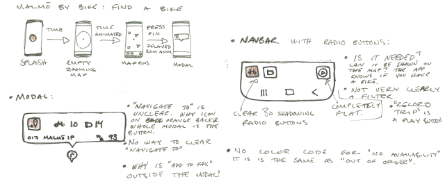
    Starting the reconstruction was harder than I thought. I stumbled a bit and had a fair bit of scope creep. In the end I decided to strip it down a lot and just focus on how you find a bike or free return slot.

    I started to make quick sketches and didn't care about the design of icons or similar. I just wanted to get a sense of what I would want in the flow. I decided to remove a lot of of functionality as I saw it as cluttering the screen.

    What am I looking for?

    When sketching the new app, I see that I'm stuck in the current design in some aspects. I did not thing of displaying more data in the map pins at all times. When I got the idea I don't understand why I didn't think of it immediately. It shows the power of sketching where one small idea gives another and you see a clear evolution in the multiple iterations.

    As a user, I want to see where to get or return a bike fast, I don't want to change filters to make the data available, filters that are reset when the app is off. I want to find a bike or return slot close to me, so the favorites have to go but the list of stations can stay (it is outside of the scope of this redesign though).

    In the end I just want the finding to be fast and clear. I want a clearer hierarchy of what services ae available at the stations.

    Throwing away stuff

    The focusing on the task at hand makes some functionality moot. I will remove the following functionality:

    • Record trips: I don't see the use of this. It is very bare-bones and just shows you a line on the map of where you have travelled. This is better done in other apps.
    • Center: I went for the approach that Google Maps has, of just showing this button when the map is not centered on you and you are not viewing a specific bike station.
    • Documentation: I want to move this to the hamburger menu and maybe show it on the first use. You should not be needing this as much with the new design and having a tutorial being that prominent in everyday use feels weird.
    • Favorite: I don't see a big reason for a list of favorites. The favorites are not as accessible as the map, as the map is the screen we start on and finding your station ahead of time has very little value as the bike stock changes fast and you never know how many bikes have been taken or returned since you looked. On top of this there seems to be a delay in the data in the app. This is frustrating when looking for a bike in real time and makes planning for finding a bike impossible.
    • Filter: I plan to remake the icons to show the stock of bikes and return slots at the same time. This make the filter superfluous and by removing it I can also remove the bottom bar and give the map more space.

    Adding stuff in

    As I opted to strip the UI down a bit, I don't add so much to the app. My main focus is the map pin for the stations. The challenge is to ass more data without making it cluttered or unclear. I experimented with different designs designs and land on one of the simpler ones.

    The qualities I like are that still has a "chevron" that point to where it is on the map. Without this it can be hard to know where the station is on the map.

    I like having both types of assets visible as bars as it makes it faster to search for the different types without changing any filters.

    I experimented with how the payment stations should be made more visible. In the end I opted for a crown. It has some Swedish connotation with the King and the name for our currency. The other visualizations might be nicer but are not as clear, especially when small.

    For color I went with the brand colors even though they are not the nicest. I would rather use Malmö green but the service uses the orange so much and it would be weird to introduce a new color.

    Sketches on paper
    Examples of map pins for an app
    Ideation on map pins for Malmö by Bike

    The digital prototype

    The final digital prototype turned out nice but I would have wanted to make it bigger in scope but that would also make the prototype massively more complex. One solution could be to make different flows where you don't have a continuos

    User Testing

    I dicided to go for a "think out loud" test as the prototype was so small in scope and I wanted quick results for such a short project. Think out loud gives you insight to the reasoning, or at least what the tester shares as their reason and that can give me insights into what I am missing.

    I gave the test users the task of finding the closest available bike as this is what my re-construction is focused on. It's hard to test what effects the decluttering of the UI has had without testing the original app as well and it feels like that is out of my scope here. It would be interesting to do some kind of A/B test with the apps but then I to remake the original app in XD or just use paper prototypes. Sadly I didn't find anyone that had any experience with the original app, but I don't think that was very important here.

    User 1

    This user was reasoning about the dot and how that was probably their position. They clicked the closest station and found that it had no bikes and then the next closest and found a bike. They said that they wanted an icon to show what the bars in the pins represent. I don't think this is the case, I think you might be confused onece before you click a station but then it is just a cleaner experience.

    User 2

    This user was very timid and it felt like they were worried of doing the wrong thing. They wanted confirmation from me that they were allowed to do things. THe user clicked aroud a bit seemingly without a plan and then found that one station was the closest but said that it didn't have any bikes but if it still was the one I wanted. They didn't like the color scheme, it felt boring.

    User 3

    This user also completed the task very quickly. They where reasoning about the crowns on some pins and that this might be where the payment is not out of order. They found this weird. I can agree that the payment station signalling is weak, I would like to work more on this.

    Test take-aways

    The test was easy for two of three users. I don't think I can credit my disign for all of this but I have made it less cluttered and a bit more clear, but I think it was mainly about the narrow scope of the test. I got some good and some less valuable feedback but if I would work omn it more I would have to take these into account.

    Portfolio

    The assignment also called for us making a portfolio page for our redesign, I have included it at portfolio/malmo-by-bike.
  2. Deconstructing Malmö by Bike

    In this project I chose to work with the app Malmö by Bike. It's a bike rental service with around 500 bikes distributed at about 50 spots in central Malmö. I use it quite a bit, when my bike is broken or I just need a bike one way. I first found the service under a different name in New York.

    An analysis of a GUI

    The app functionality include: a way to find available bikes or return spots, either on a map or in a list; a trip recorder and a view to see past trips; support ticket submission; app tutorial.

    I had a hard time narrowing down what was a good project for this assignment and kept moving away from what we are supposed to do. The app is lacking in some regards and in the beginning I was focusing too much on these bad design choices, but after talking to Clint a bit I have found a user path that I want to focus on.

    This assignment focuses on finding common UI design patterns in existing apps and communicating the findings and I have chosen to focus on the user goal of finding a bike at Dalaplan and to use it to go to Niagara at Malmö University.

    I have broken down the existing app into the following patterns:

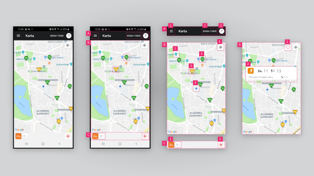
    Annotated screenshots from Malmö by Bike

    A: Top Bar

    A top bar serves to collect important navigation and page info so the user can easily navigate through the app. This top bar contains several other patterns.

    1. Hamburger Menu: This is a way of hinting that there is navigation to be accessed by pressing the button. The hamburger menu has been criticized for its accessability but is very well used today.
    2. Text Button: This is a very discrete button that does not show its affordance very well, a problem some buttons in Google's Material Design paradigm suffer from. On top of this it's a reset button for a function (trip recorder) that I would guess very few use. It takes up precious screen real-estate and is should probably move.
    3. Icon Button: This button shows help documentation for this screen. It might be a bit too much to have it here and could probably be hidden in the hamburger menu.

    B: Scrollable Map

    The main view of the app is a scrollable and zoomable map where you can navigate to find bikes and stations. Overlaid on the map are some more elements to help the navigation.

    1. Icon Button: This button center the map on your position. It's probably something that is included in the Google Maps element and thus carries the style from there.
    2. Map Pins: These map pins are included with the map to show points of interest but probably just confuse in this context.
    3. Map Pins, Stations: These pins are custom and are buttons that open a modal for the station. They have a different styling to show that they are special but don't feel coherent with the rest of the app as the shadow is totally different and they have a border stroke. Some are triangles and some are more like pins, this indicates different station types but no user would guess that triangles are stations where you can pay. That has to be found out in the documentation. The color of the pin indicate available bikes or return spots based on selected filter in the bottom bar.
    4. Map marker: THis marker is your position in the world.

    C: Bottom Bar

    The bottom bar is like the top bar, a place to cluster buttons and info that are a bit out of the scope of the main view, like the filter in this view. It is also a place where tabs that shift the view often reside in apps.

    1. Toggle Buttons: Sometimes called radio button, this button group can only have one active (pressed) button at a time. Pressing another button toggles all other buttons into inactive mode. This is useful when only one option is applicable like here in this filter selector. The style for these is again a new one.
    2. Icon Button: This button just has a play icon in a circle and I would guess very few users would know that it starts a recording of your trip. I have no idea why anyone would like this feature, if I was to record my commuting I would do it in an app that gives me a bit more, something like a training tracking app.

    D: Selected Station

    This is the scrollable map whe a station is pressed.

    1. Icon Toggle Button: This button appears when you tap a station pin. You can toggle it to save the station to your favorites list. The style is similar but not exactly the same as the center position button but why is it outside the station card? Gestalt theory would suggest this is bad as not clustering all station info together makes it hard for the user to understand the context.
    2. Card: A card envelops most of the data for the station and puts it on top of everything else. This is a clustering method to show that this data belongs together. In this app it is pretty obvious but other apps could have long lists with data that can be segmented and better understood with cards.
  3. Photo by Jannis Blume on Unsplash

    User Testing

    We had a lecture on user testing and how to do it, and also a bit on how not to do.

    We went through four different types of tests: observation, when you want a realistic use of your prototype; video analysis, where you can get very rich data on the interaction on a screen and reactions; think aloud, when you want to know the users reasoning; use & interview, when you want rich qualitative data from your tests.

    All types of tests have pros and cons and no one fits all situations.

    We also have to be conscious of when we test. We need to have something significant to test but we shouldn't wait to long as we could find fundamental flaws that have to be addressed.

    I have found that testing can reveal things you wouldn't ever dream of finding because you are so invested in your product and get blind to what other people could see in it.

    Guest Lecture

    We also had a guest lecture with Patrik from a company called Arvato Financial Solutions, it's some kind of Klarna competitor that mainly focuses on Germany right now.

    He talked about what you want to learn from your tests. What does prototypes prototype :). He also talked about the problem of building too big prototypes and the problems they have with prototypes that don't use real time data.

    It is important to know the limitations of your prototype so you can cater for that in the tests.

    Why do we user test?

    My main take away here is why we should do it, because for me it can at times feel like something I don't prioritize over doing "real" work.

    • We do it to get distance and experience the prototype for the first time through the tester.
    • We might also need a reality check on why we designed it like this, wa have an agenda and it won't always align with our users.
    • We often already know what is possible, both technically and politically, and this can close our mind.
    • Kill your darlings. User tests can reveal things that need to be cut.
  4. Photo by Alice Butenko on Unsplash

    UI Design Patterns

    We got an introduction into UI design patterns, anti-pattern and dark patterns. UI design patterns are patterns we see in software we use. Anything from simple input fields and thumbnails to more complex composite patterns like carousels and wizards. These patterns have formed when they are used in many places and almost become standard.

    Anti-Patterns

    What constitutes an anti-pattern could be contested but in my years as a web developer I have seen patterns come and go. Many consider things that take agency away from the user like auto playing carousels or scroll-jacking to be anti-patterns as they often work against the will of the user. Nowadays many consider carousels altogether to be an anti-pattern, as they hide content that is important enough to have in a prominent position and make the user click to see more.

    Dark Patterns

    Dark patterns ar more insidious, they are not just bad patterns, they are patterns that try to trick the user into doing something. This could be anything from displaying every time someone else books a hotel to make you anxious about finding the best price hotel and just book something fast. Gamification could also be seen as a dark pattern, it certainly is when casinos use it to make you gamble more, but it could also be a useful pattern in education.

    Can we break away?

    It is useful to know about these patterns as it gives us a better understanding of what makes the UI and we can use the knowledge to analyze software design. It is also important to know the rules, even informal rules like patterns, to know where we can break away from the rules and when it is smarter to just stick to the patterns we got.

    The hamburger menu is an example of this. I remember when it was new and there was a lot of discussion about it. Would it just confuse users or was it something that we needed. I think the hamburger menu won in the end but I don't know if we just got used to it or if it was innovative. I don't remember what we used to do before it.

    Finding patterns

    There are a lot of sites that gather examples of UI design patterns, I like designvault, as it has a rather large list of apps and patterns that make sense to me.

    Now I have to use this deepened knowledge to find patterns in Malmö by Bike.

  5. Photo by Kelly Sikkema on Unsplash

    Digital Prototyping Intro

    The start of our new course Digital Prototyping builds on what we did during GUI. It's a bit like the redesign for one hand assignment we did with Sofie but this time we will focus less on just UI and will focus more on UX as we are to redesign a user flow of our own choosing in an app we use often and know well.

    We talked in class about UI patterns, what they are, why they are there and how to identify then. A UI pattern can be things like using a card metaphor to cluster information or how a date input could look like an old time calendar to signal its intended use. Good UI patterns reduce cognitive load when using software as you will have a level familiarity with the UI even if you have not used it before.

    My first encounter with UI patterns and usability was with Steve Krug's book Don't make me think, as an artist and graphic designer coming into web design in 2008 this was eyeopening. I think a lot of self taught developers miss a lot of the more academic parts of design and development. I think I have gathered some of this knowledge on my journey but studying at a university has really boosted my knowledge, reasoning and confidence in this regard.

    The web has evolved a lot since I started working with it, and I think one of the reasons is that designers are better trained in usability and thinking of the web as an interactive media. More UI patterns have been established and the web looks a lot more professional these days, but it is also a little less experimental. Less and less is hand built, and that is true of mobile apps too, and more and more is using frameworks and practices from the American tech giants.

    There has to be a balance to find here, where we can do experimental and high quality design. I think one of the driving forces here is that design is still relatively low status compared to engineering and a lot of decisions in software are taken by engineers. App development seem to be ahead in this regard where both operating systems and apps like Snapchat and Tinder try to find new UI patterns with swipes. My main gripe with theses is that they are missing a GUI and often time overlap with other actions and add confusion and errors.

    Assignment: Deconstruct a GUI

    Brief: Choose an existing GUI you are familiar with. Select a user goal and deconstruct the flow and analyze the UI components used

    Materials: Use Adobe XD or similar and present the findings in a blog post.

    Team: Individual

    For my assignment I chose Malmö by Bike, an app I use when I need a bike to get to school and my normal bike is broken or when I want to go somewhere and don't want to have to care about parking and moving my bike. The service is super affordable at 250 SEK a year but the app is very poorly designed. There has probably not been any designer involved with it as it has no coherency and logos are deformed. The features available seem to have been chose more on the grounds of what was easy do implement than what was needed.