
Sinus waves
Yesterday was a gone day. I have exchanged sine waves for oozing sinus and cough. I am stuck at home feeling miserable.
If I have the energy I will start on Webinator, but not today.
Yesterday was a gone day. I have exchanged sine waves for oozing sinus and cough. I am stuck at home feeling miserable.
If I have the energy I will start on Webinator, but not today.

McLean J. Macionis and Ajay Kapur 2018
This feels like a school project, a good school project, but not one with very high academic standards or contributions. It feels like something that might be the result of our final project in TEI.
I think it is a bt thin in motivating why they did it. There are many instruments that are easy to pick up and understand and a lot of them could probably house electronics. Why choose the sansula?
Most of the features are just the result of electrifying an instrument, not particularly their implementation. The parts that are more unique feel a bit bolted on, would making gestures with the whole instrument have any positive effect for the musician. On top of that, those examples don't really use the instrument as such at all. So why not just use a sensor in any ol object then?
Kameron Christopher et al 2013
Kontrol seem to be in the same vein as Sansa in terms of the type of text. It seems a bit less cohesive as some of the examples of the Kontrol seem to be totally different devices.
I think the saxophone example shows a lack of understanding of the instrument and context. When talking about the Guqin they go into great lengths to describe how the tone is generated and what makes it special but with the saxophone they seem to think that the important part is the hands. Thinking you can respond to the music by just knowing hand movement. That would be like just knowing what string was played on a guitar or the guqin.
Furthermore I don't think most saxophonists that use filters would use them with a laptop, I think they would have pedals.
Trying to cram some buzzwords into the text in the end does not do it any favors. What do they mean by "incorporation of nanotechnology"?
Frédéric Bevilacqua et al 2016
This text was better. It goes through some earlier research into the use of sonification in different fields.
At times it feels like it rushes through what they did but there are some nice insights in it. The parts about what sounds are expected and how that can be used to increase the effect of the sound is interesting.
Most of the research seem to be inconclusive and they want further research to explore the same issues. Some of the experiments seem to be replications of older experiments and have the same results. It's hard to see the contribution of the paper other than saying that this is a field that could be studied further. I think they are right in that though. This field seems interesting and it should be studied more.

This week we explore computer assisted music with the help of machine learning in Wekinator and some Processing.
Before the demo today I ws pretty sure I was going to do this project in Node and the browser and use TensorFlow PoseNet there, but after seeing how easy it was to get going with Wekinator and Processing I'm not so sure anymore. I think we will just doi it with the tools Daniel demoed today and I can create some kind of web server that connects to Wekinator in my spare time.
A web server bridge could still be useful as it could be used for some distributed systems like art installations that the audience can interact with. I think this is a good project for the future.
Today also showed how much progress my class has made since last year with programming. It also showed in the last course but I ws impressed to see how people just started editing the Processing examples even though we have barely worked in Processing before. It really shows how experience builds confidence and how understanding of one language translates to other languages.
Brief: Design an instrument that uses a computer to generate sound
Materials: Wekinator and Processing or other stuff
Team: Cathrine, Denisa, Simon and me
We started by looking through some examples and started poking in the MIDI output example but we moved on after a while as our understanding of MIDI is limited and we don't see the great payback in figuring out all of that in a week to get Logic Pro to work with it. We think we can make more with just Processing and playing samples.
Simon made a nice example where he extended the drum machine example. He imported some nicer samples and and this will probably be a basis when continue work with Motion Leap tomorrow.

Today was show and tell with dataPhys. Some groups showed really nice concepts but a lot of us missed the opportunity to do some real physicalizations. In my opinion, most of us just did visualizations in a 3d space. I know the lines are blurry but we could have used physicality more, and this applies for most groups.
I think Julia, Therese and Victor did a really nice concept where visuals didn't matter that much. The data was conveyed with weight, and the "data points" where of different shapes so it would be hard to just see which was bigger or smaller. I think this was a brilliant move because it "traps" the data in physical space. An image of this physicalization communicates very little of the data. You really have to interact with and relate to the object to "read" it.
I wasn't that happy with our concept. It wasn't very strong. I don't mind that we took the provocation very literally, that was our intention and I think it was a bit fun not to make a social commentary but we could have worked a lot more on the physicality of it. It's mostly an object that you observe and very few of the data points could not just have been visualized.
Other things that came up during this course was how showing data is not neutral just because the data is just numbers. When you edit and filter data you have to think of the social and cultural context you act within.
Context and history matters
I also think there was a weird discussion about how the texts were too old to be relevant. I think it is very dangerous to think that visualization design is a solved problem in the last 10 years. We have more or less visualized data as long as we have recorded history and there are a lot to learn from that. Design is not bad just because it does not fit our current trend, it might actually be better att communicating the data. And just because we have better looking AR now than in the 90s it does not mean we have better AR.
Context and history matters, a lot.

This week had a rough start, one member was sick and another was working so on monday we decided to just do some ideation and try to get a context to design for. As we where only half the group present we decided not to make any decisions when we thought everyone would be there the day after. The ideation process didn't go very well either.
The only more concrete idea that came out of the day was a physicalization of the development of fetus. An object that can show the size and weight the fetus at different stages of the pregnancy. I find the idea intriguing as it is something you will never be able to experience in real life, at least not as a positive experience, and it is something where numbers are too abstract to really communicate the reality. The object could also show things that happen in the fetus as it develops, like neural development, but It may also be detrimental to the experience.
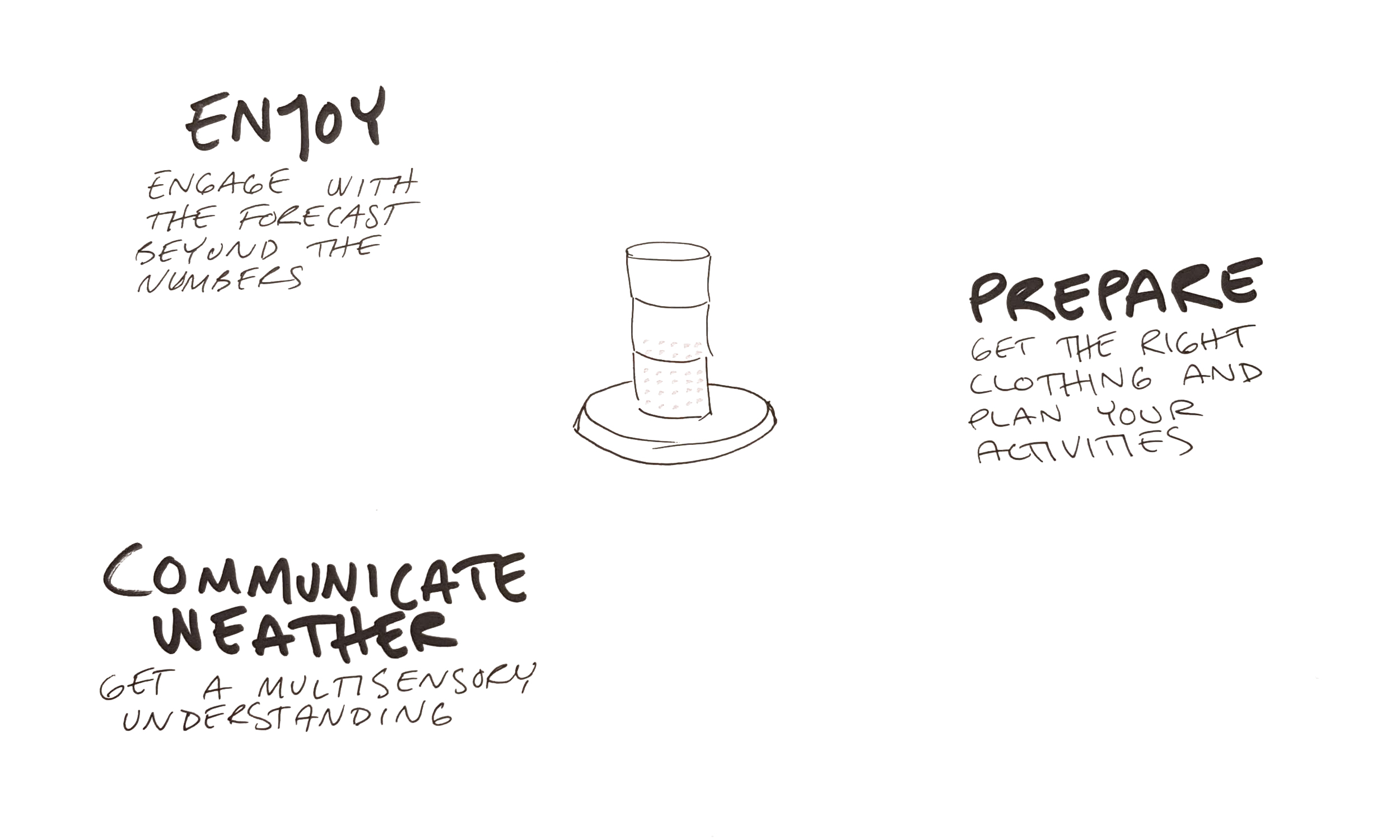
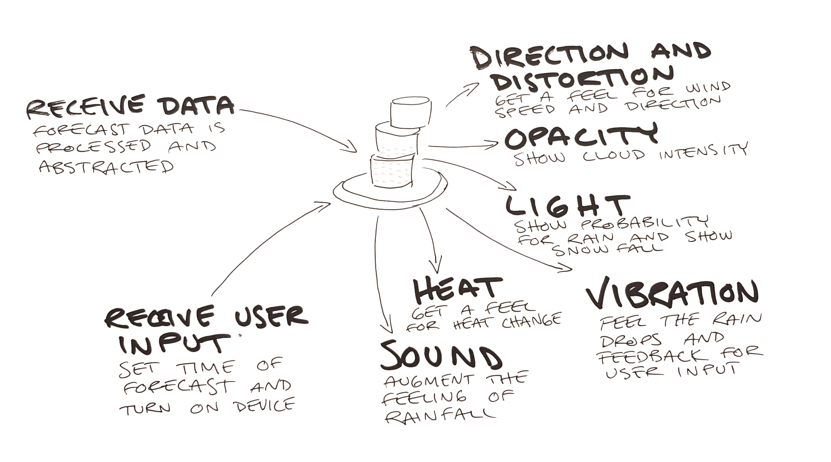
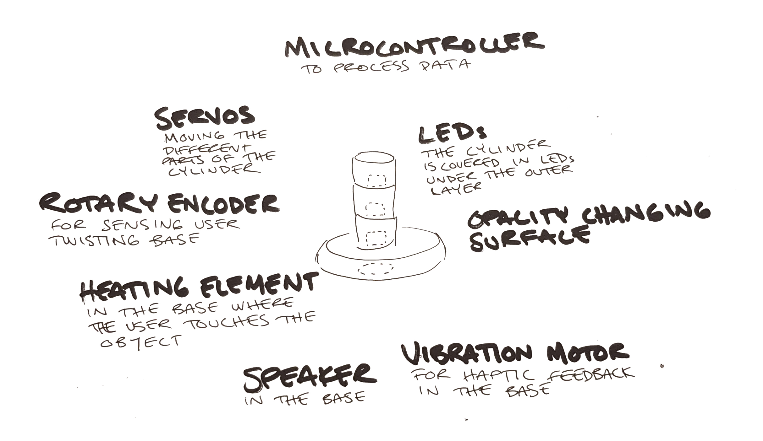
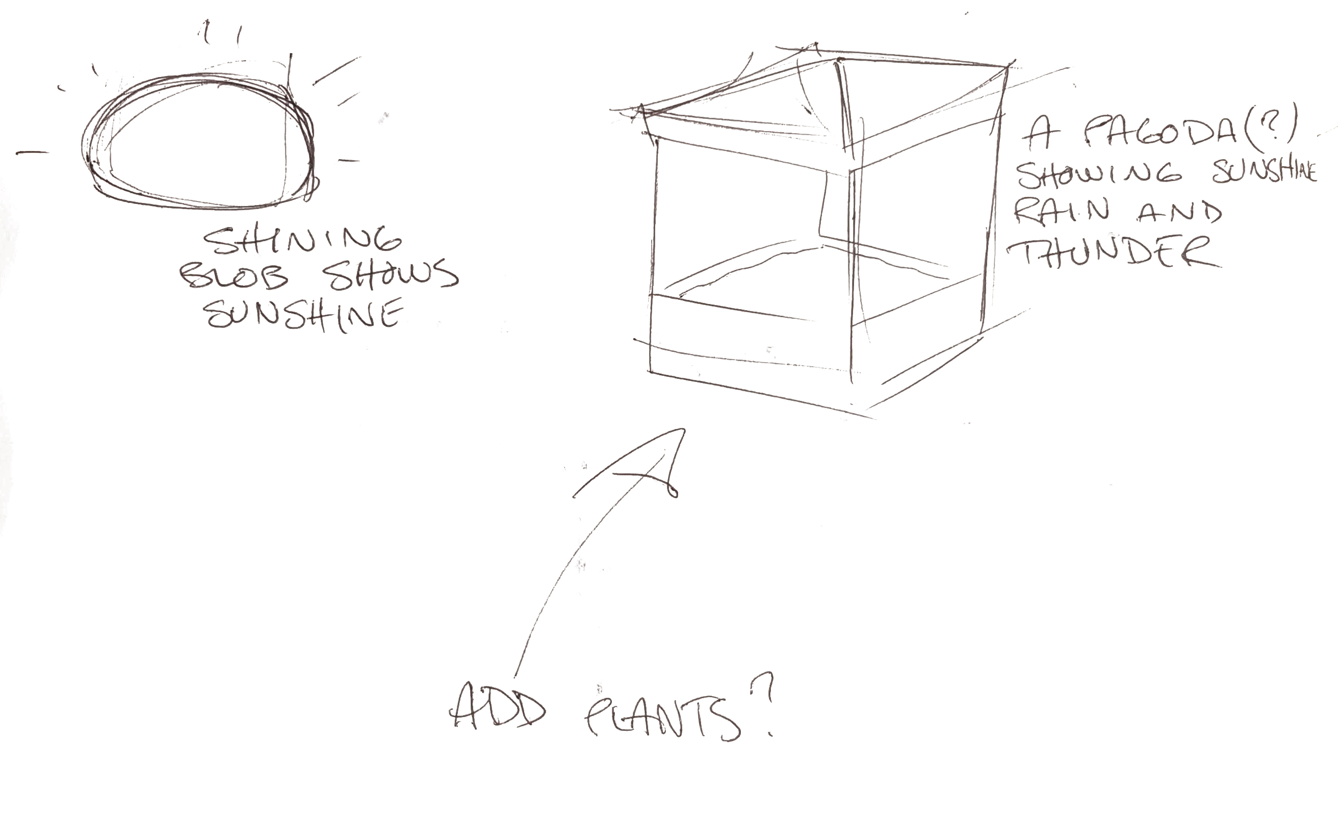
For the tuesday we decided to read the three papers and meet up after lunch to discuss them and then ideate together. Just as we where going to meet up we got messages from the teammates that where absent the day before, that the situation was the same as on monday. We met anyway to discuss the texts and ideate a bit more. During the discussions we agreed on making something less political than people would expect us to do, and hopefully something that could provoke nice feelings and joy. At the end of the day we had narrowed our contexts down to weather in a home setting. Not the most exciting context but that was intended.
On Wednesday we met before the seminar to work a bit on the project but the absent teammates had not read anything and had not looked at the slides on canvas so we had to dedicate the morning to explaining the concept for the week and what the project brief is. At least we could start talking a little more productively after the seminar and get into the physicalization of weather.
The Thursday was the first and last real work day. We started by trying to explain our ideas and how we see them being designed. This didn't lead us to any big insights and we decided to test the FSB method to step through the process and not jump ahead as much. This was a lot better for us, we could define what we wanted the artefact to to and then go on to how to do that. It seems like a nobrainer but I never done it in this way, not like this rigid framework.

In the end we got something together but I think it really shows that we didn't work at full speed this week. It's sad because I think the topic is super interesting and I would have wanted to explore it more.

Hiroshi Ishii and Brygg Ullmer 1997
Although this text is very old it is a fun read. You can see how academia was miles ahead of commercial companies and developing techniques that would take a decade to start to trickle out into the world. The Microsoft PixelSense (Surface when launched) was very similar to the metaDESK and a very interesting product. It sadly went nowhere, maybe because the price tag of $10000.
My understanding is that this is seminal work that informed much of the work in tangible interaction later on. Most of the examples are interesting but some feel a bit too quirky or gimmicky, like the LiveWire.
As a text it's more of an overview of work that has been done and there are not that many insights or maybe I take them for granted 20 years later. There are cognitive benefits to physical objects (atoms) and coupling this with a digital data (bits) create a new way of controlling a digital system and suddenly we can touch the digital world (or cyberspace as they call it) and it becomes tangible. The hope is to have the benefits of both worlds.
I love the example of the Marble Answering Machine. Maybe we don't use answering machines anymore but saving data (but more like a pointer) as a physical object gives us a relation to the data. We can keep it in a box to save for later and remember what they are by their characteristics like color and material. We can even customize them by writing on them or scratching our initials into them.
This text really inspires me. This is the reason i signed up for this programme, I was tired of being stuck in the digital world, I wnt to mix the worlds.
Yvonne Jansen et al. 2015
The concept of physicalizations is an interesting one, like supersized visualizations, but the text fails to show any appealing examples in the paper. Most examples are in my opinion just visualizations with other media. They may have some extra benefits but it's such a subtle difference that I don't think we can in all examples even talk about physicalization.
In the Hans Rosling example I argue that the fact that it is on a stage where the audience can't interact with the objects makes it a visualization. If this was to be considered a real physicalization, I argue that any movie or animation depicting physical objects also would count as one. I think that to be considered a physicalization there should for the audience be a diminishing of experience when the physicalization is recorded on video. In this example there is no active perception, non visual communication or other benefit.
I get that the lines can be a bit blurry, but if you want to argue for why this is important and why we need a new field of research, you have to make examples that are good and make your case strong.
The other parts of the text are more about how visualizations could benefit from being tangible. It borrows a lot from TUI but that is to be expected as the relationship between physicalization and TUI is similar to the relationship between visualizations and GUI.
The authors also get into the challenges of physicalizations and this seems to be similar to that of visualizations where animation and interaction can make data easier to grasp but can also make the representation harder to read.
Robert Kosara 2007
THis paper felt like the least solid one of the bunch. It takes a very strange stance when it says there are two kinds of visualizations, pragmatic and artistic, that are impossible to reconcile. It is like the author thinks that charts and graphs have no inherent meaning, as if any language, visual or other, can be communicated in a totally neutral voice without meaning. I think he comes from a place where numbers are more correct than other information, and this is probably true for most of us, but if we think harder and deeper we can also argue that the numbers are just abstract representations of the world. Statistics are a nice way of working with a complex world but they are not the world. Quantitative measures can often be less accurate than qualitative but they are so much easier to work with.
I think Kosara comes from a good place when he wants critique, and that some of his ideas are good, like having different experts weigh in on and review papers. It's just in the connection to the art world and how it should be implemented that he stumbles. I think he misunderstands what an art critic is, it is not an artist little helper that comes to the studio to discuss his latest work of art. A critic writes and theorizes about art, not for the individual artists sake, to contextualize, analyze and explain the art to others.
Another mistake in my opinion is to think that critics not being artists is a bad thing. Why is it bad to have someone that is an expert of art theory theorizing. In a way it is the same as he proposes, he wants visualization researchers to peer review his work, he does not want just engineers to review engineers. It's the same concept, take an expert of the theory of visualization to review visualizations.
The method of critiquing also baffles me. Are the rules for real? This is nothing like art critique, this is mentoring or tutoring. The author wants clear rules for good design and someone who can tell him how to do it. What he wants could probably be delivered as a book or course. It is similar to Twitter's Bootstrap for the web. It could make a lot of visualizations better but it does not make those visualizations good.
When writing a paper in the vein of "how this can learn from that" it is a good idea to have knowledge about the "that" otherwise you are just setting yourself up for failure. Most of the critique I have is about the author's notion of the art world, but when the whole premise is to bring a concept from the art world into visualization that becomes pretty important. The paper would have had more weight if he just dropped the parts he didn't grasp and focused on what he wanted. It might even fit in a tweet:
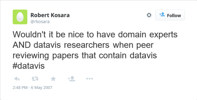
Rant over.

This week started with a lecture on visualization and physicalization of data and how that can be used and has been used to make information easier to grasp.
Almost ten years ago I fell in love with a visualization of the 2008 credit crisis. I still think it is pretty good but it today the visuals feel a bit dated. The nice thing about it is that it explains a very complex problem in a simpler graspable way.
A visualization of the 2008 credit crisis
I made some infographics over the years but I never made anything very interesting or good. I can make nice illustrations but when it comes to animation i fall short. My biggest deficit was probably the lack of understanding for the concept I tried to visualize. I never got enough time from the clients to make a really informed infographic and I think that is probably the most important part of it. You really hae to research and get into the finer details of a concept to understand what is really important and worth bringing in to the visualization.
Physicalization seems to bring a new set of problems. Not just what parts of the information do you want to give form. You also have to decide how it should be experienced, as the physical form gives it opportunities and challenges that are not present in graphics. Should the weight of the object reflect something? Should the audience pick it up? Is it an experience or an object? There are so many possibilities.
Having the real world presence can also give sculptural qualities and it makes me think of art and installations but with a message. I guess this could be just as the relationship between art and visual communication. Calling physicalisation of data art is probably an insult just as a nice book cover can be beautiful, but it's not art. Even so my thought go there, and even more when talking about dynamic physicalisations. I start to think of fluxus and how some artists painted with acid on plastic that melted away.

Today we had our show and tell with the smelly games. There where both good and less good games. Maybe smell does not do a good job in delivering a rhythm, but the same game could have become more like twister.
I liked the "Smelly Cat", a smelly version of "Old Maid". I liked the physicality of the cards and how well smell could be implemented. The same goes for "Domi-nose", a domino with scent. Theses games had smell in them as natural ingredient that had a value of it's own and never had to be translated. You never have to know what the scents are or their names, you just have to pair them with the same scent.
Many games had "guess the smell" components. But in some, like the mentioned above, the smell was a quality, you never had to translate it. Just like a color in many card games, it's just there to make the game work.
Sadly it felt like the presentations got rushed the longer the day went. In the first ones we could ask questions and such but in the end it was just presentation -> demo -> over. I would have liked a bit more information and discussion.

After the Wednesday smell workshop we got a quick assignment for the week to present on friday.
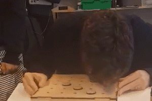
Brief: Modify an existing game to incorporate smell. It does not have to be the complete game, you can focus on just one aspect of it.
Materials: Smell and any other materials.
Team: Cathrine, Denisa, Simon and me
We started brainstorming on games and quickly gravitated towards Battleship. Not going with our other alternative, "Guess who", was lucky as two other groups went with that.
We started exploring how smell could be added and we decided to change the guessing mechanism into a smell skill assisted guessing. A quick paper prototype, where you closed your eyes and tried to track the smell showed promise and we decided on that concept.
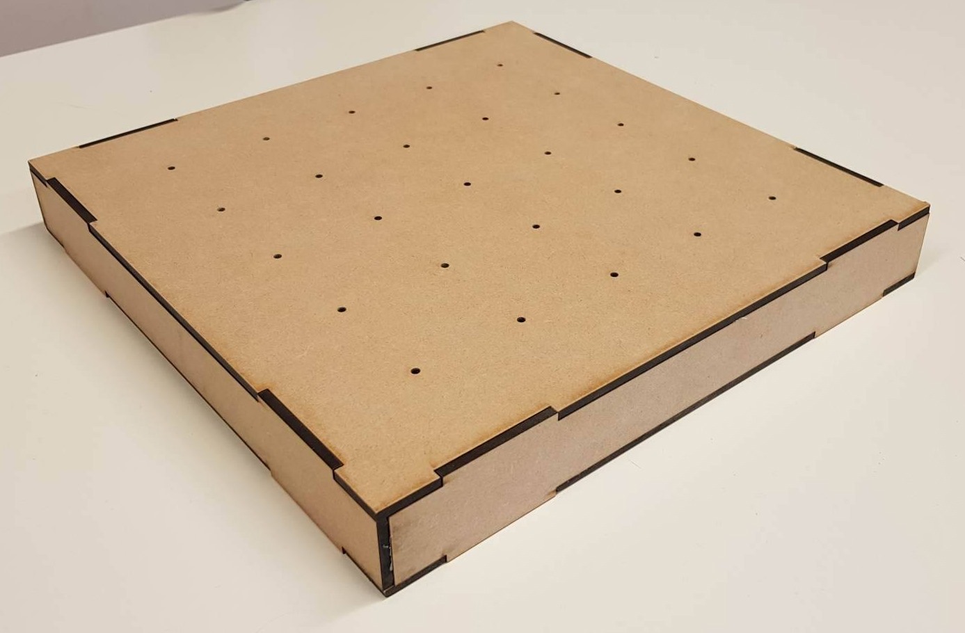
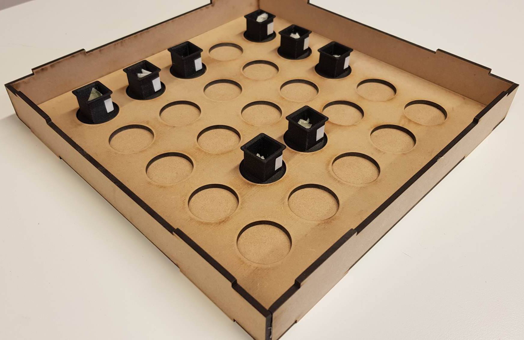
We then started designing the board in illustrator and I guided Sion through it as he has very little experience with that and wants to learn. Cat and Denisa took the designs and ran to the laser cutter while Simon and I designed some smell containers to 3d-print. We where unlucky with the printer as the PLA did not want to stick. This has been the problem for some days and I have not been able to solve it. I hoped as these designs where simple and we used the best PLA it would work but it didn't.
Luckily we had anticipated this and asked Johannes if we could use some of his small containers he has for a smell project, and that was absolutely fine. With that in mind we designed our game board to be compatible with his containers and that saved us in the end.
I will try to find some IPA and see if that solves the 3d-printer problems.
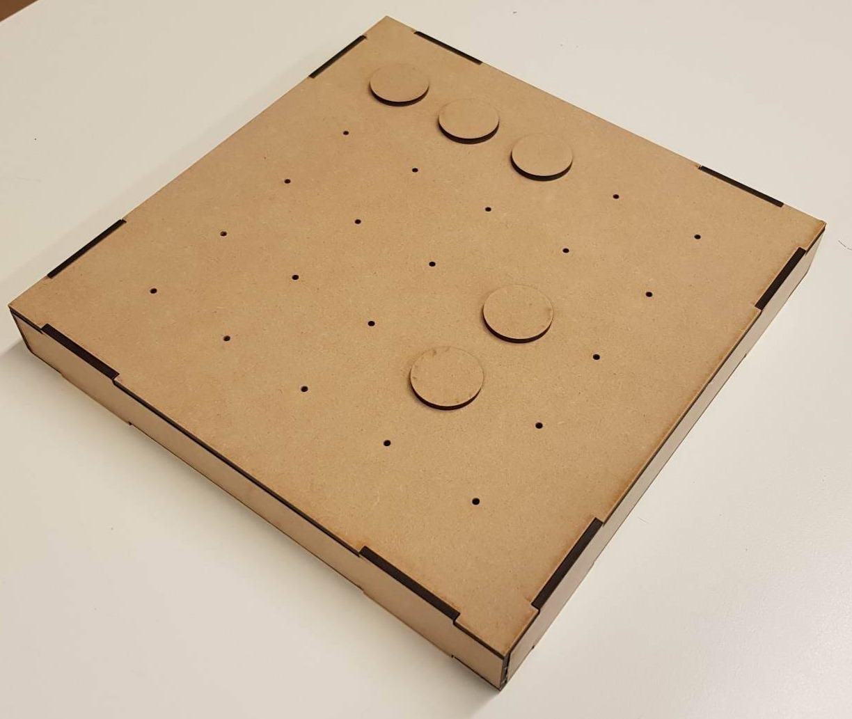
The Wednesday ended with us fitting the parts to see if everything works and then we went home. We where a bit worried about the smell of burned MDF ruining the game so I took all the parts home to lay them out on my balcony for the night. Julia mentioned baking soda as a possible smell absorber too but we didn't try that.
Today started with us sanding the board dow a bit to remove stains and a bit of smell. THe smell problem wasn't that bad, it was more like a background noise that was quite easy to disregard. It clashed a bit with bay leaf, which was one of our three smells, so we decided to change that in the end.
with enough time it was quite easy to pin point the "ships"
Trying it out on our selves and our classmates showed that with enough time it was quite easy to pin point the "ships". We tried different configurations where the "ships" could be any shape and not just lines or even scattered around. This proved to make it harder but we also strayed from the original game, so we decided to play with time instead. Having a time limit also made it harder so we stuck with that.
After having a lot of discussions about how the game rules could work we decided not to focus on those parts and more on just the smelling/guessing part of the game. The brief is clear on that we don't have to show a complete game and we want to focus making our redesigned part as good as possible.
We tested on more class mates and are happy with the result. Tomorrow we make the powerpoint and get to see what everyone else has been doing.

We had a workshop on smell. Simon started by introducing us to the history of scent toys and games.
We started with a simpler form of Kōdō, where you are subjected to three scents and have to remember them. Then we got to smell them again in a random order and we had to guess which ones they were. I took notes on the smells to try to categorize them and to remember.
I think most of us had all three right when guessing. Maybe Simon made the game a bit too easy.
These rose water filled egg shells are interesting as an artifact. As eggs they feel very fragile, are a very good size and weight in the hand and afford throwing, they almost demand throwing. The history is several hundred years old and they were used to spice up dinners and parties. It's like an antique water ballon, but they are nicer to handle than balloons.
Four people play catch with a rose bomb
Vortex cannons were a lot of fun. By blowing smoke rings, they can deliver smell over longish distances and target people. The smoke is just for visuals, it is easier to play around with if you can see the ring.
Combining this with computer vision and servos could make a fun project. A Raspberry Pi with a camera that turns to target people and shoot smells using a vortex cannon actuated by a solenoid. Maybe later.

We start a new week with a new theme, smell. Talking about smells sparked a lot of interest in me. It's a complicated topic as there is no rgb of smell, we have about 350 different working smell receptors, digitizing that is hard. So it requires physical scent carriers and that is bulky. The resolution in a scent display is very low, the ones we saw only had 4-8 different smells because it get bulky. I never thought about this topic before but Simon's angle had a lot of personal hooks for me.
Seeing how my mothers sense of smell and taste diminished in her last year, and seeing how that made her eat less and all the problems that led too was very hard. I saw the same tendencies in my girlfriends grandmother and in a lot of people when I was working in an home for elderly. That's why it felt personal reading the articles about the research and the coupling between loss of smell and dementia.
It also made me think of my brother who lost his sense of smell around the age of 25. It probably has to do with allergies and such but it would be interesting to try some smell training on him. I may try the 12 week thing on him.
Gaming is something that hooked me as a child, I still am very interested but I don't practice as much as I would want. I remember trying to play "Leisure Suit Larry" in the early nineties. My strongest memory was trying to get by the age verification system. If my memory serves me, you had to answer questions that children shouldn't know, like old politics and stuff. We had to refresh until we got the one question we knew the answer too.
There are a lot that I didn't know about smell. The belief that humans are bad at smelling is not true, we are even better than dogs at some categories of smells and we can learn to track by scent out in nature.
This week will be interesting.

Last friday we all presented the films we made that week. The assignment in was a video prototype of a multi-screen experience with a glanceable UI and it was interesting to see all the takes on the concept. Some groups made real good videos and concepts while others I think got away from the assignment a bit when they wanted to make cool things. I think it was clear that as soon as visual design elements where introduced in the videos, the critique would get skewed towards that. A lot of critique focused on colors and technology.
I think this was a bit sad as I interpret the assignment to be more about testing an experience and communicating that. I guess it's hard to make any hard lines but I would have liked to see more talk about the conceptual stuff. Like "how is glanceability built in?", "is the information useful and actionable?" and questions like that. I think it's a bit hard to critique in these large environments, especially when there is no discussion already going on. I feel that I come off as a douche when I try to point things out, but I don't feel confident enough to make any claims about the strengths of the design. I need more time with it to find those qualities and a smaller forum where I feel I can goof up without losing face. I guess that is something I'll have to work on.
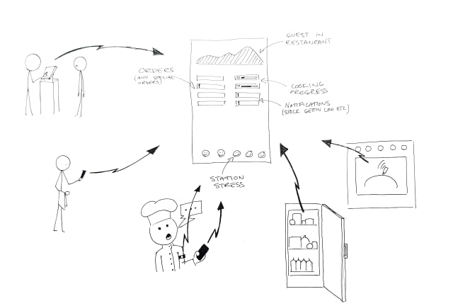
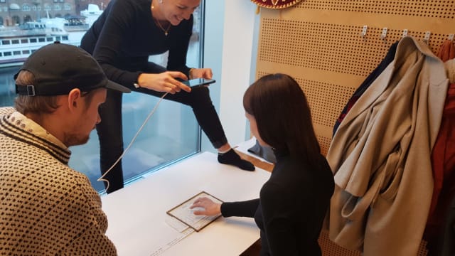
Our video is about a system that keeps the kitchen staff informed without having to know all the details. You can see if a roast is done soon, but you might not need to know the seconds. The more detailed information is available if you want it on the appliance itself.
We got some well deserved critique about how the interactions could have been better illustrated and I think the video shows how we were two different teams doing scenes at two different locations. We had just a vague idea of what the other group was doing and we should have had a "director" that could have pulled us in the same direction.
Overall I think this week showed what a powerful medium video is when you want to show an experience. It also showed us how much more experience we have with this now. Making this movie was so much faster and smoother than last time we had to make a video prototype.
I also think we got to experience how valuable lo-fi visuals can be. When you leave a lot to the imagination of the audience you don't get irrelevant questions about colors and contrasts.

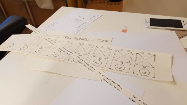
When setting out to make a quick video prototype of our project we chose paper as our material. We wanted something fast and far removed from graphic design. The fast part might not have been correct. Making six different devices in paper where all had changing components was not the fastest, we could probably have made it faster in illustrator but the what we got was a more true wireframe mindset. While we saw that other groups where debating contrast and colors we could just focus on the interactions and information in the prototype.
I think we often want do make "shiny" design. We want to present something that is aesthetically pleasing and will impress stakeholders at first glance. This can be a trap where we spend a lot of time debating ad designing characteristics of the design that may or may not even be implemented later on. We also run the risk of getting in love with a design and have a hard time scrapping it later. I have seen this many times in my own work where a design is modified to try to retain some aspects you really like, and while doing so you ruin it and get something bad, but at least you kept your favorite header almost intact :)
Another danger could be that stakeholders get attached to the design early on and don't want to change it. As they are not as involved in the design process they may have a hard time understanding why something had to change.
Just doing stuff can really make stuff happen. Who knew? We just asked if we could film in the uni cafeteria and in one hour we had planned our shots, filmed a couple of versions of every shot and edited it all.
We had some discussions in the group about how to edit and what to keep. I didn't see the benefit of keeping everything we filmed just because we want to show what we have done. I think killing darlings is really important, especially when you present your things. The audience might not even understand why you liked that thing so much. In the end we compromised and I hope everyone is happy.

We feel the time running and have to decide on a situation. We go through our earlier ideas and decide to ideate on three of them.
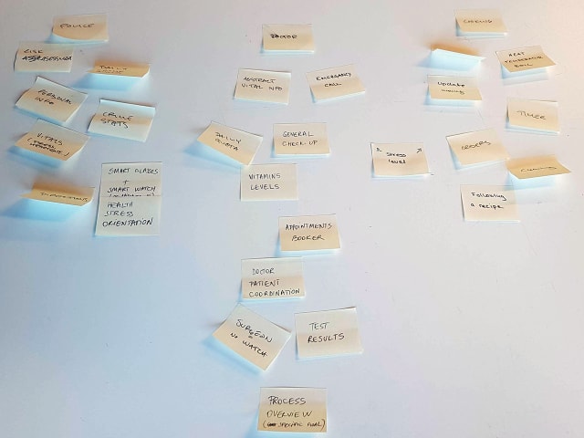
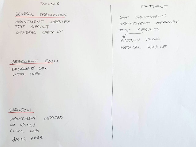
We ideate on the patient/doctor situation. This was probably the favorite situation before the ideation but we found it a it boring afterwards, we also worry that our experience in this field may be very limited.
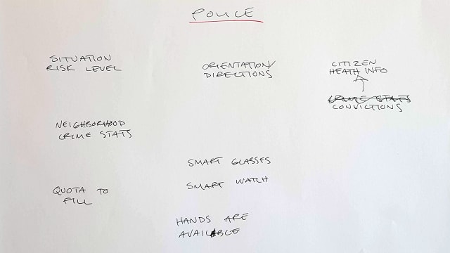
If we would pick the police we would likely go into a dark and speculative design. It would be very political and with the short time we have on the project it could fall flat and just be a "black mirror reject".
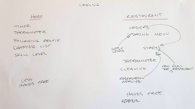
This was our least favorite situation coming in, but when we started to explore the idea, it grew on us. I like the idea of using many small screens with specialized information and a large screen with. The worry is that we are biting off more than we can chew, there is a lot to deign and prototype and we only have two days.
We decide to work on this and start to wireframe the different screens. Tomorrow we will have to make a storyboard and film it in a kitchen. We got permission to film it in the university cafeteria.

Yesterday we spent most of the day working with the texts in preparation for the seminar in the afternoon. I like how we have focused more on the texts this year. There seem to be a lot more discussion in the class this year, maybe because everyone is always working in the studio, but it may also be the seminars that force people to read the texts. Anyway, the fact that more people read the text I think has a kind of synergy, where everyone gets more out of the texts as we can discuss it more. Or it's just me reading better.
As we in our group already had been discussing the questions for the seminar for a couple of hours, we had already answered most of the questions, but discussing it in class gave us some new perspectives. Having David there deepened my understanding a bit more and opened new discussions.
We talked about how much data you need for your research and some people, me included, felt that there was not enough data to draw some conclusions. While I understand, and agree with, that qualitative research has different restrictions than quantitative studies, I just don't think some of the conclusions where justified in some cases. It's nitpicking but I still think some conclusions in the field study are weird. When 50% of group A says something, it's not ok to group them with group B that was testing a totally different prototype and conclude that prototype A had this quality just because group B thought prototype B had the same quality. You should just be honest and say that the interviews are inconsistent. I think that the way these people work may have more to say about it than the visual queues.
We have yet to pick a situation to work with. I had some ideas i will present to the group today.
My ideas seem to be rooted in my real world problems and not that exciting. We should do something crazier.
New week new course. Tangible and Embodied Interactions. I don't really know what that means, at least the embodied part. I think it has to do with a stronger relation to human physics rather than just cognition. We talk about the limitations of the human bodies and senses and will design with that in mind.
The first week we will design and present a multi screen experience where glanceability is a key factor. Glanceability is the concept where you have a visual expression (maybe other senses too?) that is so abstract and/or simple that the user just has to glance at it for less than five seconds to get it. Doing this fast glance avoids kicking into a cognitive mode where you start to analyze the data. I guess this ties back to Thinking fast and slow that Sofie brought up last year.
I can see how this could be useful while I run. I use my run tracking watch to get info while I run and I have often felt that the data is too raw. I get very stupid while running hard and trying to calculate the tempo needed to make my goal time can be hard at times. Even things like understanding what number is remaining time and what is my current tempo can be hard during intervals.
We have three texts to read for today and they aren't the hardest reads. Designing and Evaluating Glanceable Peripheral Displays, Matthews, T. (2006, June), is a writeup of a pre study for a thesis. It has some usable insights when defining glanceable displays but is not very deep. It feels a bit odd to quote psychology research from the 50's, there has to been development since then, but I'm not knowledgeable enough to argue too much. It seems a bit odd though to cite a paper and then saying that the estimation is rough. Why not use any of the later research done. I guess it comes down to having cool references.
Exploring the Design Space of Glanceable Feedback for Physical Activity Trackers, Gouveia, R., Pereira, F., Karapanos, E., Munson, S. A., & Hassenzahl, M. (2016, September), is a longer text. It's a study done through design and seems to be similar to what we are expected to hand in by the end of the course for our longer project. It breaks down glanceable feedback into six qualities to be able to discuss them but I think they are quite political when they do. Is the encouragement of checking your device more really something that we should strive for? I think a lot of people thought smart watches with notifications where going to make us check our devices less but I think this mindset might be a cause for the opposite to be true.
They also try to get people to compete with other anonymous pre recorded user data. In doing this they find it to be disheartening for users. It's not hard to see that competing against someone that always achieves the goal you set up while you might not can be a downer. If they would have thought about it, they could have realized beforehand that they should compare against other people with the same goal that also failed at times.
I think some of the shortcomings of the paper stems from that they did their research in part based on what was easily attainable. They seem to have some walking data but not the intent of the people behind the data. This is also true of the analysis, it feels shallow and very data oriented. They try to be a quantitative research paper without very much data. It can also be seen in their citations, when they cite a study of one subject. There are insights in here but it wasn't my favorite paper.
The last paper Evaluating Peripheral Displays, Matthews, T., Hsieh, G., & Mankoff, J. (2009), builds on the first. This time the Matthews puts her theories to test and does two studies, one lab study and one fields study. The study also takes three other studies to try and find a more all encompassing definition of qualities to evaluate when talking about peripheral displays. They are using both quantitative and qualitative methods but it seems to lack a bit. It does not go very deep in interviews and does not have a lot of data. One of the studies only has two people each in two groups. It's hard to extrapolate the findings like they do when comparing the field study result. They group one from group A with group B, just to be able to say that three out of four say one thing. It seems a bit disingenuous to create ad hoc groups just because the data pool is so small.
Even though I think the research lacks a bit in quality I think the paper can help us a lot in doing our own research later on in the course.
In the end all texts give insights into how a design research project can be done. It feels like every text is there to help us in one part of the later larger project. The first is how we will write our intentions in order to get feedback from our supervisor before we do our research. The second text is an example of what we should hand in in the end of the course and the third helps us with our research
See all tags.