Posts about “Interactivity”

  1. Photo by Henry & Co.

    Designing with texture

    Introduction

    Interaction designers are increasingly tasked with crafting nuanced digital feedback to inform and delight the user. However, there is a lack of frameworks for designing continuous feedback that could help. Heyer (2018) proposes a set of lenses for analyzing interactive objects in terms of how they afford manipulation in different contexts and why this manipulation is integral for skillful coping. The part of Heyer's reasoning that I will focus on in this essay is feedback and feedforward as texture. According to Heyer, texture is always there, it is part of the material, it is invisible but always available: the noise of a car engine, the weight of a coffee thermos, the sound and vibrations when a bike's tyres roll on the road. These textures reveal something about the artifact’s state and are a natural part of any mechanical machine or tool. Digital artefacts, on the other hand, do not have intrinsic textural feedback and designers need to design the feedback in order to facilitate coping. The current paradigm in interaction design is not concerned with vague textural qualities: it is more interested in the precise nature of numbers and meters.

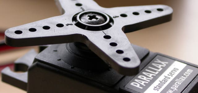
    In the Interactivity course me and my peer were tasked with designing for coping with servos. We worked with a beat, or rhythm, as feedback. While we did not arrive at a concrete application of the interaction designed, I believe the reflections provoked by this exploration highlight aspects of Heyer’s theory that I might have otherwise overlooked. Based on them, I will discuss the potential for nuanced textural feedback, how it can benefit skillful coping, and what issues might arise when designing with textures.

    Textural feedback

    Textural feedback is when an artefact informs us of its state with intrinsic features. Feedback, like the resistance when driving in a screw, the roar of the engine in a car, or the sound of the plank when the saw is cutting through wood. When you drive, you know when to shift gear without looking at the tachometer. When tightening a screw, if you are skilled enough, you know when it is tight: you do not risk over tightening. You can hear when you are nearing the end of the plank and can adjust the force and speed to get a clean cut. Physical artefacts have this feedback and feedforward mechanism built in and we as users use them to cope with the tasks at hand. Digital artefacts typically have a more binary type of feedback. Notifications and status LEDs have their role, but in the flow that is coping, they interrupt the user and enforce an unnatural cognitive evaluation of the situation. Textures in digital artifacts could keep users in their flow of actions and let them cope without thinking. However, to build texture designers have to explore all the ways they can unobtrusively give users ongoing feedback. Some examples of this are shape changing objects, color changing surfaces, vibrations, sound, or any other continuous signals. There is not a lot done in this field and it is open for design exploration.

    Interactive artefacts, as we design them, are digital in nature as that is our material. As digital artefacts they are designed from the ground up and seldomly have a lot of feedback that is inherent to their construction, at least not on purpose. We have to design the functions as well as the feedback, feedforward and affordances. When doing so we tend to like to design clear and unambiguous so that the artefact is easy to learn and use. This line of thinking goes against much of older design of machines, where the capabilities were more important than ease of use, and having to learn the trade was a given.

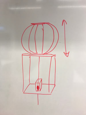
    Textural feedback can also give us glanceable information that could help us cope. A hard drive that inflates to show you how full it is would let you know without having to continuously check when we have to delete files to free up space. That kind of information would make coping easier as well as introduce social manipulability into the artefact. It would signal an ability to keep your workspace clean or to show off how much work you have done.

    Skillful coping

    Heyer (2018) builds upon earlier work on skillful coping and argues that nuance in feedback is the key to skillful coping and the development of expertise. An artefact can have different affordances to different people depending on their skill level and previous experiences. Michael Polanyi's (2009) notion of tacit knowledge also lends credibility to this theory. Polanyi proposes that we have tacit skills and knowledge difficult to express and relate. These skills can be, for example, craft-related. Here the practitioners simply know the right amount of force they need to apply to cut into their material. Polanyi suggests they could never express this knowledge or explain it without using the tool at hand.This rich feedback is unusual in digital artefacts but we can see it in some specialist tools, such as, for instance, Wacom drawing tablets. Here the pressure of the pen against the tablet lets a skilled artist draw with fluid line widths and emphasize with the force of her stroke. More advanced pens also take distance and angle into account. Wacom's tablets are a great example of where rich feedback affords skilled coping for the experienced artist but they also show that a novice user will not have as many affordances as an expert before they learn how to control the pressure of the pen, this is something to keep in mind when designing the software to be used with the pen.

    What opportunities lie in textural feedback

    Nowadays feedback is often expressed in absolute numbers, such as blinking light or text. It is good to know the percentage of battery left, but what decisions can a user make if they do not know how fast the battery is draining? They have to hover the power icon on their smartphone every time they want to know more. As designers, we could embrace this and design for less concrete feedback. We could create more nuance, richness and texture.

    What is missing is the sensed, felt, or tacit knowledge. When you pick up a spray can, you feel how full or empty it is: you do not have to check a status meter to see that it is almost empty. We can design for this in digital artefacts too. However, it requires us to think differently.

    One of the prototypes me and my peer created was a servo that one strapped onto their wrist, giving them a "heart beat" feedback that we could adjust in several dimensions. When trying out different rhythms and beats the user could get an unobtrusive yet quite rich feedback. They would experience a richness in the different rhythm, strength and speed that would make their "heart beat". There was a weird eerie feeling when experiencing the "heart beat" of the prototype ourselves. It somehow felt like our own heart beat. The sensation was similar to high intensity training, as the heart beat cooled down at times.

    An industry that could easily incorporate more textural and rich feedback is the gaming industry. Game consoles often already use haptic feedback but it is limited to occasional short bursts similar to notification vibration on smartphones, using textured feedback could give more nuance and depth. Players are used to having to learn games and their user interfaces, as they often differ quite a lot. This makes them more appreciative of novel forms of feedback. Competitive online games also have a high level of skill development that would facilitate textural feedback. With the advanced haptic feedback of the current generation of consoles, the heart beat we designed could easily be used in a game pad to communicate character health or similar status. It would just disappear in the background but always be noticeable, especially when it changes or reaches higher intensities.

    Limitations of textural feedback

    When designing texture, designers explicitly design for a learning curve. This makes the divide between a novice user and an expert even wider. Making digital artefacts approachable yet enabling rapid skill development at the same time is a big challenge. I believe this might be done, for example, with multiple layers of feedback like in the car, where the tachometer shows the engine revolution at the same time as you feel and hear it. However, it remains a challenge to tackle.

    We also have to take into account what this feedback does to the user. The "heat beat" felt very real and had a hard coupling to the real world feature it was mimicking. It would be hard to use it for something that is not associated with pulse without changing it significantly. Holding your hand on top of a device that moves with a "heart beat" was very discomforting, it felt like smothering a small living thing. I struggle to see where that could be used outside of very niche experiences. Textural feedback is specific to the experience designed for, it can not always be replicated or abstracted through patterns or rules.

    Conclusion

    Textural nuanced feedback could be instrumental in developing new artefacts that allow for skillful coping. It could help create products that are easier and more pleasurable to use in the long run. Despite its potential textural nuanced feedback remains largely unexplored in interaction design. As I have discussed in this essay, there is great potential in the concept. However, considering the steep learning curve and the specificity of feedback patterns, it might be hard to find opportunities for implementation. If we design with this in mind, as more devices implement textural nuanced feedback we might be able to shape new user interface patterns that will become recognizable and familiar.
    In this essay, I have focused only on physical feedback. Nevertheless, I see great potential in using textural feedback in purely digital artefacts, such as mobile and web applications. Here it might be designed as a background function, running continuously throughout the user’s interaction with the application, or similar. This is a subject I want to explore more as a web developer.

    References

    Heyer, C. (2018). Designing for Coping. Interacting with Computers, 30(6), 492-506. https://doi.org/10.1093/iwc/iwy025

    Polanyi, M., & Sen, A. (2009). The tacit dimension. University of Chicago press.

  2. Photo by Leone Venter on Unsplash

    Presenting

    We went through this module with great insecurity. It felt like we never had it under control until the last week. It was a good experience for me, to have to find my footing at times.

    Tracking movements when handling objects

    The presentation went ok today. We had some critique about the visualization of the movement but I am pleased overall. These actions might not have been the best suited for machine learning but it is interesting to explore the limitations of the tech as well. It made us think more about the movement in the terms the two papers talked about. We also kept away from making a flashy demo and I think that was a plus for us. In module one we spent to much time on making graphics and that was not the case here.

    This course has been an interesting one. Working with the basic ideas of interaction and exploring it in different ways has really been educational and enjoyable. There has also been more focus on the texts and that has been really helpful for me. I'm not always the best one on reading text but in this course I have leveled up my reading discipline.

  3. Photo by Mark Eder on Unsplash

    The non action

    An ioio XPS inspired me to think about not doing things. It was a talk about colonialism in design and how not trying to solve something for someone can be more helpful. We as designers have to step back at times and acknowledge that we might not always know the best answer. At times the user knows best. I guess this is also the basis for user centric design as opposed for genius based design, and maybe the basis for IxD at MAU.

    The absent action is our theme now. We will work with cancelling, regretting and uncertainty. They feel very related but stand apart a bit. The uncertainty opens up for cancelling but can also be a fulfilled action in the end. If you just take a simplistic view of it it's just a fulfilled action that is carried out slowly but I think there is a quality that is getting missed in that view. THere is something in the hesitation that is interesting.

    When you decide not to fulfill the move, we call this a cancelled move. Cancelling is easier to identify for the mover and the observer but it may be hard the machine view. If the object we are to pick up is the one sensing it will never see an action if it has no sense of the room.

    Regreting is similar to cancelling but you first fulfill and then return it. I think observing it is similar to a cancelled move where you have to have a context to understand it. You can see it as two fulfilled actions, picking up and putting down, but we argue that when you see it as a whole it is different.

    This is the space we chose to work within the last week and I think it is an interesting one. It is far from where we started and a stretch in the topic but Jens seems to be fine with it, even excited.

  4. Photo by Paolo Nicolello on Unsplash

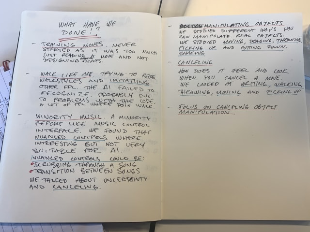
    What have we done?!

    This week we started by planning what we need to do to get ready for fridays presentation. During this we started to doubt the effort that we have made in this module. We worked together in module one and there we made several prototypes for at least four concepts and in this module we have not the same amount of output.

    Going through what we have done, we realized that we actually have worked more than we remembered.

    Notes on what we have done so far
  5. Photo by Siora Photography on Unsplash

    Cancel that

    After some coaching we got an approval for our concept. If we don't get the computer to recognize our moves that can be ok, as the investigation is the important part. We should analyze how these kind of moves and record how it looks when you regret a move and when you don't. We also have to try the moves and see how they feel for the mover.

    We will move forward by prototyping these moves in different situations to se if we can identify the canceling and regret of movements. What does it look like when you are in the middle of a movement? Can the the machine recognize the hesitation? Can we isolate this cancelling movement? Movements that are stopped and regretted, can the machine recognize this?

    We started looking at some different situations where one person would do something and one person would suddenly tell them to stop. The first was writing on a whiteboard. In this case we found that the canceling was done very subtly in between drawing the individual lines making up the letters. Stopping the writing action was not noticeable, if you don't account for the words not being completed. There was no twitch or anything that we could see.

    The same was true for walking, we could not see the cancelling as a specific move. We concluded that this could be a consequence of theses actions really being an ongoing series of actions. When told to stop, people would stop before initiating the next "subaction".

    I cancel a throw and then complete a throw of a small ball

    When making more distinct actions we noticed more clear cancels. With the throwing we could see a difference when the mover knew the he would cancel. In this case he would cancel before getting into the swing. We also had some tests where you didn't know that you had to cancel. In this case we could see the swing being initialized and that the cancel could fail, in regards to holding on to the ball. Theses moves where more interesting from the mover perspective, with a heavy object being thrown, the cancellation can really be felt, it can even hurt. As the mover has to stop the swing or divert it, the energy has to be dispersed in another way, and this will be felt in the arm.

    I pick up a bandage a couple of times

    Smaller actions like picking things up is different again. Here we get further into the action and when we cancel we can see a twitch almost like we are being burned. We can also see a lot of hesitation, probably because we know it is an experiment. We can also se that at times we actually take the object and then release it. We call this regretting a move as we think it differs from cancelling.

  6. Photo by Chris Barbalis on Unsplash

    Handling it

    We are handling real objects now in order to understand the movements. We may be able to translate this to our gesture interface later but we need to understand how to design meaningful gestures first.

    When we start to analyze object manipulation we find that there are many different ways of interaction, we can push, pick up, drag etc.

    I move an object by lifting it

    I move an object by pushing it

    I move an object by dragging it

    While testing the handling of objects we started to talk about social interactions when we handle objects. Things like giving and taking from other people can be an interesting angle. While testing this we started to play tricks on each other and saw how this changed the way we received the objects, you can see me taking it from under after Lin just dropped it once.

    Two people move an object back and forth in different ways

    While doing this prototyping we started to talk about hesitant actions and deciding not to do thing. We got back to the discussion we had earlier on, when Lin talked about hesitating to press play, and this time I understood her better. Just because the machine sees an interaction as a binary action, play or pause, it does not mean that the mover or observer sees the same. When you press play, your action starts earlier, the whole approach to the machine, reaching out and finally pressing play is part of the move.

    This whole move is disregarded by machines today, they just listen for button presses and similar. We found this interesting and started to investigate the canceling of actions.

  7. Photo by Rechanfle on Flickr

    Minority repeat

    We spent most of last week reading, tinkering with the ML libraries and walking around the studio. This wee we started working on something inspired by the movie Minority report, one of the better Philip K Dick adaptation (some are very bad). We didn't have a clear goal but after talking a lot last week we decided to just try something out.

    Just do it

    Minority Report style interaction

    We talked a lot about different gestures and what they could mean, and how you could complete certain actions. When we started to just prototype the movement we got new insights and ideas. While trying it out we decided that a general computer UI was not whet we wanted to do, we instead decided to focus on music. Music was our theme in module 1 and it seemed fitting to have it here too.

    We talked a lot about what different gestures could mean for our imaginary music player and once again got stuck a bit in the theory. After a while we just went to a white board and imagined that as our interface. When we started to gesturing and finding the actions we wanted, Lin brought up the idea of not being sure when you press play. I, stuck in a binary mind set, was skeptical of this but this lead us into to actions where you are not sure.

    Not so sure

    We started playing with skipping tracks in a more nuanced way. Maybe you can peek at the next track and slowly and gradually start to play it, or if you don't like it, just not skip to that track. This was interesting to me as I never saw these nuances before. In my mind the only nuanced action in music players are volume controls and scrubbing.

    Gesture controls for music player

    We got a bit stuck here, we had some easy gestures for some actions but others felt contrived and at times didn't even feel good. In our coaching with Clint he suggested we could try interacting with real objects to see how that manipulation is played out.

  8. Photo by McKenna Phillips on Unsplash

    What are gestures?

    We talk a lot about gestures, and in discussions we throw the word around without thinking of what it means, almost as carelessly as the use of "intuitive".

    But what is a gesture really? A gesture is many times really hard to define. How do you wave? There are a million different waves but we perceive them as the same.

    Is a gesture a symbolic move? Some definitions seem to say it is an expression. Then it seems to be a kind of language. It feels like it is a very nuanced language too, small differences in the movement can be the difference of a threat and an invite. It seems interesting today when we talk about gesture based interactions.

    When we design for gestures it is important to think about this. The mover perspective becomes very important here. A swipe in an app can become a peek if it is slow and I often pull to refresh when I just want to scroll to the top. There seems to be a lack of gesture interpretation and that can be grounded in how hard it is for the machine to understand the intent, and the intent is what differentiates the gesture from the move.

    One of the worst features in Instagram is how you have to know the amount of pictures in a post when you swipe to the next one. If you make the same swipe when you are at the last photo you are taken to the next screen. There has to be a better way to do this and I think it is a very engineery problem, a problem that is the result of engineers making the design decision. THere has to be a better way to interpret the touches, that take context into account.

  9. Photo by Jake Hills on Unsplash

    M3: Try walking in my shoes

    The last module in this course is about machine learning and gestures. We will use a phone to record movement and try to teach the machine to recognize what we do.

    An interesting part of ML is the difference from "normal programming". Where traditional programming is logical and has if/else statements, modern AI has more of a fuzzy logic, making judgments and discriminations based on earlier experience. This can make programming easier but can also lead to very unpredictable results where the logic becomes more of a black box that is hard to understand.

    When the logic comes from training there is a risk of unknown bias to creep in. When we define a human in a program we might think of things to identify them by, like legs arms and such. There is already a risk here, where we have to account for people without arms and legs and so forth. With ML this is even harder as we might forget to teach it a lot of stuff. This was the case when google launched filters for Hangouts, they taught the system on google engineer as these were easy to come by humans. This meant that it did not get trained on black people, as Silicon Valley is very white.

    Another thing to think about is what a gesture really is. A swipe on a phone is really easy to identify as a human, but if you try to describe it it gets harder. How long is it? How fast? It's interesting how all the simple things become complex when you really look at them.

    Assignment: Machine Learning

    Brief: Explore and design movement, gestures and bodily interactions with sensors and ML

    Materials: TensorFlow and sensors in a smartphone

    Team: Lin and me

    We started by toying around with the code Jens gave us. It's an extension of the Node JSON bridge by Clint that we used in Programming 2. We started by trying to record some easy gestures like circles and lines. It worked ok, but the length of th moves have to be the same and that might not be so good.

    We started thinking of some movements to analyze and as we both like working out we started to think in those terms. Maybe trying to see if you make your reps the right way or counting reps. When we talked to Jens he didn't like the idea. He wanted us to go deeper, analyze what the movements really are. The texts talk about this too, how the moves can be viewed in different ways.

    When designing movement The Mover is the first person perspective, an important experience as this is what the "end user" will experience. If the move feels weird it should probably be designed in another way. This is something that is often forgotten when designing for example mobile apps, the hamburger menu in the top left corner is a terrible position for the user but it looks good when designing the app on a large screen.

    The Observer is the view another person would have, this can be important to see the social implications of a move. A silly example could be when children spin around, they enjoy the movement but adults see all the dangers to the room and china.

    The final perspective is The Machine is a bit different than the observer as it has no understanding for cultural context. It can only see what we have given it sensors to see and many kinaesthetics known to the mover are lost. The machine can not see how hard you push and we have to account for this when we want the machine to understand the movement.

    In the end we want to find a mapping between what the mover feels and what the machine senses.

    To dig deeper we started investigating walks. We can identify people we know by their walk far away and yet it is hard to explain what it is about it that is special.

    We tried to record ourselves walking back and forth and train the machine to recognize us. In the end we wanted to be able to copy each others walking styles with the help of the machine. To get a sense of how it is to walk like another person. We failed miserably. It could never identify our walking style and always thought it was Lin.

  10. M2: Show & tell

    Our show and tell went better than expected. Jens tried our prototype and was surprised by how it really felt like his own heartbeat. This echoes what we felt earlier on in the module.

    Clint had some constructive and nice feedback too. He wondered if we had thought of music in our beat, like having a stronger beat ever second or fourth. I don't know how that escaped our mind but that would probably have been a nice thing to try to get away from the heart. Jens thought it might be hard to escape the heart as it felt so natural.

    The take away of m2

    Now when we are done I can see more clearly what Clint wanted us to explore in this module. THe title was Coping with Servos but I don't think we where supposed to work with coping. It may be a miscommunication but the focus here was nuanced expression. This was what threw us of track a few times as we where trying to get to the coping and thus invented situations to cope in.

    The nuanced expression is a must have in coping and that is why we started there. It was a challenging module and our emotions where on a rollercoaster ride but I think we got close in the end. Looking back I can mostly see the positive parts of the module but I know I was very frustrated at times.

    We had a lot of discussions in the class about the text and the usefulness of what we where doing and that was interesting. It's nice to discuss the texts and try your arguments to get a better understanding of the concepts we are introduced to.

    Coping is something I have not thought of much in the digital world but I hope I will think of it in the future.

  11. You shot me down, bang, bang

    Coaching didn't go as planned. Clint didn't see any nuance in the what we where planning and he didn't think it was good to focus so much on a situation.

    We had a discussion about the difference between nuance and steps and that maybe if you get very many steps you get nuance.

    I find it hard to talk about coping when you don't have a situation.

    We dropped the GUI and focus on the trying to make the heartbeat more interesting.

  12. Another week another concept

    While Josefine was in Stockholm I have been implementing some kind of attack in our prototype. It's the time it takes to change the beat. It makes for a smoother experience where you feel the build up to a higher puls. A bit like a real heart in that it takes time to change heartbeat.

    We also got some kind of sustain working where you could change the space between beats without changing the number of beats per minute. This could be useful to make it less heartlike.

    Under the sea

    We start thinking of coral reefs and how we can have multiple Gluewies together to form a larger whole, where the individual movement becomes less prominent. We will try to get this into some kind of emailing situation.

    In this situation there is no wrong order, you will succeed whatever order you do it in but there might be an optimal order where you minimize the risk of mistakes. While you write the email and have no subject the expression will reflect this and it will look like there is some friction in "the machine", just as you can feel when you work a machine in the wrong way.

  13. Nuance and Gluewie

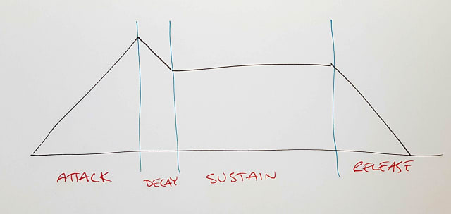
    We try to get some more nuance into our project by adding some concepts from syths. Attack, Decay, Sustain and Release (ADSR) is a breakdown of what happens when you press a synth key. The attack is the time it takes to get to max volume, decay is what gets you from there to the sustained tone wile holding the key and the release is how the tone fades away.

    A sketch showing the concept of ADSR

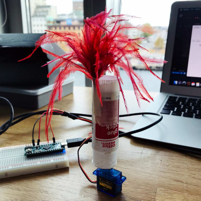
    I start trying to implement some of this while Josefine tries to find new ways to express the beat. She constructs Gluewie, the gluestick/feather thingy that rolls against your skin and tickles you with feathers. It's not the greatest success.
    Gluewie, a character made of a gluestick and a feather

    Stealing as prototyping

    We also steal a prototype from Patrik And Kornelia to test a constricting expression. This was one of my first thoughts to go with early on in the project but it felt like it could be a bit to much just for laughs. The prototype works good but is not better than what we have so we stick to our direction.

    Coaching

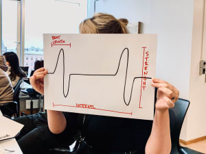
    Clint asks if we are to restricted by heartbeat and if it is really nuanced or is it just on/off. I disagree as I think the beat is not in itself a complete heartbeat, the heartbeat is the strength, the distance between beats and more. We might want to work more on this though, to get more dimensions in there.

    During the coaching we talk about how Gluewie is almost like a coral reef or jellyfish when he moves. This is intriguing and Josefine and I start thinking of concepts like that. We decide to diverge our thinking next week and come up with different ways of expressing the flow in a more visual form.

  14. Beat it

    Placement matters

    After yesterday's ideation we realized we wanted to make something that is attached to the body instead of something you just see or hold.
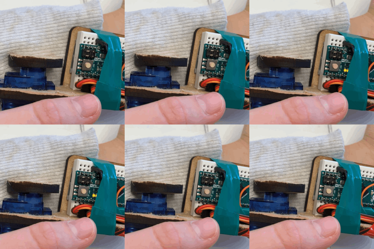
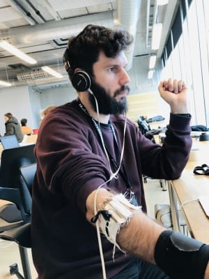
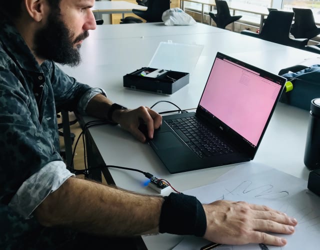
    With the software we could regulate speed and strength of the beat. We tried to attach the servo to four different spots while trying it with or without hearing it (muting the sound with headphones).

    testing the beat on my wrist
    testing the beat on my wrist
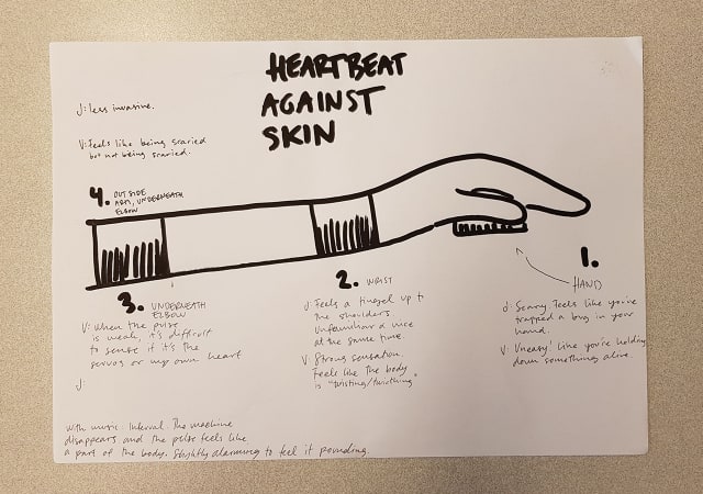
    • Palm: Feels weird, like you are trapping or crushing a small animal.
    • Wrist: I felt a bit like it was something medical. in the way when you try to do stuff.
    • Antecubital: Very similar to the wrist. A bit less in the way than when on the wrist.
    • Elbow: This may be the best placement. It feels less invasive than the wrist or antecubital.
    sketch of the spots we tested the servo on

    All placements other than having it in the palm felt really similar. We both had a hard time distinguishing the machine beat from our own heart beat. When it was weak I didn't notice it much but when we dialed up the strength and speed it felt like your heart was pounding, like you are running or scared.

    Feedforward

    sketch of the GUI we used to test

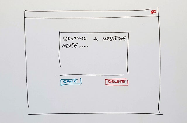
    We built a simple GUI to test if we can communicate a sense of how "dangerous" the action is. It's some kind of feed forward but very abstract, you will just get a feeling for how nervous you should be when performing the action. When you hover the save button the beat slows down and becomes less strong and when you hover delete it becomes stronger and faster.

    The "save" feedforward wasn't that obvious but the "delete" felt quite dangerous, like something bad would happen. We also tried it on a class mate and her reactions where very different when she saw the GUI or just felt the beat. When she had not seen the GUI she could feel the changes but didn't put much meaning into them. When she could see the GUI and move the mouse she felt it more strongly and associated it to danger like Josefine and me.

    Take aways

    I think we learned a lot today. The beat may have some kind of quality that makes us associate it with our own body and not think of it as an external artefact. This was a really strange and strong insight. The placement also means a lot, maybe because some spots would be associated with medicine and the cable running from your wrist feels like some kind of intravenous tube?

    We still lack some nuance in our prototypes. The beat can be adjusted finely but we have no way for the user to do this. Maybe we need a more complex GUI and task for the user to do.

  15. New week new direction

    After a good end to last week we start up again and try to go in a different direction.

    Josefine talks about feedforward and palm reading, I'm sceptical.

    The sound of the servo laying and beating on a table is not pleasant. Very tiring in the long run.

    We talk more about the heartbeat and how it could be used. Feedback seems limited, should we do feed forward? Maybe with a GUI.

  16. Friday wine and workshop

    Some kind of flow

    Today was a productive day. In the morning I was programming the servo movement so we could make a rod move up and down to show some kind of flow. Josefine built a prototype of some kind of shape changing thing to show the motion.

    We take Clint's wine example to heart and the creativity starts flowing.

    As the day progressed we worked more and more together on the physical objects. The iterations got sturdier and sturdier as the first one was too flimsy. In the end we got it to work but we didn't like the result very much. The movement was long and slow and looks like some kind of breath. It didn't give the impression we where looking for. Just having the servo laying on the table with the arm moving in much smaller angles made for a more interesting movement. It felt like some kind of heartbeat. Putting your hand over it fells like crushing a small animal. Unsettling.

  17. Coaching gets us started

    Coaching

    We get our first coaching and we find that we might be on a stray path. Robots and gaming might not be the best way forward. Clint wants us to think about where we have been coping and what lenses apply in those instances.

    He suggested that we should think about our own examples of coping and where they are in the “spectrum” of lenses. We are still very confused about what to do. We go back to the text and discuss it with fellow students.

    Clint talk a lot about a glass of wine and how that appears different to different people. We should somehow focus on the novice to mastery journey.

    Post coaching

    Josefine talks about how working in a restaurant has a lot to do with coping. Your actions have social manipulability as you communicate with your speed and apparent busyness that you don't have time to carry out more food and how planning the carrying of dishes is important. What is done in the doing.

    I had a weird social interaction with someone with noise canceling headphones last semester. Does that have anything to do with social manipulability?

    We end the day with a little sketching and plan to meet up in the workshop to build something in the morning.

  18. Feedback in games

    We get into how feedback is in games. In Zelda, breath of the wild the player has to be vigilant of remaining energy while running. If you empty the energy stor e you will be punished by having to walk for a while. The feedback for this is a circle on the screen and we talked about how this could be implemented as a continuous and nuanced feedback and how there are very many missed opportunities. The Nintendo Switch, and some earlier consoles by the company, tries to push for new interactions and feedback but it seems to be hard to convince game makers to use these. I remember how many reviews of the Switch focused on the console as an artefact and these feedbacks where key. The click when docking the joycons is even part of Switch logo.

    Gaming is a genre where it seems to be easier than most to introduce new concepts in interface and interactivity. The VR "revolution" has focused on gaming in both iterations (90s and 20-teens). The same seems true for haptic feedback, even though Apple has been focusing on this lately. The Apple haptic feedback seems to be more about how you can make thing thinner if they don't have to move but you then have to create an artificial feedback to make up for the lost feedback.

    Update: The Playstation 5 has been announced and they seem to move towards more nuanced feedback and feedforward with "adaptive triggers" and "haptic feedback far more capable than the rumble moto" Wired interview with Sony

  19. Draw robot draw

    Drawing on previous experience

    As we dive into the coping we talk about where we experienced coping in digital products. The only experience I can think of where nuance is present is when using a wacom pen and tablet. You can feel how the pressure of the pen against the tablet changes the brush on the screen. The pen has been designed with meta manipulability in mind as you can easily switch tool in the app by just flipping the pen around. You go from drawing to erasing with ease and don't have to think about it. It's also an example of how the users skill changes the use of the artefact, a beginner does not yet have great control of the brush size but the more you use it the better you get at fine grained control.

    Drawing with robots
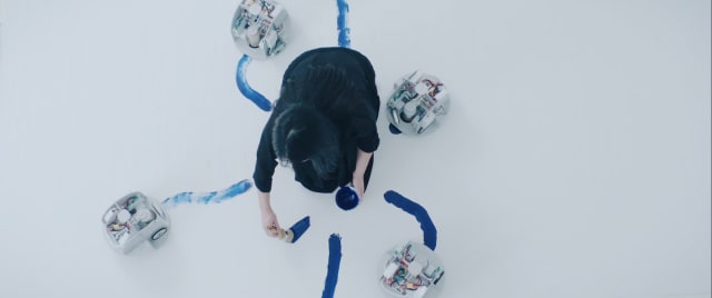
    Omnia per Omnia by Sougwen Chung

    A tool that moves with you

    The drawing discussion led us into tools and drawing, could we make some kind of tool with a servo? Maybe a robot. Josefine found an interesting art project tat was using robots to draw and we decided to do something in that direction.

    We finish the day on a high. Robots and painting seem fun.

  20. Coping with servos

    We start this module by reading Designing for coping by Clint Heyer. He introduces four lenses we can use to identify different kinds of coping mechanisms we have with and through our artifacts.

    • Malleability is the properties we change outside of our intended action, like setting thing up for our activity. They are more or less permanent, like changing tyres on our car, once we have done it it stays like that until we change it again.

    • Meta Manipulability happens inside our activity but is not really a part of it, it is more about facilitating our activity by adjusting tools and the like. Handing over a tool in the wrong way does not stop the activity but it can break a flow. When you are drawing you constantly adjust your position and the paper to keep make it less physically demanding to draw.

    • Direct Manipulability could be described as the coupling between the action and the way I use the object. It can be the feedback I get from my engine revving or the thicker line I get when I press harder with my pen.

    • Social Manipulability is what your actions express in a social context the act of writing a document on a computer has a lot of social expressions, like how hard you type, if you move away from others to do it or if you just start writing in the middle of a meeting. All these qualities are lost in your document as the only thing that is left is text.

    These four concept are reduced or even often lost in digital products. We have no richness in our impression and expression, text is text, the computer is a black box and you are left with really poor abilities to interact with our artifacts. We seldom get the a fraction of the nuance we get from mechanical products. Even if you don't know what way to screw in a screw, you can feel the when it is tightening or loosening. The same is not true for most digital stuff, I can't feel when I am nearing the edge of the screen with my mouse.

    One of the few places I have found a richer input is in my wacom tablet. I can feel how hard I press and that translates to the screen, and I am always aware of where my pen will land on the screen when I put it to the tablet, the direct manipulability. Rearranging the tablet to give me a better position is meta manipulability. Theses qualities make my work easier, I guess this is what Clint talks about when he talks about coping.

    The text is a hard read and I'm pretty sure I have misunderstood at least some parts of it but I like how it makes me think about aspects of artefacts that I have not been thinking of before.

    Assignment: Coping/Servo

    Brief: Design a fluid, nuanced interaction with servos

    Materials: Servos and the text "Designing for Coping"

    Team: Josefine and me

    We kick this off by examining the text, discussing it with each other and with our class mates.

  21. M1 Takeaway

    When we started this module we where experimenting rather blindly with the camera and different computer vision libraries. We just did what we felt like doing that day, without really thinking of a vision or how the interaction should be like. We had our focus on the input, probably because that's where we had some concrete limitations with computer vision.

    In this stage we missed to think about the whole. Theme

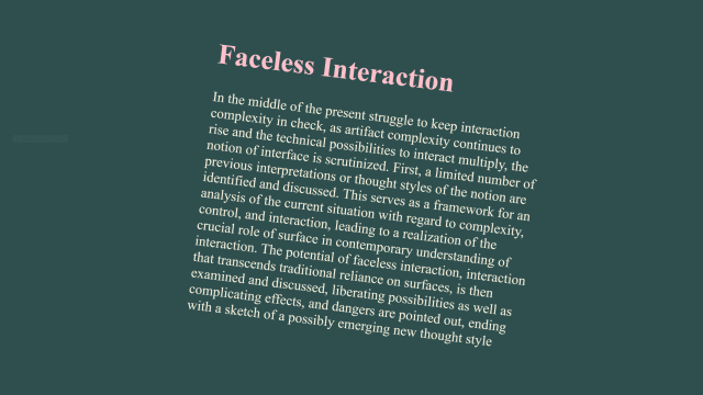
    We started this module with a text about faceless interaction

  22. Building tension

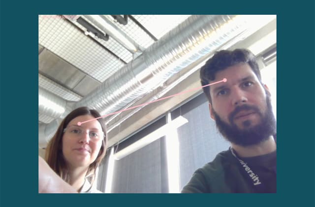
    After a coaching session with Jens we might have found a theme. We talked about how we could build something that is not obviously of any use and that could be interesting and have meaningful interactions. We found that when we talk about what we want to build, a magical focus or the the stone from 2001, we are talking not just about relations but some kind of tension that build in relation to the people and the artefact or point in space. Instead of playing a sound depending on where you are in the room and in relation to other we should focus on how to build tension.

    What is tension

    We have different associations with this but I come back to the rubber band. How does that sound? We could have some kind of tone that changes. Now we just need to learn how to generate tones and apply effects in the browser.

  23. Helping Friends

    Today I held a little workshop in the Studio to help class mates that struggle with the programming part of the project. In a couple of hours we went through a lot of questions and threw some ideas around.

    Temporal Chromatic Experiments

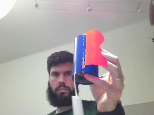
    In this first session we focused on the Diff example by Clint but expanded it by changing colors of objects. Then someone asked if it was possible to delay parts of the image to have some kind of ghost effect. I had no idea but started coding while explaining what I was doing and came up with a functional sketch of this.

    Mind Lasers

    We moved on to test some TensorFlow things. With the Coco SSD we experimented with trying to find the heads of people. It's not perfect but it works ok.

    In helping Josefine with a question about drawing lines I suddenly connected the dots, both literally and metaphorically. Lin and I had been talking about relationships between people and and it seemed like a daunting task to calculate all this. Now I see how easy it could be.

    I never thought I would think it's this much fun to hold a lecture/workshop. I always resisted the idea of teaching others. I am reconsidering. I get so much back. It is so inspiring to see what everyone else is thinking of and struggling with and I get so many ideas about what I want to do next.

  24. Aesthetics of interaction

    In Aesthetics of Interaction – A Literature Synthesis by Lenz, Diefenbach and Hassenzahl they analyze 19 papers describing the aesthetics of interaction to find a common ground and language to be able to critique interactions in a less subjective manner. They find common attributes that can be used to describe broader needs or categories that describe how the interaction feels like security, autonomy and so forth.

    I like how texts like these can show things that seem so obvious when you read them. Finding a new language around these things really make me think in different manners and reveal patterns that I didn't see before.

    Having theses attributes gives us the opportunity to design something different and consciously try to make our interactions break with our established thought and patterns. Is faster always better? Should we really have so many notifications or should I as a designer try to alleviate the information overload and the constant call for attention. Computers and by extension smartphones are built as tools but when we use them as social devices we might need to design them with different attributes.

    I listened to Kara Swisher interview the psychologist Jennifer Eberhardt about bias in tech on Recode Decode the other day. An interesting bit was when Eberhardt talked about a social network for neighborhoods that slowed down it's UI to make people think more when they wanted to report a suspicious person. By doing this they avoided a lot of racism.

  25. Coaching & relationships

    Our latest sketches may be fun but it's more about having control and being a user. That's something we want to get away from in this module. We tried to introduce more people but we only got more chaos.

    When talking to Clint we found that maybe we want to work with relationships between people rather than just where they are in space and their relationship to the camera. His feedback was also to make the project a bit more interesting by having it react to people instead of just being controlled. We should move away from music and maybe find a sample we can play. We talk about some kind of noise that can be affected by different people. After the coaching talk it feels like we have more direction and can keep moving after standing still for a bit.

    Lin and I talk a lot about programming and how simple math can be used to great effect in our prototypes. Things seem more complicated than they are. We can take some shortcuts to fool people it is more complicated than it really is. She will keep doing some smaller projects while I focus on finding out more about sounds in the browser.

  26. Field work

    I am struggling to find an interesting faceless interaction field. I tend to want to find a situation and a function but our assignment is specifically to ignore why and where.

    One problem is that we don't really have a question that we want to answer. We are talking about relationships between people and maybe objects too but we not anything deeper than that. In our last coaching talk, this was the main thing Clint thought we have to work on. The problem is that I don't know how. It seems we are stuck in some kind of rut, manufacturing "slick" demos without really exploring what we are supposed to do.

    We worked a bit separately today so I would give Lin a chance to program without me just taking over all the time. While I was working alone I started exploring something that would pick up on where in a room a person would be and control the sound volume and speed that way. I don't know what to do with this. I still don't know what this has to do with faceless interactions and fields. It feels like something I did because it was a logical step to take based on the last sketches.

  27. Tinkering

    Text Tracker

    text tracker

    We started experimenting with what kind of interactions we could get out of a camera. An obvious one was taking facial tracking and making some kind of weak faceless interaction. The result is a text that you can control with tilting and moving your face to tilt, scroll and zoom the text.

    Text Tracker Demo

    I found the face-tracking to be a intuitive and fun but we came very close to a normal interface. It is so direct and the feedback so clear. We are very much focusing on one user manipulating the graphics on the screen and this was not the purpose of the assignment.

    Trying to get away from the "face" of the Text Tracker we decided to testing out sounds.

    Music on Speed

    music on speed

    Trying to get away from the directness of the previous example we tried to work with more general movement (number of pixels that have changed between frames) hoping that control scheme would make it less obvious and opening it up to multiple people at the same time. One aspect I think is important in Faceless Interaction Fields is to try to get away from the user. The way we try to do it is to have multiple users and having the interaction be a collaboration between all of them.

    Music on Speed Demo

    I think we got closer to facelessness here. You could argue we don't have a user as the program just cares about movement in the room. I think we may have polished the wave a bit too much. It was just there to visualize the movement before we tried to get sound working but it takes away a bit from the whole experience as it draws your attention to the screen and thus also making you think about the computer as an observer of sorts instead of treating the room as a "sensor".

    Using music is also problematic as the interaction feedback becomes so prominent. We will have to go into something more abstract that draws less attention.

    Next step

    We are still stuck working with a computer and a screen. We have to move on and make it less obvious where and what the interaction is.

  28. Interactivity - M1 kickoff

    The semester starts with a lecture on Faceless Interaction — A Conceptual Examination of the Notion of Interface: Past, Present, and Future by Janlert & Stolterman. They argue that we are to locked into what they describe as four different thought styles about interfaces and have not really defined what interfaces are. The authors want us to think further and less technically about interactions and interfaces. As interactions become more complex we might need to create new types of interfaces or leave the traditional interface behind and behave more like people do, interactions that are more based on culture and context than on control panels.

    What they propose is a new faceless interaction thought style, where we don't direct our attention to a specific surface. It is more about fluid interactions in an open world where we think of interactions more like waves than points. Waves are less defined and can differ in strength, so thinking in this wave makes more continuous and less on or off.

    The authors imagine three different directions for faceless interactions:

    • things: Artefacts that interacted with based on physicality like picking up a speaker to make it play or flipping your phone to mute it.

    • being: Systems that you relate to like having conversation with it like smart speakers and digital assistants

    • field: A more abstract interaction where you don't have a clear target to interact with or maybe not even a user. Ambient computing and prediction could fit in here.

    It's an interesting and thought provoking text but I think it lacks a bit in it's grounding. The authors ask us to just trust them as they don't give us a lot of evidence to base the assumptions on. I really think there are things to work with here and it gives me a better language and understanding of interaction as a medium but I wish they would explain a bit more how they came to these conclusions.

    Assignment: Fields/Computer Vision

    Brief: Tinker with computer vision and how that could be used with the fields direction of faceless interactions. Formulate a very modest initial question, sketch, reflect, repeat.

    Materials: Computer vision.

    Team: Lin and me

    We started by examining the computer vision demos Clint gave us and explored some more libraries. TensorFlow by google seems to have some nice functions to find people and stuff.

    The assignment seems very vague and we are struggling a bit to come up with stuff we want to tinker with but reading more about it and discussing it with other people should make it a bit more clear.