
Blog
-
Valentin Salja on Unsplash 
My essay for re-eamination in -
Photo by Henry & Co. 
Designing with texture
Interaction designers are increasingly tasked with crafting nuanced digital feedback to inform and delight the user. However, there is a lack of frameworks for designing continuous feedback that could help. Heyer (2018) proposes a set of lenses for analyzing interactive objects in terms of how they afford manipulation in different contexts and why this manipulation is integral for skillful coping. The part of Heyer's reasoning that I will focus on in this essay is feedback and feedforward as texture. According to Heyer, texture is always there, it is part of the material, it is invisible but always available: the noise of a car engine, the weight of a coffee thermos, the sound and vibrations when a bike's tyres roll on the road. These textures reveal something about the artifact’s state and are a natural part of any mechanical machine or tool. Digital artefacts, on the other hand, do not have intrinsic textural feedback and designers need to design the feedback in order to facilitate coping. The current paradigm in interaction design is not concerned with vague textural qualities: it is more interested in the precise nature of numbers and meters. -
Photo by Kelly Sikkema on Unsplash 
Service Design intro and readings
We start a new course, Service Design where we will work with Malmö libraries as a stakeholder to design for libraries during societal crisis. Good timing. -
Photo by Kelly Sikkema on Unsplash 
Sinus waves
Yesterday was a gone day. I have exchanged sine waves for oozing sinus and cough. -

Instrumental knowledge
We get three texts to read. Two are design projects and one is more of a research project. -
Photo by Franck V. on Unsplash 
Computer, make music
We start a new week and topic. This time it is AI assisted musical instruments with Wekinator and processing. -
Photo by Ricardo Gomez Angel on Unsplash 
Show and tell it with physics
All the groups show their concepts. Most of us have been working with physical visualizations. -
Photo by Isis França on Unsplash 
Finally working
After a few days with half the group missing, we can finally work some more and get some decisions done. -
Photo by Jeremy Lishner on Unsplash 
Tangible bits and other pieces
We read three texts. An old clasic, Tangible Bits by Ishii and Ullmer, Visualization Criticism by Kosara and Opportunities and Challenges for Data Physicalization by Jansen et al. All texts have something but some have quite little. -
Diagram by Florence Nightingale 
Provocative information
A new week with a new topic. This time it is about informing and provoking with physicalization of data. What is information and what is provocation and are they even on the same spectrum. -
Photo by nattarin kraiwachirasit on Unsplash 
Smell & tell
Today we had our show and tell with the smelly games. There where both good and less good games. -
Photo by Darren Nunis on Unsplash 
Building Battlescent
The assignment this week is to modify an existing game to incorporate smell. We build a smelly version of Battleship. -
Photo by Pedro Figueras from Pexels 
Smoke rings
A workshop on smell. Working with vortex cannons and rose bombs. -
Photo by Alejandra Coral on Unsplash 
Smelling
Last friday we all presented the films we made that week. Every group talked and got critique from the class and David. -
Photo by Jeremy Yap on Unsplash 
Multiscreening
Last friday we all presented the films we made that week. Every group talked and got critique from the class and David. -

Rocking scissors and paper
Making paper prototypes may have been bit too slow but at least we got it done -

Screen time
We ideate on the possible situations where multiple screens could be used. The finalists are patrolling police, doctors with patients and cooking. -

Working with text
We have a seminar about the texts and we start working on our group project for the week. -
First glance at TEI
We start a new course, TEI, and it looks like it's gonna be a wild ride. The first week involves designing a glanceable interface and presenting on friday. -
Photo by Leone Venter on Unsplash 
Presenting
The last module in this course is about machine learning and gestures. We will use a phone to record movement and try to teach the machine to recognize what we do. -
Photo by Mark Eder on Unsplash 
The non action
The last module in this course is about machine learning and gestures. We will use a phone to record movement and try to teach the machine to recognize what we do. -
Photo by Paolo Nicolello on Unsplash 
What have we done?!
The last module in this course is about machine learning and gestures. We will use a phone to record movement and try to teach the machine to recognize what we do. -
Photo by Siora Photography on Unsplash 
Cancel that
The last module in this course is about machine learning and gestures. We will use a phone to record movement and try to teach the machine to recognize what we do. -
Photo by Chris Barbalis on Unsplash 
Handling it
The last module in this course is about machine learning and gestures. We will use a phone to record movement and try to teach the machine to recognize what we do. -
Photo by Rechanfle on Flickr 
Minority repeat
We spent most of last week reading, tinkering with the ML libraries and walking around the studio. This wee we started working on something inspired by the movie Minority report, one of the better Philip K Dick adaptation (some are very bad). -
Photo by McKenna Phillips on Unsplash 
What are gestures?
We talk a lot about gestures, and in discussions we throw the word around without thinking of what it means, almost as carelessly as the use of "intuitive". -
Photo by Jake Hills on Unsplash 
M3: Try walking in my shoes
The last module in this course is about machine learning and gestures. We will use a phone to record movement and try to teach the machine to recognize what we do. -

M2: Show & tell
Show and tell went better than expected -

You shot me down, bang, bang
Coaching didn't go as planned. Clint didn't see any nuance in the what we where planning and he didn't think it was good to focus so much on a situation. -

Another week another concept
We take concepts from synths and apply them to our beat. We also start to explore new concepts with feathers and rollers. -

Nuance and Gluewie
We take concepts from synths and apply them to our beat. We also start to explore new concepts with feathers and rollers. -

Beat it
Experiencing the beat gives insights we couldn't know beforehand -

New week new direction
After a good end to last week we start up again and try to go in a different direction. -

Friday wine and workshop
We take Clints wine example to heart and the creativity starts flowing. -

Coaching gets us started
We get our first coaching and we find that we might be on a stray path. Robots and gaming might not be the best way forward. Clint wants us to think about where we have been coping and what lenses apply in those instances. -

Feedback in games
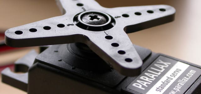
We start M2, Coping with servos. What is coping, what s nuance in interactivity and how do mechanical machines have inherent deep feedback that digital ones lack -

Draw robot draw
We start M2, Coping with servos. What is coping, what s nuance in interactivity and how do mechanical machines have inherent deep feedback that digital ones lack -
Coping with servos
We start M2, Coping with servos. What is coping, what s nuance in interactivity and how do mechanical machines have inherent deep feedback that digital ones lack -

M1 Takeaway
What did we learn in M1? -

Building tension
After a coaching session with Jens we might have found a theme and will start to build tension in a faceless field. -

Helping Friends
on the Aesthetics of Interaction and how thinking the opposite can be better for all. -

Aesthetics of interaction
on the Aesthetics of Interaction and how thinking the opposite can be better for all. -

Coaching & relationships
Some much needed direction after talking to Clint. We will focus on relationships. -

Field work
The struggle to find a field continues. -

Tinkering
Tinkering with different examples and libraries to find interesting interactions and effects. -

Interactivity - M1 kickoff
We start the interactivity course with a lecture on the paper Faceless Interaction by Janlert & Stolterman where they introduce five Thought Styles when looking at interactions. We also start a workshop where we will explore fields and computer vision in the next three weeks. -
Photo by Nathan Dumlao on Unsplash 
Final week of prototyping
The last supervision before the presentation went well. We got good feedback and some small pointers to where we could improve before handing it in. The only point of contention was about the company website where we got the feedback that it might be good to have two separate for workers and consumers, but we think that this should be viewed more like a company overview where all the parts are presented, just like the uber homepage. The apps should be viewed as the separate portals for workers and consumers. -
Photo by Austrian National Library on Unsplash 
The Uber for t-shirts
This week was great for us, we worked hard and came to great insights that changed our project's path. We are now a gig economy company exploiting developing countries. -
Photo by Gaelle Marcel on Unsplash 
Finding new ways forward
This week was a bit frustrating. It felt like we didn't communicate our ideas very well at the critique sessions and the group fell apart a bit. -
Photo by Aron Visuals on Unsplash 
Struggling to find our way
We started talking about what sustainability really is how planned obsolescence can be a thing and how consumers could make informed choices. We got interested in the informed consumer and dove down that rabbit hole. When every product is as complex as they are today it seems impossible to make a real informed choice. We would have to spend hours just to shop for tomatoes. -
Photo by Meg Nielson on Unsplash 
Speculative Project
We were introduced to the project we are going to be working on for the next 4 weeks. We are to select one of UN's Sustainable Development Goals and somehow create new knowledge around that. We started discussing what goals we wanted to work with and we landed on number 12, Ensure sustainable consumption and production patterns. -
Photo by Markus Winkler on Unsplash 
Google Analytics
We had an assignment to use Google analytics to find design opportunities in a web store. -
Photo by Markus Winkler on Unsplash 
Prototyping with Data
We had a workshop where we was given the task to design a movie app but I did a news feed app instead as I found it a bit more inspiring. To fake data in a more realistic way we installed the plugin Repeator that lets you mock data into repeater grids. This was a nifty plugin that I will use in the future when I have to do these kind of mockups. -
Photo by Markus Winkler on Unsplash 
Data driven design
What are the implications of heavy use of data in the design process? We can easily get into hairy situations where we are spying very much on our users, gathering data that will never be used but risks exposing our users if the company is hacked or an the company goes rogue. -

Reconstructing Malmö by Bike
Starting the reconstruction was harder than I thought. I stumbled a bit and had a fair bit of scope creep. In the end I decided to strip it down a lot and just focus on how you find a bike or free return slot. I started to make quick sketches and didn't care about the design of icons or similar. I just wanted to get a sense of what I would want in the flow. I decided to remove a lot of of functionality as I saw it as cluttering the screen. -
Photo by Rechanfle on Flickr 
Critical Speculative Fiction
This was an interesting lecture where we got to see some speculative / critical design. Many projects can look silly at first glance but if you dig a little deeper they quite intriguing and could lead to interesting discussions. Dunne & Raby with their A/B Manifesto, might be drinking their own Kool-aid a bit too much, but the manifesto is interesting and thought provoking. -

Deconstructing Malmö by Bike
After talking to Clint a bit I have found a user path that I want to focus on. I had a hard time narrowing down what was a good project for this assignment and kept moving away from what we are supposed to do. -
Photo by Jannis Blume on Unsplash 
User Testing
We had a lecture on user testing and how to do it, and also a bit on how not to do. We went through four different types of tests: observation, when you want a realistic use of your prototype; video analysis, where you can get very rich data on the interaction on a screen and reactions; think aloud, when you want to know the users reasoning; use & interview, when you want rich qualitative data from your tests. -
Photo by Alice Butenko on Unsplash 
UI Design Patterns
We got an introduction into UI design patterns, anti-pattern and dark patterns. UI design patterns are patterns we see in software we use. Anything from simple input fields and thumbnails to more complex composite patterns like carousels and wizards. These patterns have formed when they are used in many places and almost become standard. -
Photo by Kelly Sikkema on Unsplash 
Digital Prototyping Intro
The start of our new course _Digital Prototyping_ builds on what we did during GUI. It's a bit like the _redesign for one hand_ assignment we did with Sofie but this time we will focus less on just UI and will focus more on UX as we are to redesign a user flow of our own choosing in an app we use often and know well. -

First day filming
We start our work in the workshop. Some work on sound, some on story and some on the physical artefact. -

Laser Focus
We start our work in the workshop. Some work on sound, some on story and some on the physical artefact. -
The story so far
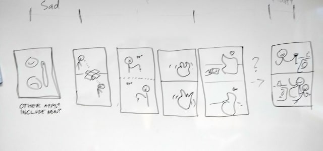
What is our device and what story does it need to tell? We finalize the concept and start working on our story. -

What is prototyping, and why?
Part 2 of the Clint sessions. We dissect prototyping. -
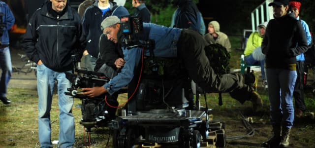
Video prototyping group project
We start our video prototyping group project and ideate over different and form a concept. -

Video prototyping intro
Intro to video prototyping where we discuss narrative pacing and make a gesture interface for Netflix. -

Prepare for failure
A quick workshop working with timers and arduino -

Cardboard Keyboard
An intro to Arduino, Processing, buttons and such and then we have a workshop project. -
Let's get physical
Todays lecture was mostly a recap of what we learned in methods 1 but also expanded on how to use prototyping in the design process. Clint talked about what prototypes prototype and what we learn from different approaches.
Blog
this is my blog page